Google's refreshed Chrome design is nearly here
It rolls out on Canary today.
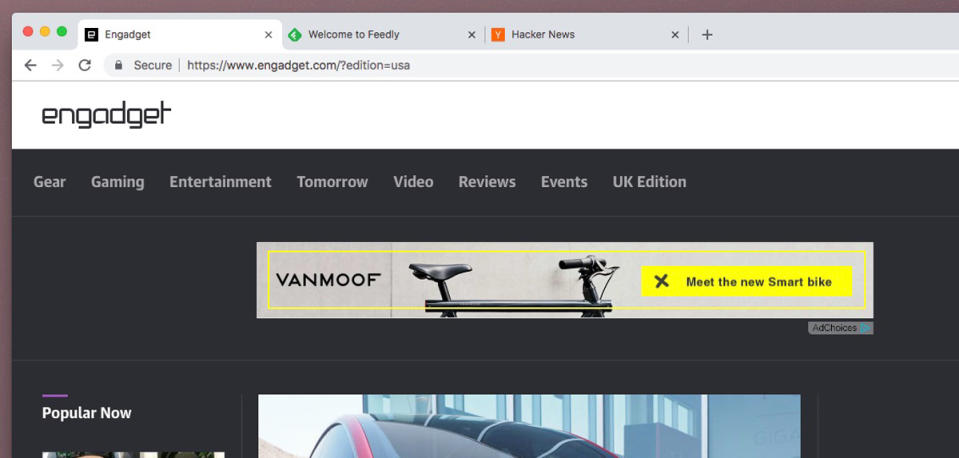
Chrome's design has remained largely the same for a long time, but earlier this year Google started hinting at a complete "Material Design" overhaul. Now, we've got a better idea of what this might finally look like. As the company gets even closer to updating the browser's UI, it's today rolled out an update to Chrome Canary on Windows, Linux and Chrome OS that enables the new Material Design UI by default.

Things look pretty different. There's a new address bar, plus refreshed tab shapes and colors. Chromium Evangelist Francois Beaufort also mentions omnibox suggestion icons, tab strip coloring, pinned tabs and alert indicators in his announcement of the update. "Plenty of things have been updated for the better in my opinion," he says, although it will likely take Chrome fans a while to get used to the new set up.
While the release has been available via a flag for a while (and is still only accessible with a flag on MacOS), today's update is easier to explore and likely more stable. That said, it's still Canary and it's still being actively developed, so you may encounter a few bugs while its creases are ironed out.


