userinterface
Latest

Xbox remote play is open to everyone on Android devices
The new Xbox Android app can help you set up your Series X/S console.

Xbox beta testers can try the Xbox One UI redesign starting today
The August update includes some useful features for everyone.

'Death Stranding' update will fix tiny, hard-to-read text
One of the more prevalent criticisms of Hideo Kojima's Death Stranding is that the onscreen text is often pretty small and difficult to read. Kojima Productions has been working on a fix for the issue, and you'll be able to increase the font size.

iOS 13 may include system-wide dark mode and undo gesture
With Apple's Worldwide Developer Conference less than two months away, more details about what iOS 13 might have in store are emerging. It could add a system-wide dark mode, deeper multitasking options, an undo gesture and updates for the likes of Safari and Mail, according to 9to5 Mac.
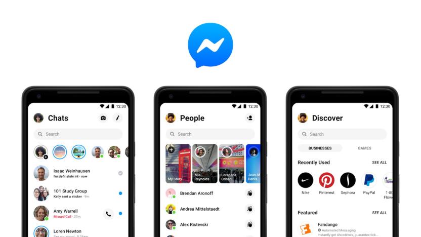
Facebook’s simplified Messenger app interface is rolling out to users
Facebook teased a Messenger redesign at its F8 conference back in May and then started slowly rolling out the simpler interface last October. Now, The Verge reports, the redesign is becoming available more widely, with both the App Store and Google Play Store listings displaying the new interface. The new design features fewer tabs, makes it easier for you to chat with friends and introduces contextual icons that let you know what's going on in a conversation.
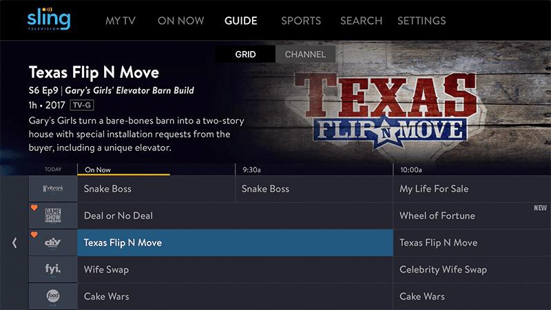
Sling TV rolls out improved UI features on Apple TV
Apple TV users are getting some new Sling TV features that will make it easier to find and watch shows. Sling said the updates are geared towards being more "content-centric" and they include changes to the main guide, content information views and remote capabilities.
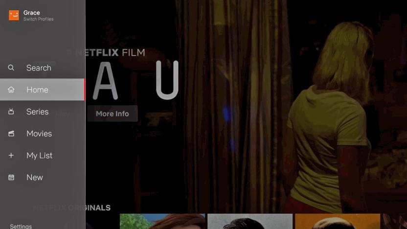
Netflix refreshes TV interface with a handy navigation bar
Netflix is giving its TV interface a fresh lick of paint with an update that should make navigation a little easier. A new bar on the left of the screen lets you jump to the TV show and movie catalogs, depending on what you're in the mood for. You can also check out all of the latest content Netflix has added in the New tab. So, when the new seasons of Orange is the New Black and Stranger Things arrive, you'll know where to find them quickly. The bar lets you access search and My List in a flash too -- you'll no longer need to scroll through a bunch of rows in the home screen to find everything you've saved for later viewing.

Everyone will soon have to use the Google Calendar redesign
If you've been avoiding the visual refresh Google recently gave to the web version of Calendar, your time is almost at an end. Starting January 8th, users of G Suite and Google Domains will be automatically switched to the new design. Anyone who opted out manually won't be forced to use the new Calendar until February 5th, but all users will get the upgrade on February 28th.
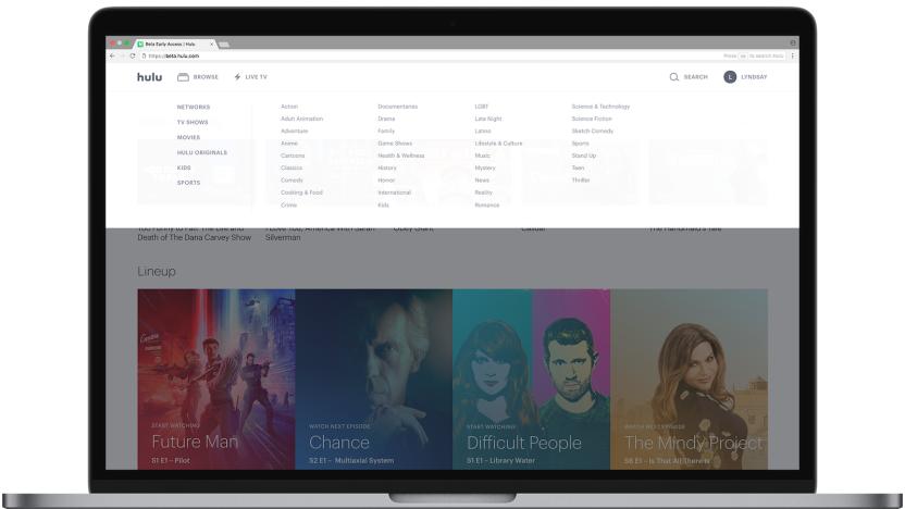
Hulu's Live TV service is now much easier to browse on the web
Hulu has been working on some new features for its Live TV service. The changes are specifically geared towards improving navigation and browsing in the web version of Hulu Live TV. First, the new version has a Live TV button right at the top of the home page and there are also more curated collections of shows and movies. Web users will now see collections like Keep Watching, Lineup and Fall TV. Hulu has also changed how to access title details by making them easier to get to and having them show up as an overlay so you can easily return to browsing. And there's also now a dedicated Browse menu.

Facebook clarifies its security settings to curb confusion
Facebook has picked up on the fact that everyone thinks its security settings are confusing. So, it has rolled out a redesign based on user research to bring some much-needed clarity to its security page.
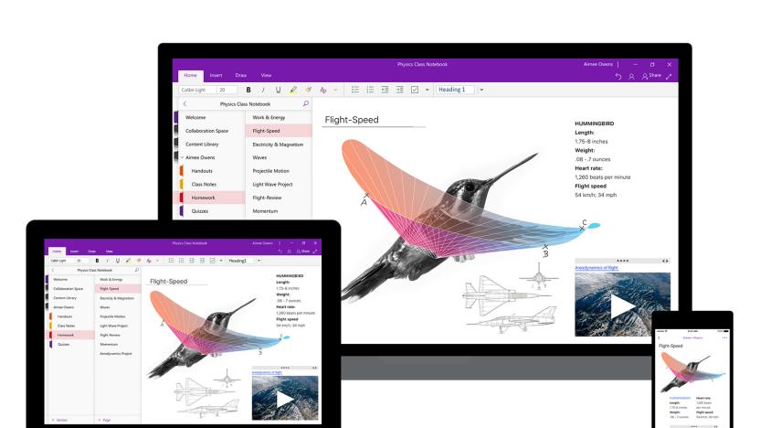
Microsoft simplifies OneNote UI for the visually impaired
March Rogers, Microsoft's Director of Product Design for OneNote, spent a year working with teachers and students to figure out the best way to reimagine the app's user interface. The result is a OneNote that's easier to navigate, even for people with visual impairment and mobility problems. You'll now find all the app's navigation controls on the left-hand side, not just so you can find your notes more quickly, but also because that makes things easier to parse for screen readers. As a result, your notes are now front and center, helping you focus on what you need to learn.

Using Tinder's swipe UI isn't always a good idea
Thanks to Tinder, swiping left or right on the photo of a potential hookup quickly became a common user interface element. But a new startup is reminding us that swiping right isn't appropriate for every kind of app -- say, an adoption app. Adoptly wants to modernize adoption by letting prospective parents set up a profile, filter potential adoptable children by age, race, gender and a few other characteristics -- and then let parents swipe right or left to express interest (or a lack thereof). Indeed, the company's slogan is "parenthood is just a swipe away."

Shape-shifting interface lets you touch computer simulations
Researchers want us to better interact with machines via screens and VR, but let's face it, we humans like to touch real objects. MIT's Tangible Media Group has been playing with that idea for awhile now with projects like InForm, an uncanny telepresence interface. It has now taken it further with Materiable, a shape-changing interface that lets you see and even touch physical simulations. The idea is to let users visualize and interact with materials or mathematical models of things like earthquakes and landslides.

He made Tom Cruise 'forget the mouse.' Now it's our turn.
In a way, John Underkoffler's like Hollywood's own Wizard of Oz. He's the man behind the curtain responsible for infusing blockbuster fantasy with real-world tech. He created the futuristic UI in Minority Report, worked on the timeline for Hulk's transformation and found a Soviet fusion reactor to blow up Stark Industries in Iron Man. He also recently received the Cooper Hewitt National Design Award for his work as an interface designer both in films and in the real world.

OUYA's streamlined new user interface arrives later this month
The OUYA user interface isn't what we'd call "ideal." The folks behind OUYA apparently realize that too, and today we've got the first look at some big updates that will be coming to the Android-based $100 game console sometime this month. A company spokesperson says a new designer was brought in to overhaul the UI so that it's easier to discover new games (and so that it's more pleasant to look at from 10 feet away). Additionally, the update includes some honest-to-goodness new features, including support for USB storage and the ability to queue games from the web (and OUYA's newsletters) so that when you go fire up the console they'll already be downloaded. Throughout, you'll notice a bigger emphasis on cover art -- in the "Discover" section, for instance, the menu headers have actually been made smaller to make room for larger game thumbnails. OUYA also made some subtle tweaks like showing all the game titles on the "Discover" page and going with a more consistent icon style. Not rocket science, exactly, but they're details that should add up to a cleaner browsing experience. Additionally, double-tapping will bring up the redesigned system menu, where you can purchase and like games. Here, you'll also find custom game recommendations -- not unlike what Microsoft has begun doing in the Windows Store.

Archiving iPhone app workflows
For app developers and bloggers, it's very instructive to have an idea of what has changed in the user interface of an app. App developers can look back and see how both the "look and feel" and steps required to perform a workflow have changed, while bloggers and other writers can use the information to update books or write posts about upgrades. Fortunately for both parties, there's a website called UX Archive run by two French developers (one of whom has moved to the Bay Area) and an American that plans to be an online museum of sorts, exhibiting the changes in app user interfaces and workflows over time. The site neatly divides the screenshots by app and task, so you can narrow down a search to just one particular task -- like creating, deleting, recording, sharing or uploading -- in one specific app. While there aren't a tremendous number of apps and versions currently archived (I counted 60 apps, with only a few showing the changes between iOS 6 and iOS 7 versions of those apps), it's a good start and UX Archive will be a helpful tool in the future provided the curators keep up with the updates. If you sign up for a free email list, UX Archive will ping you when a new workflow is added to the site.

BBC teams up with British universities to research new TV interfaces and systems
When the BBC asked "Where next?" most of us assumed that online-only programming and all-HD channels would be the extent of the broadcaster's ambition. Not so, now that the corporation has signed a deal with six British universities to research new ways that TV can be created, distributed and navigated. Buzzwords like "content" and "audience focused innovation" seem to mask an initiative to develop a new IP broadcasting system, work on user interfaces beyond gestures and research into how elderly, young and disabled viewers can get around 999-channel TV guides. The project will initially last for four years, by which time we're hoping that the BBC can just beam episodes of Doctor Who straight into our brains -- that's not too much to ask, is it?

Wordpress for iOS gets a new user interface
The Wordpress app for iOS has been updated again, and it features a brand-new interface for browsing, writing and editing posts on the popular blogging platform. As you can see above, the new interface apes Facebook's "side menu" (as have a few other big apps lately), and the update also fixes some other bugs, and adds some performance improvements in regards to emoticons and notifications in general. Wordpress for iOS is an open-source project, and thus you can download it straight from the App Store any time for free.

Eyes-on: MIT Media Lab's Smarter Objects can map a user interface onto... anything (video)
While patrolling the halls of the CHI 2013 Human Factors in Computing conference in Paris, we spied a research project from MIT's Media Lab called "Smarter Objects" that turns Minority Report tech on its head. The researchers figured out a way to map software functionality onto tangible objects like a radio, light switch or door lock through an iPad interface and a simple processor / WiFi transceiver in the object. Researcher Valentin Huen explains that "graphical user interfaces are perfect for modifying systems," but operating them on a day-to-day basis is much easier using tangible objects. To that end, the team developed an iPad app that uses motion tracking technology to "map" a user interface onto different parts of an object. The example we saw was a simple radio with a a pair of dials and a speaker, and when the iPad's camera was pointed at it, a circular interface along with a menu system popped up that cannily tracked the radio. From there, Huen mapped various songs onto different positions of the knob, allowing him to control his playlist by moving it -- a simple, manual interface for selecting music. He was even able to activate a second speaker by drawing a line to it, then "cutting" the line to shut it off. We're not sure when, or if, this kind of tech will ever make it into your house, but the demo we saw (see the pair of videos after the break) seemed impressively ready to go.

Sony flaunts portable, social aspects of PS4 with high-res screenshots
To keep the buzz going from its recent PlayStation 4 announcement event in New York, Sony's just released some high-res screenshots from the upcoming console's user interface. While we already saw many of them at the big event, there's a few intriguing images showing how the tablet or smartphone interface might look, along with shots of the social and video editing aspects of the UI. Other screens show the home, sharing, game streaming, user profile and friend feed pages, so hopefully the gallery below will whet your appetite until we can all actually see, you know, the console. %Gallery-180113%


