mapbox
Latest
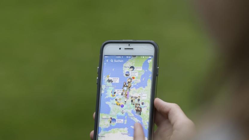
Foursquare puts check-in data to greater use in apps like Snapchat
Foursquare might not be as big as it was in its heyday, but it has a clever strategy for remaining important: it's making itself indispensable to the apps you use every day. On top of its recent Tinder Places deal, it's becoming the main point-of-interest provider for Mapbox, whose location info powers apps like Snapchat, Instacart and Lonely Planet. Even if you've never touched Foursquare or Swarm, you'll likely be using some of their data when you swing by a restaurant or hotel.

Want to fly a drone? Don't do it here
It may sound blindingly obvious to avoid flying a UAV around America's foremost military academy. But not all drone no-fly zones are as obvious as West Point, which is why Mapbox has just issued an interactive US map showing where all of them are. Included are things like national defense bases, airports, nuclear power plants and recent additions like national parks. As Wired pointed out, many clearly off-limit zones like Lawrence Livermore's lab still aren't listed, but if you notice one you can add it to an open-source page on GitHub. Meanwhile, all commercial drone flights are still banned, unless noted otherwise by the FAA. For hobbyists, however, they sky's the limit -- just stay out of the red zones.

Daily Update for June 20, 2013
It's the TUAW Daily Update, your source for Apple news in a convenient audio format. You'll get all the top Apple stories of the day in three to five minutes for a quick review of what's happening in the Apple world. You can listen to today's Apple stories by clicking the inline player (requires Flash) or the non-Flash link below. To subscribe to the podcast for daily listening through iTunes, click here. No Flash? Click here to listen. Subscribe via RSS

Twitter heat map shows iPhones dominate affluent areas
Mapping software company MapBox has created an incredible interactive map that highlights the devices that are used with Twitter across the world. The map looks at over 280 million tweets sent from iPhones, Android phones, BlackBerry devices and more, and plots all of that data by geographic location. As one might expect, the wealthier, more affluent countries have the most tweets sent from iPhones, while those in poorer countries typically use lower-cost mobile phones from BlackBerry and a few Android handsets. The map is a fascinating look at the prevalence of tweeting around the world and yet it is still only a fraction of all the tweets sent in a single day. The data was compiled with help from technology from GNIP.


