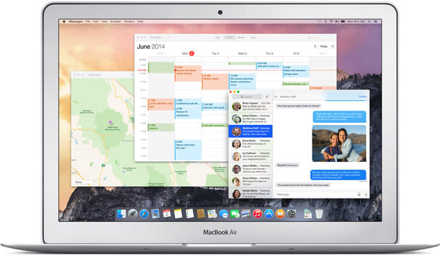
OS X Yosemite Design: The good and the bad

Designer and Pixelapse co-founder Lo Min Ming took a magnifying glass to the design of OS X Yosemite and teased out those UI elements that have changed significantly, both for better and for worse, in Apple's next-generation desktop OS.
As discussed by Ming, some of the best changes in OS X are the cleaner login screen, a sharper menu bar and a fresh set of default app icons, which we have already highlighted. There's also a roomier sidebar with a 2 pixel buffer that is more pleasing to the eye.
While there are many refinements, Apple did stumble in a few areas, most notably with the new folder icons, which now "appear far too bright and demand too much attention," writes Ming. He also noticed that there are three different sets of forward and back buttons, suggesting Apple is still tweaking this part of the UI.
You can read more about OS X and its design details over at the Pixelapse blog.

