Microsoft's redesigned Office icons reflect its move to the cloud
It's cosmetic, but it says a lot about how Microsoft has changed.

Microsoft's Office icons on Windows and the web have been conservative, to put it mildly. They've been functional things you click while you scramble to finish a business spreadsheet or school report. The company would like you to sit up and take notice this time around, though. It just unveiled redesigned Office icons that will reach apps and the web in the "coming months," and they're decidedly more interesting. To Microsoft, they're a reflection of how much Office has changed in the five years since the icons last received a makeover.
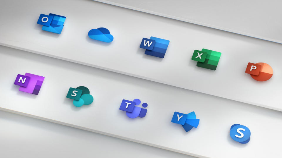
Instead of nice, neat outlines that represent the old concept of opening a local document, each icon has a distinctive shape that indicates its specific role. Excel has a rectangular icon to reflect spreadsheets, but you'll see a circular pie chart for PowerPoint, abstract people for Teams and similar changes for other apps. The emphasis on content over format mimics the "collaborative nature" of Office 365, design lead Jon Friedman said.
Yes, they're purely superficial changes that don't translate to functional improvements. However, it's easy to see this as a symbolic milestone for Microsoft as a whole, not just Office. The 2013 icons came at the tail end of the Steve Ballmer era, when the company still revolved heavily around Windows and was only just ramping up its cloud services (Office 365 launched in 2011). Flash forward to 2018 and it's a different story. Conventional Office releases and Windows still exist, of course, but Microsoft is thriving in the cloud and considers Windows just one piece of a larger puzzle. There's a real chance you might never click these icons on a PC's desktop, and that speaks volumes about the tech giant's transition.
