Google turned cloud storage traffic into mesmerizing works of art
Spotting trends in cloud storage data made for engaging visuals.


Let's face it, data storage isn't the most exciting topic to talk about. While necessary and important for much of the hardware and software you use every day, it's just not terribly engaging, and that's a challenge that Google's Cloud Storage team is pretty familiar with. For its Cloud Next events, Google began looking for a way to engage those in attendance, a way to pull people in and get them to talk about data storage. "We wanted to have an experience that would get folks engaged on the topic of storage," Chris Talbott, head of Cloud Storage product marketing at Google, told Engadget. And at the same time, Google's dedicated Cloud team wanted to see if visualizing storage data in a different way could help them serve their customers more effectively.
It's a tall order, given that we're talking about cloud storage traffic. But the result is a collection of data visualizations that turn out to be both useful and in some cases rather mesmerizing.
"The basic expectation of storage technology is that you put bytes in and you get bytes back. But storage is more insightful than you might think," the Google Cloud team wrote in a blog post about the project. "At the scale of Google Cloud Platform (GCP), storage gives us a glimpse into how the world is interacting with trillions of pieces of content." To prove these claims, the team took one week's worth of its storage traffic data and explored whether any useful patterns could be gleaned for their customers, which include companies like Spotify, Vimeo and Motorola.
The data were aggregated and anonymized, so no customer information was connected to the data points. Talbott compared the information gathered for the project to the types of data you would be able to collect from cars passing through a toll booth. They could see the direction the cars were going, how many were passing through and at what time, but they couldn't determine the type of car or who was driving.

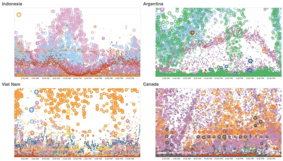
Some of the simpler visualizations they came up with show how much data was being trafficked throughout the day and which way it was moving -- either from a user in a specific country to one of the 18 regions around the world in which Google Cloud houses its data, or vice versa. In the image above, you can see what that looks like for four countries. The bubbles denote the size of the data packet, the arrows show which direction it was traveling and you can see how that information changes across a day. One important detail to note: The colors don't actually mean anything. They're only there are there to help viewers see some of the changes in the data.
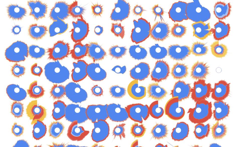
Other images, like the one below, showed how volatile storage traffic can be. Each radial diagram represents 24 hours of a country's data requests, with spikes outward denoting data headed to a user and spikes inward representing data heading from a user to a Google Cloud region. The colors signal the region the data was transiting from with red representing Asia, yellow for Europe and blue for North America.

Some of these visualizations could help Google's Cloud customers better serve their own users. Understanding customers' usage patterns to the point where they can be more accurately predicted would help companies manage traffic load and improve user experience. And Talbott notes that having a better grasp on where in the world customers are could help providers improve their services as well. Talbott told Engadget that Google Cloud was looking into whether it could surface these sorts of insights for its customers on an ongoing basis in the future.
Other information that came out of the data visualizations, while not necessarily useful for service enhancements, was surprising to Talbott. The team looked at how correlated digital traffic was country to country and in some cases, there were patterns you might anticipate. Countries near each other operating in the same time zones often had similar storage traffic patterns, for example.
But there were also some unexpected correlations. Talbott said Italy's and South Africa's traffic was highly correlated, as was that of a Caribbean country and Canada. He called these correlated pairs "digital buddies" and said uncovering them was a surprising and rather interesting part of the project. "What makes companies and users in South Africa act similarly as they access their data to those in Italy?" he said, though Google doesn't have a good answer to that question yet.
In the video above, you can see how storage traffic changes throughout the day for different countries, and this is where the data can get a little mesmerizing. Bubbles move up or down depending on the data direction with their size representing the amount of data. "Looking at Cloud Storage requests over time showed us a distinct pattern, the pattern gave us a way to correlate countries, and each correlation gave us an insight into connections around the globe," said the team. Talbott added that while parts of this type of work may be useful for those using the service, it can also just be really pretty. "You can make storage beautiful when you look at it in different ways," he said, "and in doing so you can really generate some thought provoking insights for your customers."
