Android 11 review: An incremental update that needs some polish
The new OS finally brings built-in screen recording.
Android 11 is here, three months after the first public beta was released in June. Not much has changed since then -- mostly fixes for some bugs and third-party app troubles, as well as a long-awaited built-in screen recorder. But for the majority of people who didn’t check out the beta, you’ll find a few new features, like new controls for media and devices, improved privacy permissions and a focus on communicating with people. The changes from Android 10 are subtle, especially some behind-the-scenes upgrades like better 5G support. Still, a new OS can make your phone feel fresh and efficient, and Android 11 delivers.
Screen recording
The feature I’m most stoked about is built in screen recording. iOS already offers this, while Samsung, LG and OnePlus have this in their Android phones. Prior to this, I’d been using a third party app on my Pixel to capture snippets from my review videos to share to Instagram. Now that a native version is available, I can finally delete the ad-ridden app, which also added an annoying watermark. You have to add the screen recording tool to the quick settings panel. When you tap it you get a warning, followed by a countdown to when the recording starts. To end your session, you’ll have to pull down the notifications shade and tap the big red card, and an MP4 file is saved to your gallery.
Bubbles
Another high profile addition to Android 11 is messaging bubbles. This allows apps like Android Messages, Telegram and Facebook Messenger to display a (theoretically) persistent floating circle on your screen so you can quickly reply to your friends without switching apps. If it sounds familiar, that’s because it’s basically Facebook Messenger’s floating heads that’s been around for years on Android. The new OS offers a few more features, though like the ability to open a bubble from a notification and see your recent conversations from different apps.
My biggest issue with bubbles is that it’s not consistent. After enabling the feature in settings, I used it across multiple conversations in Telegram and Facebook Messenger and was frustrated when chats would randomly close. I had two bubbles open for different people in Telegram, and each would just go away for reasons I can only guess. Sometimes it seemed like it was because I used the app itself, even if it was to start a completely separate conversation. And sometimes it seemed like it was because I locked my phone. Facebook Messenger’s chats stuck around, though, so this might be a Telegram-specific issue.
Bugs are often a given with early software, so I’m less bothered by these hiccups since they’ll hopefully be fixed over time. The other problem is that you can’t reopen a chat bubble after it closes until you get notification from that conversation. You have to press the icon on the bottom right of an alert to launch a bubble -- think of them more as interactive notifications. But this was also inconsistent -- sometimes the launch button wouldn’t show up.
If you wanted to leave a chat floating and had accidentally closed it, the only way to re-open it is to wait for an alert to come in. You should theoretically also be able to use the “recent bubbles” page to do this, but during my testing this never showed any of my previous chats -- it always brought up a pathetically empty window.

For most people this isn’t a huge issue. But when you want to maintain all-day contact, say with a partner or a collaborator on an important project, it would be nice to keep bubbles open with them. I enjoy having my favorite conversations open for easier access instead of having to tap twice to launch the app and find the right chat. For now, though, app support is still incomplete -- neither WhatsApp nor Google’s own Hangouts work with bubbles -- and some bugs need to be fixed.
The new notifications shade
Another way Google tried to make it easier to communicate with the important people in your life in Android 11 is by grouping and prioritizing alerts from your messaging apps. When it debuted in the beta, I wasn’t sure if it would help with organization or if it just added more clutter. Now that I’ve spent more time with the software, I’m leaning towards the latter.
The section headers do provide some form of organization and help me differentiate more-urgent alerts from the less-important ones. But sometimes Google is wrong and relegates a notification I care about to the “Silent” section at the bottom, so I find myself having to scroll to the end to make sure I haven’t missed anything.

Since I still have to go through the entire notifications list instead of dealing with just the alerts near the top, the new section headers actually add to the amount of scrolling and swiping I have to do.
Google placing conversations near the top is nice in theory, but it leaves out people I interact with on apps like Twitter, Instagram and email. I prefer to address Twitter and Instagram alerts sooner than messages, so Google's ranking isn't my favorite. You can prioritize specific chats, but only if they're already coming from supported messaging apps. If you hate clutter like I do, you'll be disappointed to learn that there's no way to disable these section headers.
Media and other device controls
Another change that Android 11 brings to your notifications shade is a new persistent media player in the Quick Settings panel. When you’re playing music or a video via a supported app like Spotify or YouTube Music, a dashboard appears above your notifications for quick access to controls. This is meant to make it easier to change your output device, whether it’s headphones, speakers, a TV or the phone itself.
In general it’s effective but unnecessary. The player takes up two rows of space, pushing notifications down. And, honestly I found the lock screen controls more convenient.
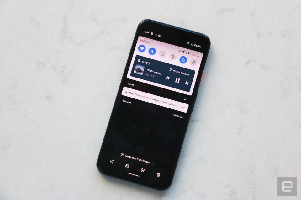
My early build of Android 11 continued to be a bit buggy here, with the player sometimes not showing up even though Spotify was streaming a banging KPop playlist. I started playing a show on HBO Max after pausing Spotify, but HBO did not take over the controls as I expected and music controls remained. This is on by default for media apps, so developer support shouldn’t be an issue. You can choose to hide the player when your media sessions are over, though I preferred to leave it on to resume playback whenever I wanted.
It’s nice to have a space dedicated to playback controls instead of in a notification card like in Android 10, especially since the feature was a little finicky in the older software. But a lock screen version would still be easier to use since my phone is usually locked if I’m listening to music or casting a video and it’s faster to access the lock screen than the notifications shade.
With Android 11, Google is also trying to cram more controls into spaces that were previously underused such as the power button menu, which now shows devices connected to your network -- like your smart lights, security cameras or speakers, in addition to your Google Pay cards. Oh and the shutdown and restart buttons, of course.
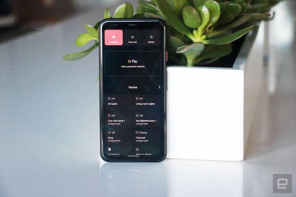
Each of your devices has its own tile, and one tap on them will turn them off or on. There’s also a master control tile that can turn off all your lights at once, which is handy. The master switch is the first box you’ll see, but you can also rearrange all your devices to put your favorites higher up.
I was dubious of this feature when I first tried it in the beta, because I thought it was easier to just tell my smart speaker to turn my lights on or off. But I’ve since come around, especially after I added my Chromecast to this page. It’s much easier to hold down the power button and immediately control all my devices than having to find the Google Home app and search for the specific speaker or TV I wanted to turn off. Those in large homes with many rooms and multiple gadgets connected to their network will very likely find this helpful, too.
Privacy permissions and small interface tweaks
Those were the most obvious updates, but there are some small, less noticeable tweaks too. Google handles screenshots a little differently in this iteration. They appear as a thumbnail in the bottom left corner after being captured, with options to share, edit or dismiss. Thank God the company has gotten rid of the notification after every. Single. Screenshot, which used to really clutter up the page. Also, when you’re viewing all your open apps, Android 11 will show options at the bottom of the screen to take a screenshot or select parts of the page.These two interface tweaks will only be available on Pixel devices.
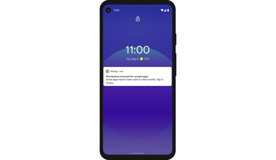
Another imperceptible but important update is the ability to set one-time app permissions for things like location and camera access. This way, you can have greater control over what apps are following you in the background. Plus, if you haven’t used an app in a few months, its permissions will automatically reset and it will have to request access when you open it again. Obviously I haven’t used Android 11 long enough for that to happen yet, but I appreciate it in theory.
Android 11 also added the option to show an extra row of apps at the bottom of your home screen for easier access to what Google thinks you use most often. It’s similar to the suggestions already available at the top of the app drawer, but is pretty redundant. Most users already place their most frequently used apps on their home page. When I enabled this, Google showed me stuff like Spotify, Telegram, Instagram and Netflix, which were already sitting on the screen right above it. The good news is, you can choose not to enable this row and it’s not on by default.
There are some other small changes coming in Android 11 that will likely be more fruitful over time. For example, a new on-device visual cortex better identifies elements on the screen so those who use voice controls can navigate the interface more easily. It also works when you’re looking at your open apps and hit the “Select” option at the bottom -- Google will highlight pictures, icons and texts on the screen and you can tap each one to share or save it or even use Lens to get more information.
Android Auto now works wirelessly to connect phones with compatible cars (though as a New Yorker with no vehicle I couldn’t test that). Also, new 5G app support means developers can check if you’re on a fast connection and bump up resolution for video streams or download higher quality game assets.
Wrap-up
Most of my frustrations with Android 11 are the result of bugs rather than the features themselves. Bubbles has the potential to be helpful, while the new screen recorder and device and media controls are useful. Yes, some updates are redundant, but the good news is that Google gives you the option to disable most of it. Android 11 is not a big leap forward, and while it does potentially add more clutter, it also gives the user more controls and options. This is an Android that power users can tweak to their heart’s content… as long as they can get past the initial mess.
