Icon
Latest

Razor made an electric version of its original metal scooter
The Razor Icon looks a little classier than your average e-scooter.

Windows 10 icons are getting an overdue redesign
Microsoft refreshed Office's icons last year, and now it's Windows 10's turn. The software giant is rolling out updates to the icons for Windows 10's core apps over the months ahead, starting with the Calendar and Mail apps in a new Release Preview for Windows Insiders in the Fast ring. The company's design team explained that it wanted to break away from the flat, colorless icons you see today in favor of ones that are at once more consistent with newer branding (including apps available beyond Windows) and different enough that you'll have an easier time finding the one you want.

Pass Tinder’s catfish test and you’ll get verified
In an attempt to deter catfishing, or that awkward moment when you show up for a date and the other person looks nothing like their photos, Tinder is introducing a new Photo Verification feature. The tool will compare a series of real-time posed selfies to existing profile photos. If the photos match and pass a human-assisted AI review, the user will get a blue checkmark on their profile.
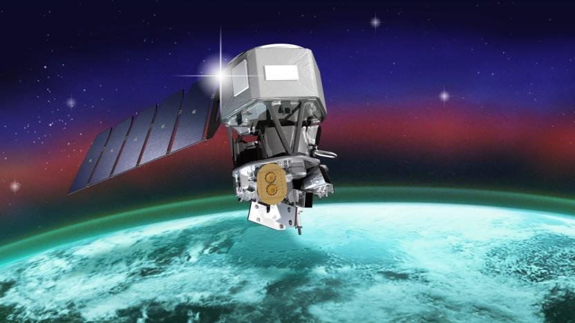
NASA's ICON launches to study the boundary between Earth and space
NASA's Ionospheric Connection Explorer or ICON spacecraft is finally in orbit after years of delays and postponed launches. A Northrop Grumman aircraft carried ICON, which was strapped to a Northrop Grumman Pegasus XL rocket, to an altitude of 39,000 feet. At 9:59 PM EDT on October 10th, the carrier plane dropped the fridge-sized spacecraft, which has since deployed its solar panels. That means it has power, and it's all systems go for the long-delayed mission.
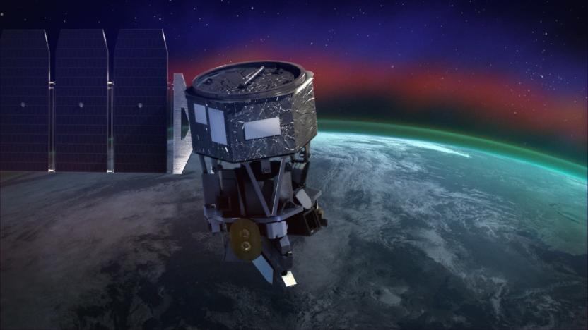
NASA's ICON launch to the ionosphere delayed (update)
Need something else to watch after all the results come in? Tonight NASA's launching a mission to explore Earth's ionosphere, but this isn't the average rocket launch. The Ionospheric Connection Explorer (ICON) will take off on a Northrop Grumman Pegasus XL rocket -- in use since the 90s, and scheduled for use with the giant Stratolaunch once that's ready to fly -- that's being dropped from a specially designed plane at about 40,000 feet over the open ocean. Dubbed Stargazer L-1011, the carrier aircraft will take off from Cape Canaveral ahead of a 90-minute launch window that opens at 3 AM ET. As Space.com notes, the launch has been delayed over concerns about the rocket, but all the testing is complete and now it's ready to fly.

iOS 12 developer beta points to bezel-less iPad with Face ID
Last year, early iOS leaks gave us a preview of the eventual iPhone X and some details on Apple's HomePod speaker. Now, 9to5Mac points out an icon in the iOS 12 developer beta that seems to show an iPad design with tiny bezels all around and missing the home button. Separately, code for accessibility features shows evidence of Face ID support in an upcoming iPad Pro likely scheduled for release this fall. The image doesn't show an iPhone X-like notch, so presumably new iPads would manage to squeeze a TrueDepth camera into the remaining bezel. With iPad sales remaining flat compared to last year, it seems likely that we'll see new devices soon, and now we have some idea at least of what they'll look like.
Netflix profile icons are getting a facelift
With all the money Netflix is spending on new shows, for awhile it's overlooked a small detail we all encounter before watching. The service's profile icons are soon getting a long overdue update, going from the flat minimalist versions that have been around for the last five years, to slightly embellished editions starting today. The aviator sunglasses and mustache (my personal favorite, and second most-popular among Netflix users) has gold-hued aviators now and black facial hair now, for example.

Icon A5 plane crash kills two, including its lead designer
A fatal crash has left the amphibious Icon A5 personal aircraft's fate mired in uncertainty. Lead engineer Jon Karkow and coworker Cagri Sever were killed in the accident outside of Icon's Vacaville, California training facility, AVweb reports. Karkow was piloting the aircraft at the time and the pair had been airborne for around 20 minutes.
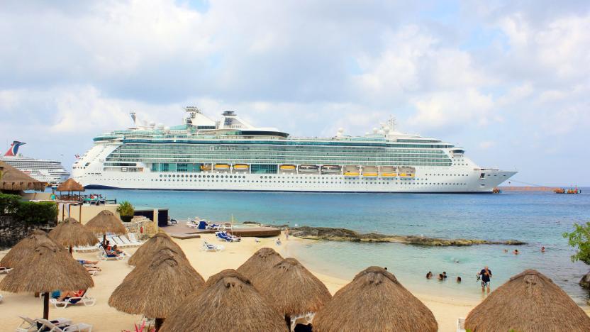
Royal Caribbean uses fuel cells to power cleaner cruise ships
It's not just ground-based transportation that could stand to benefit from clean-running fuel cells. Cruise ship operator Royal Caribbean has revealed that it's developing a new class of ship, the Icon, that will run on liquified natural gas fuel cells. The move would dramatically reduce the harmful emissions from the vessels (the company hints they'd output nothing more than water) without compromising on reliability or safety. Boats wouldn't be stuck if they have to dock somewhere which can't offer natural gas, either, as they could rely on distillate gas in a pinch.

Researchers propose using patterns and icons for passwords
Researchers at Plymouth University have devised a new password input method they believe could improve security. Called GOTPass, it combines patterns, imagery, and one-time passcode to create a system that it's hoped would be both more secure and easier to remember than traditional passwords.

ICYMI: Dark matter search, the personal plane and more
#fivemin-widget-blogsmith-image-123513{display:none;} .cke_show_borders #fivemin-widget-blogsmith-image-123513, #postcontentcontainer #fivemin-widget-blogsmith-image-123513{width:570px;display:block;}try{document.getElementById("fivemin-widget-blogsmith-image-123513").style.display="none";}catch(e){}Today on In Case You Missed It: The new Icon A5 personal aircraft is available for $189,000, shrinking middle class be damned. China's space agency launched a spacecraft to hunt for signs of dark matter's existence. And Netflix's latest Make It project is a cosy nod to what too many of us will likely be doing over holiday breaks: Going on prolonged Netflix binges. The company is giving instructions for how to construct socks that will pause your show if you should fall asleep.

Flying the Icon A5, an almost affordable personal plane
As we cut through the skies over the Hudson River and traced a loop around the Statue of Liberty, I spent as much time glancing down at the instrument cluster as I did peering out the window. That might seem like a huge waste of time given the views I was taking in but I couldn't help it: It's not often I wind up in the cockpit of a plane looking at dials and readouts, much less ones that make sense to me. That's because a pilot and I were tooling around in an Icon A5, a $189,000 "light sport" amphibious aircraft that's eager to shrug off the complexity of (relatively) cheap aviation. After nearly ten years of development and fighting for FAA approval, the A5 is almost ready to make the skies accessible to the well-heeled.

Tacos, burritos and unicorn emoji are coming, thanks to Unicode 8.0
The Unicode Consortium unveiled its new emoji set as part of the standard's version 8.0 update on Wednesday. Yes, that taco emoji we've all been waiting for on bated breath has arrived and lo, it is glorious. Other food-related icons include taco's big brother, the burrito, as well as a hot dog, popcorn and a cheese wedge. Inedible emoji like a Unicorn head, prayer beads and a volleyball are also available. Surprisingly though, no hotdog pizza emoji just yet -- probably because we're not sure yet if they're ok for human consumption.
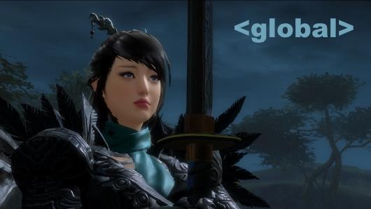
Global Chat: Guild Wars 2's economy is broken
Guild Wars 2's economy remains a hot-button issue even two-and-a-half years after its release. In this week's exploration of the blogosphere, one writer pulls out all the stops to let you know what's broken about this MMO's economy -- and how it can be fixed. In addition to this thoughtful read, Global Chat will hear some snark on silly hotbar icons, pontificate about poor MMO names, deliver The Repopulation first impressions, and invite you to participate in a grand MUD experiment. Let's get going!

Guild Wars 2 retools commander icons, fees
As Massively's Anatoli Ingram discussed in his Flameseeker Chronicles column yesterday, Guild Wars 2's September feature pack will include significant changes to the commander system that marks player volunteers as leaders on various world maps. After the patch, commander tags will become account-bound rather than character-bound, meaning your newbie Asura can strut around Metrica Province as if she owns the place. Consequently, tags will triple in price to 300 gold. Players will also be able to customize their icons with spiffy new colors intended to "facilitate a range of tactical uses" like organizing groups in PvE and PvP. Already a commander? Lucky you: ArenaNet says you'll be grandfathered into the new system for no extra fee. The studio plans to consider "possibilities for recognizing experienced and prestigious commanders" in the future.

A closer look at the new trash can and dock UI in OS X Yosemite
The design shift from Mavericks to Yosemite is a lot less stark than what we saw last year with the transition from iOS 6 to iOS 7. Nonetheless, Apple with OS X Yosemite still managed to implement a number of noticeable changes to the overall look and feel of the OS, from conspicuous new icons to more subtle UI tweaks. Min Ming Long of Pixelapse last week put up a relatively comprehensive and informative post detailing a number of the new UI changes we can look forward to once OS X Yosemite breaks free from its beta designation. The entire post is worth checking out, but we'll just highlight two examples to whet your appetite. First up, we have a close-up view of OS X's new trash can. Yeah, we know that a new trash can icon is typically nothing to write home about, but given that it's a glaring design change, why not give it its due? Besides, you might recall Apple's Craig Federighi saying that Apple spent quite a bit of time on the design. And so, without further ado, here it is in all of its glory. Behold! I can't lie; it is pretty sleek. As we covered in greater detail last week, there are a number of icon changes on OS X Yosemite's dock that, on the whole, really embody thoughtful design. The new trashcan in particular marks the end to an OS X trashcan design that more or less looked like this for the last 14 years. Trashcan business aside, there are some other changes to the OS X Yosemite dock that are worth mentioning. As evidenced in the photo below, Apple has done away with the 3D shelf for icons, a dock mainstay since OS X Leopard. Also make note of new indicator dots and lighter labels for each corresponding application. Again, make sure to digest the full entry for a more complete rundown of UI changes, from new and almost-neon blue system folders to newly designed navigation elements and a whole lot more. OS X Yosemite won't be available as a final release until this fall, but until then, interested Mac users can download a beta of the upcoming OS free of charge. Lastly, make sure to check out our handy guide which lays out which Mac models will actually able to run the OS X 10.10.

After 14 years, the "Preview Kid" on OS X's Preview icon is no more
Earlier this week we covered many of the new icons users can look forward to in OS X Yosemite. As opposed to iOS 7, the iconography in Yosemite is rather impressive. Instead of blindly adhering to a flat design aesthetic, OS X Yosemite's icons appear a bit more nuanced and elegant, seemingly an indication that a lot more thought (and time, most likely) went into the design process. While design changes to the Finder and Trashcan icons are the most noticeable, you may have missed the significance of Apple's brand new Preview icon. By itself, it's not too shabby, what with a scenic photo nestled beneath a loupe. But the redesign of the Preview icon also spells the end for what some are calling the Preview Kid. For approximately 14 years, the Preview icon in OS X looked like this - an adorable little kid having a grand old time by the water. OS X Snow Leopard? He's there. OS X Jaguar? He's there. Yep, this kid is as old as OS X itself, even gracing the original Dock that was introduced in OS X 10.0. After 14 years, there's no question that he's had an incredible run, but with college probably looming next year, it'd be pretty darn selfish of us to expect him to hang around the Dock forever. So, Preview Kid, wherever you are, a hearty bon voyage! is in order. We can only hope that your time in OS X was as meaningful and memorable to you as it was to all of us. via Reddit

Susan Kare, the brains behind the Mac's famous icons and fonts
As one of the original members of Apple's Macintosh team, Susan Kare played an integral role in determining the look and feel for the original Mac OS. Recently, Priceonomics ran an extensive and informative interview with Kare wherein she details some behind the scenes info regarding the design of some of her most famous icons and fonts. First, it's interesting to note how Kare -- who holds a Ph.D in design -- got involved with the Macintosh team in the first place. As it turns out, Kare was friends with Andy Hertzfeld who tipped her off that the then burgeoning team needed some graphic art expertise. By remaining friendly with Andy after high school, I knew he obviously was really interested in computers. He showed me a very rudimentary Macintosh, and mentioned that he needed some graphics for it. He knew I was interested in art and graphics, and that if I got some graph paper I could make small images out of the squares, which he could then transfer onto the computer screen. That sounded to me like a great project. I did it in exchange for an Apple II, although I didn't actually use the Apple II for Mac graphics. Once on-board, Kare went to work where she would go on to design icons and fonts that are familiar to multitudes of computer users even to this day. From the Happy Mac to the dreaded "bomb" icon, Kare's work certainly evokes feelings of nostalgia for anyone who spent a fair amount of time on the Mac back in the 80s and 90s. The entire article is well worth a read as it provides interesting tidbits regarding the Apple command key, how Kare dealt with Steve Jobs, how the infamous Dogcow icon came to be, and why Kare never viewed icon design as a new artistic endeavor unto itself. I still joke that there's nothing new under the sun, and bitmap graphics are like mosaics and needlepoint and other pseudo-digital art forms, all of which I had practiced before going to Apple. I didn't have any computer experience, but I had experience in graphic design. As for what Kare has been up to after leaving Apple, well, she joined Steve Jobs at NeXT and subsequently went off on her own in 1997, going on to to perform freelance work at companies like Facebook, Paypal, and Microsoft. She also sells prints of some her most well-known icon designs on her website.

Weekly Roundup: Facebook acquires WhatsApp, tablet buyer's guide and more!
You might say the week is never really done in consumer technology news. Your workweek, however, hopefully draws to a close at some point. This is the Weekly Roundup on Engadget, a quick peek back at the top headlines for the past seven days -- all handpicked by the editors here at the site. Click on through the break, and enjoy.

The original Mac icon was inspired by Matisse, not Pablo Picasso
You might recognize the illustration on the right as the original Mac icon, a fixture on much of the early packaging materials and manuals that came with the early Macs, not to mention the icon that greeted users on the Mac OS startup screen back in the day. While it was long assumed that the icon was inspired by the work of Pablo Picasso -- it was even referred to as the 'Picasso Mac' for many years -- Cult of Mac recently discovered that the artist responsible for inspiring the bright, colorful squiggly lines was not Picasso, but rather French artist Henry Matisse. Originally designed by Tom Hughes and John Casado, Cult of Mac reached out Casado who explained the impetus behind the iconic, well, icon. I thought I could shed some light on my inspiration for the trademark for the first Mac. I was given the assignment by Tom Hughes after it was determined that Folon's version wasn't going to work for business reasons. I met with Steve and Tom and spent some time interviewing and talking to all the players. After a few weeks, I came back to the group and made my presentation. In that presentation, I said that the inspiration for the drawing style was Matisse, whom I so admired as an artist. The idea of the graphics being 'Picasso style' was, as I remember, a journalist's description at the time of the launch. I think since no one ever ask[ed] me or Tom where the influence came from, it became fact. I never stated it publicly, only when asked during design forums.


