fonts
Latest
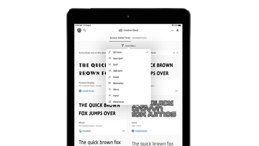
Adobe brings its enormous font library to iPhone and iPad
Adobe's Creative Cloud service comes with about 20 apps, as well as bonuses like video tutorials and a huge font library. Those fonts -- all 17,000 of them -- are now available for subscribers to use in compatible iPhone and iPad apps, as long as you're running iOS 13.1 or later. The previously desktop-exclusive typefaces are designed by well known foundries and cover plenty of styles, so you'll be able to get creative instead of sticking with the same handful of overused fonts.
Recommended Reading: Coachella was built for YouTube
Coachella 2019 review: A festival built for YouTube Paul A. Thompson, Pitchfork For years, Coachella's opening weekend has been a huge event for YouTube. A weekend's worth of livestreams don't deliver all of the acts to your living room, but the site typically offers a lot of the big names so you don't have to travel to the desert. Pitchfork explains how the festival is now designed just as much for the viewers at home in its review of the 2019 event. "Especially after Beyoncé's Earth-rattling set last year, some stars and would-be stars lunged at the chance to make statements with their performances over the weekend, with productions designed to appeal as much to live streamers as to the crowd at Indio, California's Empire Polo Club," the site notes. And perhaps no one went all-in this year as much as Childish Gambino.
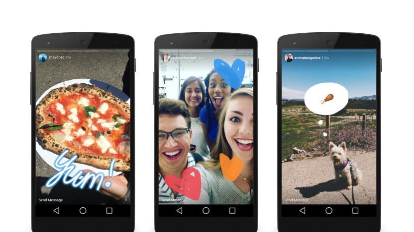
Instagram is testing a text-based 'Type' feature for Stories
Instagram keeps updating its Stories feature lately with new additions to keep things interesting. The company recently added polls, a way to surface past Stories and has been experimenting with cross-posts to WhatsApp. Now, according to a report at The Next Web, the latest Stories addition is something called Type, which gives you a number of new fonts to type your message across a background or photo as part of your Story.
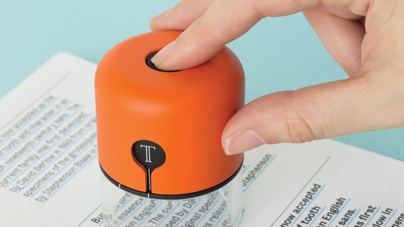
Spector captures printed fonts and sends the details to InDesign
When a designer sees typography they like or a color that might be useful for a project, the first move is usually to snap a picture with their phone. I can say that because I'm a designer myself, frequently capturing textures, hues and letterforms for reference later. Royal College of Art MA student Fiona O'Leary came up with a better solution though, one that gets those bits of type and color into a desktop design app even faster. O'Leary built Spector: a small camera that logs typography and palettes before sending them directly to InDesign.
'Operator' is a font designed to make coding easier
While many of us bristle at the sight of Comic Sans (this writer included), coders have an altogether different view of typefaces and how they're presented. Thus, Operator Mono, the new font from one of the highest-regarded typeface-creators that was forged to make life easier for the folks who build the websites you visit. "In developing Operator, we found ourselves talking about Javascript and CSS," founder Jonathan Hoefler writes. While the blog post about typography and font faces can come off as a bit pretentious, it's clear that the team paid attention to how the likes of brackets, commas and semicolons are spaced and how they appear in back-end coding environments.

Recommended Reading: How Oculus took Netflix to the Gear VR
Recommended Reading highlights the best long-form writing on technology and more in print and on the web. Some weeks, you'll also find short reviews of books that we think are worth your time. We hope you enjoy the read. John Carmack on Developing the Netflix App for Oculus by John Carmack Netflix Tech Blog During this week's Oculus Connect 2 keynote, the virtual reality company announced that the upcoming Gear VR would include support for Netflix. What does is take to bring a streaming service inside the headset? Well, Oculus CTO John Carmack detailed the process on the Netflix Tech Blog.

Samsung's bringing back the TV 'set' with the Serif TV
The humble television wasn't always the ultra-thin, wall-mounted "appliance" we know today -- it used to be a piece of furniture, wrapped in an elegant case of wood, plastics and metal. Now, Samsung is bringing the idea of a stylized 'TV Set' back, introducing a an expensive, font-inspired television called the Serif TV.

Stupid Hackathon produces zany projects that no one needs
iPad on a face, a Google Glass app that makes the user throw up and a device powered by twerking. These are but some of the masterpieces out of this year's Stupid Hackathon, and they all embody what the event's organizers are looking for: "stupid shit no one needs and terrible ideas." Now before you think we've gone rogue or have had too much wine and stuffing, we promise you that Stupid Hackathon is real, and this is its second run. In fact, we've talked to its masterminds, Amelia Winger-Bearskin and Sam Lavigne, who told us that the event's goal is "to create and fully realize projects that have no value whatsoever."

Apple Watch's new font isn't the first Apple font named San Francisco
Today Apple released WatchKit, the tools for developers to start building apps for the Apple Watch. Buried inside the kit is a brand new font called "San Francisco" specifically designed for use with the Apple Watch. Given the challenges of reading text on such a tiny screen Apple needed to ensure it came with a font that met the device's needs. In the release notes for developers the company describes the font thusly. The system font was designed specifically for legibility on Apple Watch. At large sizes, the font's slightly condensed letters are set tight to take up less horizontal space. But at small sizes, they are spaced more loosely and have bigger apertures in glyphs like 'a' and 'e' to make these easier to read at a glance. Punctuation is also proportionally larger when the font gets smaller. And as text size changes, Apple Watch dynamically switches between fonts to maintain clarity and legibility at all times. It appears the "San Francisco" font is going to be an important part of the Apple Watch experience. Of course it isn't the first Apple font to go by that name. No, there was another "San Francisco" which was one of the original bitmap typefaces for the Apple Macintosh. Designed by Susan Kare, the font allowed for users to mimic the effect of a ransom note, for any number of presumably reasonable "ransom note mimicking" reasons. H/T to The Next Web for originally noticing the similar font names.

You can now spice up those iPad docs with Hoefler & Co. fonts
Sure, you're likely not buying $300 fonts just for your Pages and Keynote work on an iPad, but for those who've already splurged for a bite of Hoefler & Co.'s catalog, the option is pretty tempting. The popular type foundry has made purchased fonts available for use on devices running iOS 7, with the ability to download the requisite files directly from the site. A quick jaunt over to your Font Library page will show the options you've licensed with the option to "add to device" for an easy install. One thing's for sure: those cover letters typed out in a pinch are about to get a major aesthetic upgrade.

Susan Kare, the brains behind the Mac's famous icons and fonts
As one of the original members of Apple's Macintosh team, Susan Kare played an integral role in determining the look and feel for the original Mac OS. Recently, Priceonomics ran an extensive and informative interview with Kare wherein she details some behind the scenes info regarding the design of some of her most famous icons and fonts. First, it's interesting to note how Kare -- who holds a Ph.D in design -- got involved with the Macintosh team in the first place. As it turns out, Kare was friends with Andy Hertzfeld who tipped her off that the then burgeoning team needed some graphic art expertise. By remaining friendly with Andy after high school, I knew he obviously was really interested in computers. He showed me a very rudimentary Macintosh, and mentioned that he needed some graphics for it. He knew I was interested in art and graphics, and that if I got some graph paper I could make small images out of the squares, which he could then transfer onto the computer screen. That sounded to me like a great project. I did it in exchange for an Apple II, although I didn't actually use the Apple II for Mac graphics. Once on-board, Kare went to work where she would go on to design icons and fonts that are familiar to multitudes of computer users even to this day. From the Happy Mac to the dreaded "bomb" icon, Kare's work certainly evokes feelings of nostalgia for anyone who spent a fair amount of time on the Mac back in the 80s and 90s. The entire article is well worth a read as it provides interesting tidbits regarding the Apple command key, how Kare dealt with Steve Jobs, how the infamous Dogcow icon came to be, and why Kare never viewed icon design as a new artistic endeavor unto itself. I still joke that there's nothing new under the sun, and bitmap graphics are like mosaics and needlepoint and other pseudo-digital art forms, all of which I had practiced before going to Apple. I didn't have any computer experience, but I had experience in graphic design. As for what Kare has been up to after leaving Apple, well, she joined Steve Jobs at NeXT and subsequently went off on her own in 1997, going on to to perform freelance work at companies like Facebook, Paypal, and Microsoft. She also sells prints of some her most well-known icon designs on her website.

Mac font designer awarded AIGA Medal
Many Mac users probably don't give a second thought to the fonts on the screen, but they make up a critical part of the user experience in any GUI-based operating system. Fonts are so important that Steve Jobs even called them out during his famous Stanford commencement speech. Now Jonathan Hoefler, the designer of Hoefler Text (a font that has been part of every Mac OS since version 7.5) has been awarded the prestigious AIGA Medal, with his design/business partner Tobias Frere-Jones. The award is for contributions to "the typographic landscape through impeccable craftsmanship, skilled historical reference and insightful vernacular considerations." Hoefler designed the font exclusively for Apple back in 1991. H&FJ's site calls the font "a modern classic" and says: Hoefler Text resuscitated a number of other traditions that had once been central to fine printing: extended ligature sets, the engraved capitals of the early twentieth century and the arabesques of the renaissance. Hoefler Text even invented a few traditions of its own, such as case-specific punctuation and italic small caps, and worked to expand the reach of digital typography beyond the United States by including a wealth of foreign symbols and accents. To get an idea of what goes into creating a font, watch the video interview with the two AIGA honorees below. [via Daring Fireball]

Adobe Edge swells to include Tools & Services, streamlines the designer web
Adobe really wants web designers to kick things up a notch. Not satisfied with where Edge has gone so far, it just released a full-fledged Edge Tools & Services suite to cover the bases for polished desktop and mobile pages on most any modern platform. Motion tool Edge Animate (formerly Edge Preview), automated previewing tool Edge Inspect (formerly Shadow) and mobile app packager PhoneGap Build have all arrived in the suite as version 1.0 releases, and come with both Edge Web Fonts as well as TypeKit to spruce up text. A pair of pre-release utilities, Edge Code (Brackets) and Edge Reflow, are also joining the group to tackle the nitty-gritty of editing web code and layouts. Any of the apps will readily cooperate with third-party software, although they won't always be cheap: while most of the Edge suite is free to use in at least a basic form as long as you have a Creative Cloud membership at any level, Edge Animate is only free during its initial run and should eventually cost either $15 per month or $499 in a one-time sale. For pros that want to burnish their corner of the web to a shine, the result just might be worth the expense.

Google Docs adds 450 fonts and 60 templates, sadly includes Comic Sans
Google Docs has lagged behind offline apps in the number of fonts and pre-made layouts to choose from, but that's just changed with a much larger catalog for both. More than 60 new templates and 450 fonts are now on tap to use in your presentations and reports. This comes on top of a handful of other recent improvements, such as Google Drive support, searching the Life Photo archive and boosts to accessibility and spreadsheet layouts. Apps Script gets both a Google Drive tie-in and new publishing control, too. Be forewarned: Comic Sans is one of the new font options, and it's clearly not an April Fools' gag.

EVE Online: Crucible forges a new game today
Crucible is an apt name for EVE Online's 15th expansion, considering that the game, its developers, and its players have gone through a severe testing this year in many respects. CCP is hoping that Crucible will be better received than its previous expansion, Incarna, and is hyping it as "EVE reforged." Today Crucible is coming to the game as a free expansion following a period of extended downtime. It's very much a "kitchen sink" update, with major improvements and reworkings of game systems. These include items as big as improved space visuals and dilating time to allow for large fleet battles to touches as small as contrails, an improved font, and new Captains Quarters. New ships in the expansion are a given, but ground-bound pilots might be attracted to opening up their very own customs offices to tax planetary businesses. There are so many additions and changes, in fact, that it's almost futile to try to crush them into a couple paragraphs, so while you're waiting for the game to come back up, make sure to check out the patch notes, the EVE Online: Crucible website, and our own Brendan Drain's thoughts for more info.

Nokia N9 user previews PR1.2 update, full of camera and imaging refinements
Many N9 users are still waiting to receive the PR1.1 update from Nokia, which officially began rolling out last week, but one lucky individual is already dabbling with what's next from Espoo. After viewing the handful of screenshots, it's obvious that PR1.2 will provide a number of enhancements for photo enthusiasts. For instance, the camera application sports a refined interface with all flash options visible at once. There's also facial recognition in the gallery, along with support for color profiles in the display options. Additionally, users can now manage apps from the application menu, and keen-eyed observers will likely notice the re-styled buttons. We've also been told to expect changes to the N9's default font, Nokia Pure Text, which we can only assume will make its arrival with PR1.2. Take a peek after the break to satiate your typeface urges.

Embrace your obsessive inner typefacer with 'KernType,' a game about kerning
It's rare that we separate ourselves from our readers when choosing pieces to post on Joystiq, but with Method of Action's "KernType," we had to make an exception. You see, folks, our love for games is important, but our distinctly less relatable love/obsession with visual design is just as strong, which is why we immediately fell head over heels for KernType. Oh, we should probably explain what "kerning" is, eh? It's the space between letters in words. Yup, thrilling stuff, we know. But it's important! And in KernType, you're tasked with fixing the kerning of various typefaces (represented by words such as "wave" and "type"), which then compares your own skill with that of proportional computations. Call of Duty deathmatch it is not, but if you're of the very particular niche that is both obsessed with games and the written word, KernType is right up your alley. Also, hey, it's free right here!

Possible fix for font issues in 10.6.7
Late last month, a troubling font issue came to light after Apple rolled out version 10.6.7 of Mac OS X. The update appeared to cause problems with the printing and PDF handling of OpenType PostScript fonts. Apple has not officially acknowledged the problem, but a growing thread on Apple's discussion boards details the issues Mac users are experiencing. Good news for those affected by this font problem as forum member KJK555 claims to have a fix. KJK555 has released an installation package that replaces the affected 10.6.7 ATS.framework binaries with the previous 10.6.6 versions. The ATS.framework is involved in the font layout and management of Apple Type Services Before you jump for joy, the initial success rate of this fix is mixed. Some folks claim font issues in apps such as LiveType disappear, while others are still reporting problems with Adobe apps like Acrobat distiller. If you are plagued by this problem and don't want to wait for Apple to roll out an official update, this solution may be worth a try. As always, proceed at your own risk, as there is always the chance of a negative outcome when you start mucking around with system components, such as fonts and printing. If you do bravely forge ahead and apply the fix, give us a shout in the comments and let us know how it works for you. Thanks, Laurie!

10.6.7 update causes OpenType font issues
There's a thread on Apple's Discussions boards suggesting that Mac OS X 10.6.7 introduces issues with OpenType PostScript fonts when it comes to printing and PDF handling. Kurt Lang writes: "As soon as you install 10.6.7, OpenType PostScript fonts are indeed broken... [the issue] is confined to OT PS fonts. All PDF files, including those using OpenType PostScript fonts display correctly in Preview. With the Acrobat Reader, all PDF files display correctly except those using OT PS fonts. So no matter who gets PDF files created under 10.6.7 using OT PS fonts, they will not display correctly on the Mac or in Windows..." Oops. Lang goes on to note that everything was working perfectly under Mac OS X 10.6.6. Also, he has not changed his installations of Adobe Reader or Preview. Only the OS is different. Since everything works fine in Preview and is only troublesome in Reader, you might be inclined to point the finger towards Adobe. However, we agree with Lang that it isn't solely Adobe's responsibility to ensure compatibility with minor OS updates -- if something's changed in the OS's type handling without Apple announcing it, there's not much Adobe could do in advance. Update: Adam Engst at TidBITS dives into the issue and reports that the impacts are wider than we knew. As far as we know, Apple is not yet working on the issue. If you've experienced this trouble, let us know. Hopefully a fix will be issued soon. Thanks, Laurie.

Font made out of 540 iPhone apps
Sure, you may have already picked up your Steve Jobs mosaic print made from Apple products, but do you have a font made entirely from 540 iPhone apps? I didn't think so! Tumblr We Love Apple posted about this font made by Oriol Fernandez Tur, a catalan art director from Barcelona with "too much free time" -- his own words. Organizing iPhone apps by color, Tur invented his own typeface font, with each page of apps being a different letter of the alphabet. While some Apple fans may just want to change the note-taking font on their iPad to Helvetica or make their own custom signature in the Mail.app, truly dedicated fanboys and fangirls everywhere might want to check out Tur's custom iPhone app font and try to make it their own. The font is a little tough to read, but at the very least, it could be used to leave secret messages on friends' iPhones or iPads. Click Read More to check out video of the font in action.


