typeface
Latest
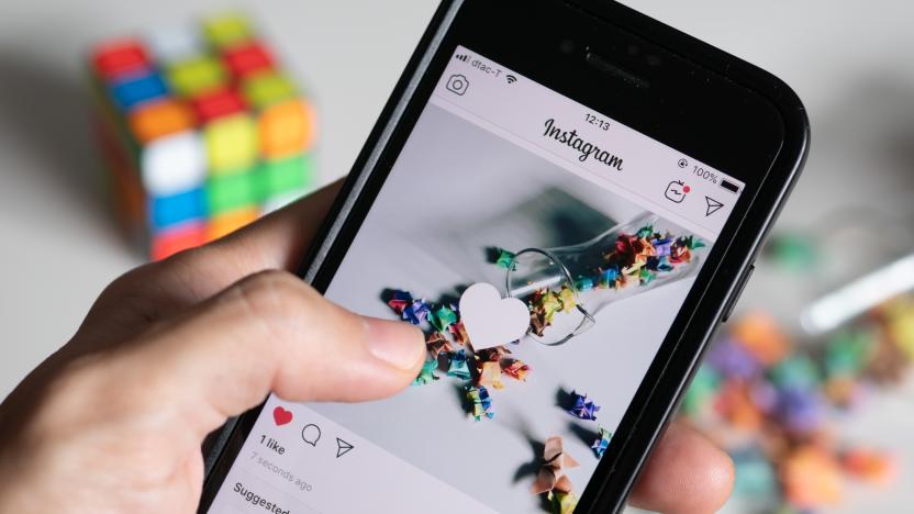
Instagram inexplicably adds a Comic Sans-like font to Stories
Instagram couldn't even get the real Comic Sans for Stories.
Recommended Reading: Coachella was built for YouTube
Coachella 2019 review: A festival built for YouTube Paul A. Thompson, Pitchfork For years, Coachella's opening weekend has been a huge event for YouTube. A weekend's worth of livestreams don't deliver all of the acts to your living room, but the site typically offers a lot of the big names so you don't have to travel to the desert. Pitchfork explains how the festival is now designed just as much for the viewers at home in its review of the 2019 event. "Especially after Beyoncé's Earth-rattling set last year, some stars and would-be stars lunged at the chance to make statements with their performances over the weekend, with productions designed to appeal as much to live streamers as to the crowd at Indio, California's Empire Polo Club," the site notes. And perhaps no one went all-in this year as much as Childish Gambino.

The National Parks ‘font’ has finally been digitized
Fonts are as synonymous with a brand as a logo, and these days every kind of company and organization (and some cities) have a design they call their own. Even America's National Parks have their own distinct lettering, found on wooden signs throughout parks across the country. But it wasn't until 2013 it became apparent that the iconic font isn't an actual typeface at all -- instead, it's simply the product of the chiseling gear found in the National Park sign shop. Now, the design has been digitized for others to use.

Uber hopes a new font will symbolize its turnaround
Uber has been through a lot since it booted Travis Kalanick: a new CEO, a new management team and an emphasis on doing things by the book (even if it proves costly). But how is it supposed to convey that it turned a corner besides ads? Through a new font, apparently. The ridesharing firm has unveiled a new look that revolves around a new typeface, Uber Move. It's unique, inspired by transportation fonts (think road signs and subways) and works in every country where Uber has a presence.
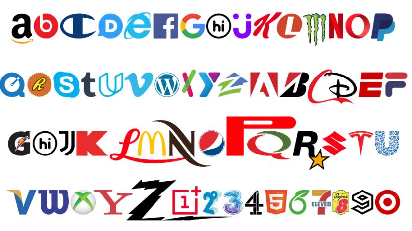
This funky new font is made up entirely of brands
A digital studio called Hello Velocity has created a typeface that embraces well-known corporate logos and is still somehow far less annoying than Comic Sans. The studio says it creates "thought-provoking internet experiences," and its Brand New Roman font is a clever statement on consumerism.

London Tube font redesigned for the internet age
The iconic typeface of the London Underground is getting a revamp. Design firm Monotype has been commissioned to rework the letters, numbers and symbols that people look at every day while they hurriedly board Tube carriages, stand on platforms and look at maps. The "Johnston" typeface was unveiled in 1916 and while it's undergone some changes since then, Transport for London (TfL) thinks it could use another tweak. The new "Johnston100" serves two purposes; to bring back some of the "soul" of the original typeface, which may have been lost in subsequent redesigns, and to make it more legible for apps and digital signage.

The owner of Helvetica and Times New Roman just bought some emoji
Monotype just bought Swyft Media. Or, a company you probably haven't heard of just bought a company you probably haven't heard of. Monotype, for the uninitiated, is a company that helped revolutionize typesetting at the latter end of the 19th century, and owns typefaces you probably see every day like Helvetica, Times New Roman and Franklin Gothic. And Swyft? It's a startup that creates stickers and emoji. Recently profiled by Fortune, it works with brands to create custom sticker packs for apps like Facebook Messenger and Line. At first glance, an emoji advertising firm and a historic type company might seem an odd couple, but given the rate that stickers are replacing our written words, perhaps it's money well spent. The deal could (according to TechCrunch) cost Monotype up to $27 million -- a small price to pay for staying relevant in our emoji-filled future.

Bic boils down the world's handwriting into one average typeface
As time marches on and the world grows smaller, we're left with the understanding that we - you, me, and folks across the globe - are more alike than we realize. Except, you know, when it comes to handwriting. To commemorate selling billions of pens you've seen countless times in your life, Bic has set out to create what it calls the Universal Typeface: a series of characters created by basically averaging thousands of writing samples from people across the world.

Twitter abandons one of humanity's most widely used fonts
The next time you visit Twitter.com things may look a little different, now that the site is rolling out a new font. After years of using Helvetica Neue, it's switching to the Gotham typeface. Already, design and typography fans are expressing dismay at the switch, although if you're still reading Tweets mostly through apps, it could be a while before you notice any difference at all. Check after the break to see the new style in action (and some of the responses to it.) [Image credit: AP Photo/Kathy Willens]

This smiley face is either a perfectly fitting typo or the world's first emoticon
It turns out that the emoticon might be a bit older than we originally thought. Literary critic Levi Stahl has found what could possibly be the first instance of a ":)" in Robert Herrick's 1648 poem "To Fortune." Stahl checked to see if it was just a typo in the edition of Hesperides that he owns, and says that he found the smiley intact in the authoritative two-volume edition of Herrick's work published last year by the Oxford University Press. Stahl explains that the poet's work was rife with humor, so this likely isn't a "punctuational oddity." If true, it'd beat the previous record-holder's age -- a transcription of an 1862 speech by Abe Lincoln -- by some 200 years. That isn't quite the final word, however. The New Atlantis (a scholarly journal about tech and society) writes that this probably isn't the case, and the only real way to tell if the emoticon was Herrick's intent would be to look up very early editions or his original manuscripts. The 19th century version it found didn't have the parentheses, however, and thus it ruled that the smiley was likely the result of a modern editor's insertion :( [Image credit: Robert Herrick]

Google Fonts now lets you experiment with typefaces in a free app
Google has a lot of free fonts on offer, but it's hard to know how they'll look on a website without putting them into HTML code or buying a preview tool. It's now much easier to experiment with typefaces, however, as Google Fonts has just integrated a typography app. Designers can click a link to test a given font in a free, lightweight version of Monotype's Typecast; from there, they can try out new color combos, effects, sizes and weights. Those happy with their work can export code and save images, and they can subscribe to Typecast's $29 per month premium service if they need to create style guides or offer live web previews. Page creators only need to visit Google Fonts to start tinkering with their text.

Font created with an iPhone in a dark room
What do you get when you take a motion graphics designer, an iPhone and a dark room, and put them together with a Canon 5D DSLR? You get a new font named "Phone Streak," created by Marcus Byrne. To create the font, Byrne set up the camera to take time exposures as he "light painted" the air with an iPhone. He painted not only uppercase and lowercase versions of the 26 letters of the English alphabet, but also numerals and punctuation marks. The short video below demonstrates how different versions of some letters were captured, and also how once Byrne had settled on the shape of each letter, he actually 3D-printed the "Z" (his favorite) as art. Phone Streak is available for free download on Dafont.com.

Roboto font and the new design philosophy of Android 4.0, Ice Cream Sandwich
When it came time to talk Ice Cream Sandwich, Matias Duarte started the conversation (or is it lecture?) with a bit about Roboto. At its most basic, Roboto is a font -- the new face of Android in a post Honeycomb world where tablets and phones share the same software space. Sure, it may seem like just another rounded, clean sans serif typeface, but it's really an entire aesthetic that Duarte says has guided the design philosophy of Android 4.0. It's "modern, yet approachable" and "emotional," in PR speak at least. But the clean, geometric design extends to the rest of the OS, which now sports more clean lines, subtle animations and ditches UI elements that have been deemed "unnecessary." Sure, Roboto may seem like "just a font" to you, but for the folks behind ICS, it's a mindset.

Embrace your obsessive inner typefacer with 'KernType,' a game about kerning
It's rare that we separate ourselves from our readers when choosing pieces to post on Joystiq, but with Method of Action's "KernType," we had to make an exception. You see, folks, our love for games is important, but our distinctly less relatable love/obsession with visual design is just as strong, which is why we immediately fell head over heels for KernType. Oh, we should probably explain what "kerning" is, eh? It's the space between letters in words. Yup, thrilling stuff, we know. But it's important! And in KernType, you're tasked with fixing the kerning of various typefaces (represented by words such as "wave" and "type"), which then compares your own skill with that of proportional computations. Call of Duty deathmatch it is not, but if you're of the very particular niche that is both obsessed with games and the written word, KernType is right up your alley. Also, hey, it's free right here!

Macworld 2010: TypeDNA
On the last day of Macworld, I caught up with the guys from TypeDNA to take a look at what I soon realized was going to be a revolutionary bit of software magic for designers of any ilk. TypeDNA is a series of plugins for Adobe CS4 applications (Photoshop, InDesign, Illustrator) which makes finding the right font a simple matter. It has several methods for navigating font collections, starting with a search by name, which is handy on its own. The functionality expands from there, doing such things as automatically offering suggestions for similar fonts and font harmonies. The harmonies feature is especially interesting, and the suggestions it offered while they were demoing it were very good. You can pick a font from the suggestions and search for similar fonts to find exactly the right typeface for your project. TypeDNA always offers a variety of suggestions, and recognizes that font choice is entirely subjective ... you make all the decisions, it just helps you navigate a large font collection quickly and intuitively. I'll be doing a more in-depth review as soon as the demo version comes out (soon). The full version will be available in March, and will run $59US per plugin, or $89US for a full set (3 plugins) and two licenses so you can use them on two separate machines.

TUAW giveaway: Typewar for 10 lucky winners
If you read our little review of Typewar yesterday, you already know that it's an elegant and fun game for iPhone and iPod touch. Now you have a chance to win one of ten copies of Typewar in a TUAW giveaway. All you need to do is leave us a comment telling us what your favorite typeface is. The details of the giveaway are as follows: Open to legal US residents of the 50 United States and the District of Columbia who are 18 and older. To enter, leave a comment telling us what your favorite typeface is. The comment must be left before Wednesday, February 3, 2010, 11:59PM Eastern Standard Time. You may enter only once. Ten winners will be selected in a random drawing. Prize: One promo code for a copy of Typewar (Value: US$1.99) Click Here for complete Official Rules. Remember, if you're not a winner, you can still purchase the game from the App Store or play the online version. Good luck, and start studying the Font Book app to get higher scores.


