user
Latest
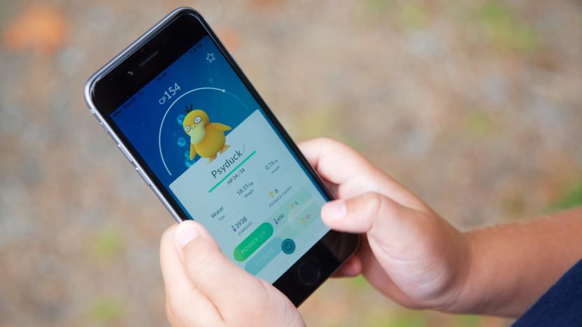
'Pokémon Go' saw a 35 percent growth this summer
Pokémon Go remains one of the most recognizable mobile games around, but it definitely experienced periods of user decline over the past couple of years after it took the world by storm. While not everyone who used to play the game picked it up again, it sounds like this past summer has been good to it -- according to Niantic, it saw a 35 percent increase in active usage since May. That's in line with a SuperData report from June, which said that the game had its highest active user count in May since its debut in 2016.

Facebook quiz app maker exposed data on over 120 million users
While Facebook tries to close the book on its Cambridge Analytica scandal, it's still dealing with many more. The FTC is conducting a non-public probe into the company's behavior around privacy data, the EU's stricter laws are making it hard for the company and they keep finding more apps that may have misused your data. Case in point: security researcher Inti De Ceukelaire has found that a quiz app from NameTests.com has been exposing user data for more than a year.

Over a million Americans quit Twitter in just three months
Controversial presidential announcements and celebrity revenge porn are all in a day's work for the social network everyone loves to hate. Now, Twitter has announced its most recent financial results and things aren't looking good for the microblog beloved by the leader of the free world.

Send Instagram to Dropbox for a cool Apple TV screen saver
Just recently, I posted about the Instacube, a Kickstarter project that allows you to more easily show off your great (or at least well-filtered) photography work on Instagram. But it turns out you don't need a whole cube to do that. With the proper tweaking of IFTTT (a tool we at TUAW also love), you can set up Instagram images to display on your Apple TV's screensaver, making for a fun party trick or just a cool way to show off the pictures you've been taking. All you need to do is save your Instagram pictures to Dropbox, and then share that folder out to the Apple TV, and boom, instant streaming screensaver. There are a few hitches, unfortunately, and the biggest one is that your Apple TV won't automatically pull in new images, so you'll have to sync folders after you add (or remove) any images yourself to see new pictures. If you want to pull in pictures from more than one Instagram user, you'll also have to set up multiple IFTTT recipes, one for each user you want to watch. But the good news is that you can pull in from any other photo feeds as well -- maybe a better solution, to show off pictures from a party, for example, would be to use a Flickr tag so that anyone can post to it. At any rate, it's cool idea for sure. IFTTT is a really powerful tool, and hookups like this can really give your Apple devices to some new and interesting uses. [via MacStories]

Gold Capped: Improving the default auction house interface
Every week, WoW Insider brings you Gold Capped, in which Basil "Euripides" Berntsen aims to show you how to make money on the auction house. Email Basil with your questions, comments, or hate mail! The default interface for the auction house could use some loving. It's an essential part of players' gaming experience, and whether they use it or not, its design has an effect on them. We've seen many examples of Blizzard designing parts of their UI to include features provided by addons that had become so prevalent that everyone had to run them. For example, threat didn't always show up on the default frames -- back in my day, we had to run Omen to avoid pulling aggro from the tank. It's important to recognize that not every valuable interface tweak belongs in the basic WoW UI, though. If it's a feature that's only used by a small segment of players or is unnecessarily complex, it's probably best off in an addon. You won't see me advocating that the base AH UI keep historic pricing numbers, for example. It is, though, a travesty that you have to page through hundreds of pages of single auctions to get to the lower priced stacks.

Ads in Angry Birds cause some squawking
Rovio's Peter Vesterbacka was pretty outgoing at GDC a few weeks ago, claiming that "it all works" when it comes to ad-driven business models on the App Store. But he might be relearning that lesson the hard way right now -- after an update to Angry Birds HD on the iPad added a "News" section in the replay screen that advertises other Angry Birds products, some users have gotten their feathers ruffled. That "News" section takes a while to load, and it must come up every time a level needs to be restarted, which means some players have raised their voices and voting fingers on the official iTunes listing. There's a few issues here -- first, we've seen in the past that most users don't actually mind ads in iPhone apps, as long as they don't mess up the flow of the app. It sounds like Rovio didn't quite plan this one correctly. Users who need to replay levels a lot (like those trying to max out their star totals) are seeing the ads quite a bit and losing that loading time every time, which creates frustration. Second, this is a free update to a paid app, and users who had already paid the US$4.99 for it are now frustrated that they're seeing ads, even if they are just for other Angry Birds products. So what's Rovio to do? The company has had success already with ads on the Android version of the app, but that was originally a free download. Given that the iTunes ratings are definitely suffering (the latest version only has 2.5 stars, as opposed to all versions' 4.5 stars), Rovio will probably have to put its ads elsewhere, either in the main menu of the app or out of the paid app completely. It seems like Vesterbacka and company have finally found a model for Angry Birds that doesn't work that well.

Bad apps mar the experience, according to survey
Here's an interesting reason why so many (around 9 percent, according to the most recent data) iPad and iPhone owners don't use apps as often as you might think: one bad experience usually ruins the whole setup for them. That's according to a new survey done by Harris Interactive, which found that 38 percent of mobile app using adults polled were actually dissatisfied with "most" of the apps they'd used. And 69 percent said that using an app they didn't like actually colored their perception of that brand entirely. Thirteen percent said that any bad app hindered them from even downloading other apps. You can probably imagine a user pulling up a fart app recommended by a friend, realizing how dumb it is, and then dismissing the App Store entirely. Of course, this survey doesn't seem to specifically cover the App Store (and it only surveyed 781 people, though we'll hope Harris chose those people as a representative sample), so these people could have been using non-iPhone mobile apps -- typically a far cry from what's available in terms of selection and quality on the App Store right now. It is interesting to hear some reasons why people aren't downloading and using apps. It's weird to think that people would use a terrible app and have it color their perception of some of the great apps we love, but as new as this platform still is, mass market users are still forming their opinions about the concept of applications on their phones.

Blind user explains why he loves the iPhone
Here's a wild little story that made its way around the blogonets this past weekend -- it was originally posted in June, but it got recirculated on Twitter, and we first heard it from Steve Troughton-Smith. Austin Seraphin is a blind person, and he says that getting an iPhone changed his life forever -- he considers Apple's iDevice to be "the greatest thing to happen to the blind for a very long time, possibly ever." Really high praise, especially considering that we've heard both good and bad about the iPhone in terms of accessibility. Seraphin's story is a great read, so I just suggest you head over to his blog and check it out. But why does he appreciate the phone so much? Apple's VoiceOver feature is a big plus -- it allows people without sight to browse and control the iPhone's touch screen using audio feedback, reading off messages and even checking things like stocks and weather all by translating it through the speaker. Seraphin even describes using a color picking app to use the iPhone's camera to "see" colors around him, with VoiceOver reading off descriptive names of the colors coming through the lens. That's pretty incredible, and something only the iPhone, with its extremely mobile combination of technology and UI design, can easily make possible. Seraphin still has an issue using iTunes, and not all apps are, of course, quite as accessible as Apple's guidelines ask them to be. But it's awesome to hear how Apple's approach to technology, combined with all of the various apps out there, can make a significant change in this man's life. In fact, last week he got himself an iMac.

iPad use case: Pro blogger
Over the past few weeks, we've heard many people say, "The iPad is cool, but what would I do with it?" This new series aims to answer that question. We'll examine one user case per post, from couch surfer to mobile professional, and describe just how that person uses his or her iPad. As a professional blogger, there are 5 things I need to do my job: A comfortable, reliable keyboard A text editor RSS feeds Web access A reference tool for compiling research The iPad lets me get nearly all of that accomplished. Let's start with what works. The keyboard The iPad's software keyboard is more usable that I expected. It's forced me to develop a hybrid typing method that's part hunt-and-peck and part touch typing. Years ago, I learned to keep my fingers in the home position, lightly touching the keys. On the iPad, "lightly touching" means "pressing," so now I hover just above the keys. The landscape keyboard is just a bit smaller than a standard keyboard, so I can't keep my hands in the true home position. However, knowing each key's location without having to look is tremendously helpful. With a bit of practice, my muscle memory has adapted to the smaller keyboard. The real key, as with the iPhone, is to be fearless and type. The iPad will correct the vast majority of your mistakes. That being said, I don't want to write more than a few hundred words with it. Even with the above accommodations, I still make more errors than I do with a physical keyboard. Therefore, Apple's Bluetooth keyboard is essential. It's a breeze to set up, fits squarely in a bag and is barely wider than the iPad itself. With the iPad docked and the keyboard in place, I'm ready to write.

Developer quacks about 'minimal user functionality,' but it's not a new rule
Since the early days of the App Store, it's been a virtual Wild West out there -- people can release apps that do whatever they can imagine, from a virtual cowbell to a mirror, silly as the functionality may be. Still, there has always been a (very low) hurdle for the least an app can do; once again, Apple has rejected an app for the reason of "minimal user functionality." To be clear, despite what you may be reading elsewhere, this is not a new rule, but one developer thought that his rejection under a long-standing reviewer's option was a reason to raise a little heck. The creator of the just-rejected app (which, for the record, shows a picture of a duck and makes the iPhone quack like a duck) emailed TechCrunch looking for a little justice, and all he got from them was sarcasm. We don't have anything he'll want to hear, either: with hundreds of thousands of applications in the store, Apple is entitled to use its veto power on the non-functional apps. And so far, that's a good thing for consumers like us. Deleting apps for sexual content is one thing, but deleting apps for lacking all redeeming value is another. Of course, the standards are just as sticky (what if someone really does need a quacking sound?), but at least someone at Apple does have a standard somewhere in terms of making an app serve a purpose. I don't mind the sex apps (and I think an Explicit category is the right way to go), but I would appreciate Apple stepping up the line on quality, especially now that the store is full of great apps already.

Apple shifts focus from sales to quality in China
There was quite a bit of discussion from Apple yesterday about their sales in China (you can see that in our liveblog from yesterday afternoon), and AppleInsider points out that Apple is changing priorities over there, from straight up sales to brand quality. Tim Cook said yesterday that Apple has activated more than 200,000 iPhones since the release in China last year, and only in relation to the iPhone can anyone think that number could have been better. Apple is behind the pack in China -- there are a significant number of competitors over there, and unlike the market in the West, multifunctional smartphones have been popular for a long time already. But Apple recognizes the potential overseas, and Cook says the company does "...realize we must do well in these markets to continue to grow." What changes can they make? Price for one -- Apple says that as a premium brand, they're going to have to tweak a little bit to fit into the lower-income middle class in China while still competing on user experience. Apple didn't say that they weren't happy with what's happening in China, but compared to other countries in Asia (Japan came out of last quarter with a 400% year-over-year growth), Apple has a little more work to do there.

Tabs in the title bar: a UI design trend that needs to go
Safari 4 Beta's new tab arrangement has me bothered. It seems to be largely lifted from Chrome's user interface that puts the tabs at the very top of the window. Not only is this a departure from Apple's typical UI choices, it presents problems for users with special needs. On your average Apple user interface, every object -- a title bar, menu, button, or handle -- has a single function. It can resize the window, move it, close it, or scroll it. Safari 4's tabs, however, have a dual purpose: They not only can be selected to move the entire Safari 4 window, but can be clicked individually to display their contents. In Safari 3, this was handled by two different objects -- the title bar to move the window, and tabs in the tab bar. Google chose to put tabs at the top of the window because it was an important part of the user metaphor for their web browser, Chrome. In Chrome, tabs are independent processes brought together in a kind of stack. This is all very well and good, but it poses the same problem of having the area at the top of the window do two things at once: move the window as a whole, and control each item in the stack.

'Marble' to be the next look-and-feel for Mac OS X?
Snow Leopard, the next major version of Mac OS X, will include minor tweaks to the user interface, according to MacRumors' Arnold Kim. "The new theme will likely involve tweaks to the existing design and perhaps a 'flattening' of Aqua in-line with Apple's iTunes and iPhoto interface elements," Kim writes. AppleInsider's Kate Marsal posted a screenshot of some controls purported to be part of the new interface, dubbed "Marble." It's unclear where the screenshot came from, as Kim writes that development builds have so far used Leopard's version of the Aqua theme. They could easily be Photoshopped screenshots of iPhoto or iTunes, so take that with a grain of salt. Daring Fireball's John Gruber wrote that Marble was the codename for the new interface scheme in his Macworld predictions roundup, but said later he was wrong when it was not announced during the keynote. He wagered that the look would feature "iTunes-style scrollbars everywhere, darker window chrome, and a light-text-on-dark-background menu bar." Snow Leopard is rumored to be released before the end of March.

Debuff limit removed
Previously you could only have 40 debuffs up on a single mob. That might seem like a lot, but when you got in a raid with 25 other people all putting up their own set of debuffs and dots, etc... things tended to get a little full.Daelo, the Lead Encounter Designer, announced today that the debuff limit has been removed*. This is a subtle yet important change for many raiding guilds.He notes that the default UI won't normally be able to show all the debuffs, but that's just a bug in the UI. The debuffs are still there and working. We don't have any verifiable information yet as to if custom mods can display an infinite number of debuffs.

Breaking News: In game calendar system revealed
Elizabeth Harper managed to get onto the latest beta build of Wrath of the Lich King tonight and snap us a few screenshots of the new calendar system. It looks quite nice, and to me appears to be a step up from current in game calendar options.Blizzard has mentioned that they've been working on one of these for a while, and it's nice to see the results. If you look closely you'll see things like when the Darkmoon Faire is coming, and when the Stranglethorn Fishing Extravagenza is happening. It doesn't show what PvP weekend it is, but I have to believe that's something they'll be working on.Check out the screenshots below for the new UI. I'm sure you'll be happy!Update 12:57 a.m.: There is a way to add user events in the calendar. It also appears there is a way to share the calender items among individuals. More information incoming.%Gallery-28666%

Reader UI of the Week: Draxyl of Turalyon
World of Warcraft allows all of us an unprecedented ability to modify our user interface to meet our needs. Each week WoW Insider will bring you a fresh and detailed look at reader submitted UIs. Have a screenshot of your UI you want to submit? Send it, along with your character name and server, to readerui@gmail.com.Draxyl from the Turalyon U.S. server submits to us his Warlock UI. It's actually very reminiscent of the UI that I had for quite some time until I upgraded my graphics card and started using a lot of alpha-blending (transparency). He uses Fubar across the top with several key pieces of information and quick to reach options, and then has the bottom of the screen filled with status indicators, chat, and action buttons.I think it's a common theme amongst most UI enthusiasts to focus the information in one or two places. This has several benefits, from limiting eye movement when trying to pickup information, to allowing more space to see what's going on in the rest of the environment.%Gallery-19902%

Reader UI of the Week: Zerfall of Eonar
World of Warcraft allows all of us an unprecedented ability to modify our user interface to meet our needs. Each week WoW Insider will bring you a fresh and detailed look at reader submitted UIs. Have a screenshot of your UI you want to submit? Send it, along with your character name and server, to readerui@gmail.com.Today's Reader UI of the Week comes from Zerfall, and Undead Warlock on server Eonar. He has many addons working together to support his game play. What I particularly like about his UI is that it's not cluttered, allows for good visibility, and uses what I would consider to be critical addons that everyone should at least try out.I always find that Warlocks and Tanks have the most complicated UIs. Tanks because of the necessary information they need to have about everything and everyone, and Warlocks because of the large amount of spells at their disposal. Zerfall does a good job at organizing all his abilities using his action bars. One area is for miscellaneous items, one area for his pet bar, one for his curses and often used spells, and another for his lesser used spells and abilities. I always find that this kind of distinction is critical in a successful UI.%Gallery-19902%

24 Hours of Leopard: Web Clips
Feature: Web Clips, little roll-your-own widgets for Dashboard that will tell you anything the Web can.How it works: Making a Dashboard widget isn't really that hard now, but it's about to get a lot easier. There'll be a little button in Safari that you can press to take a "clip" of a web page and turn it into a widget on the Dashboard that updates as that page does. Found your local weather forecast somewhere, or a webcam that watches the outside of your house? Clip that section of the page into a web clip, and you've got a simple, custom-made widget so easy Grandma can make one. Here's what it looked like in an old build, and it's probably going to be even easier in Leopard.Who will use it: If it's as easy as Apple says it is (and all indications say yes), everybody. Anything on the web can be clipped into a widget, so if you can access constantly updated content (say, the top story of TUAW?) then you could use it as a web clip.You can check out all our 24 Hours of Leopard posts here.

iSlayer - Vector, Bitmap, and Resolution Independence
Dashboard developer iSlayer has posted an interesting article examining the implications resolution independence (a new feature in Leopard) will have on icon design. Even before the issue of resolution independence, UI designers have been in two camps regarding the use of bitmap vs vector files for icons. It is in the nature of vector images to scale, but things get a bit out of proportion and wonky- looking after a while. Bitmap images can be tweaked to a designer's heart's content, but that means they have to produce a different image for each possible eventual icon size. iSlayer breaks down the deeper pros and cons of each format, including resource usage and if there is really a need for such high resolution interface components. Definitely a must read for those in, or interested in Mac interface design.
Rumor: portable user accounts coming in Mac OS X 10.5 Leopard?
A new Apple patent uncovered by PC Pro hints at the possibility of portable user accounts making their way into the Spring '07 release of Mac OS X 10.5 Leopard. For a quick break down: the long-standing rumor has been that this would allow a user to keep their account - the entire home directory, applications, media, preferences, you name it - on an external storage device like an iPod, and simply plug that device into any Mac and log in with access to all of their stuff. The possibilities are pretty juicy, and for once the language in the patent is fairly straight-forward, if not a little repetitive: "The multi-user computer system, eg. through its operating system, locates user accounts not only in local storage of the multi-user computer system, but also in any removable data storage attached to the multi-user computer system."While this particular rumor has been in the wind for a few years now, we don't have anything else specifying that it is for sure arriving in Leopard. This could be yet another unused patent, or it could be slated for 10.7 for all we know. As usual, we'll keep our ears out.[via Slashdot]


