The new Office for iPhone is everything it should have been on day one
I remember when Microsoft first came out with Office for iPhone. It was actually kind of exciting. Here was this thing that for years had only existed in the form of rumors and leaked documents. And there it was, at last: the killer iPhone app, ready to download. Or so I thought. Maybe I was expecting too much, but I came away feeling underwhelmed. That first version of Office Mobile was a watered-down gimp of a program, with pitifully few editing tools and an occasionally confusing layout (imagine having no way of knowing what size font you were using). Compared to some apps, like Google Drive, it wasn't that bad, but it still wasn't as feature-rich as Apple's own iWork suite. Worst of all, the software has received few feature updates in the 17 months since it debuted. Is this what we waited so long for?
At last, however, Microsoft seems to have come to its senses. The company is getting rid of Office Mobile and replacing it with three standalone iPhone apps for Word, Excel and PowerPoint, just like on the iPad. In fact, because these apps share code with the iPad version, they arrive with the same robust feature set, along with a couple tricks designed specifically for the iPhone. In short, then, the new apps are everything the original Office for iPhone should have been.
If you've spent any time with Office for iPad (or if you read my review), you'll notice right away that these new iPhone apps have generally the same UI as the tablet version. The icons are the same, as is the layout of the home screen, where you can create new documents, view recently opened files or poke around any storage accounts you may have linked. Speaking of the sort, whereas you once needed a Microsoft OneDrive or SharePoint account to open something stored in the cloud, you now have the option of connecting your Dropbox account as well. It's a brilliant solution when you think about it: Dropbox doesn't have built-in office tools like OneDrive or Google Drive, and meanwhile Microsoft has caught flak for not supporting enough storage services. Everybody wins, especially users.
Though the UI is similar in style to the iPad version, Microsoft did have to make a few tweaks to ensure Office ran well on the iPhone's smaller screen. For instance, while the iPhone apps have the familiar "Ribbon" interface, it now shows up at the bottom of the screen, not the top. Just hit the fourth button from the right in the top pane, and you'll see a menu pop up at the bottom of the screen, exactly where you'd normally expect to see the onscreen keyboard. Because of that, the Ribbon never feels like it's in the way: If you're used to constantly having a soft keyboard taking up the lower half of your phone screen, then Office's "vertical Ribbon" setup should feel quite natural.
From there, you can tap through all of the usual Ribbon options ("Insert," "Review," et cetera). As you'd expect, the menu of options will change depending on the context, but regardless of what you're doing, the controls are large and easy to hit with your finger. Wanna change the font or color of your text? No problem. Want to program a cell to calculate a formula? Easy peasy. Need to add a transition to your PowerPoint slides? You get where I'm going here. The point is, for an app that offers such a large number of options, it's impressively well-organized. Best of all, because the main Ribbon menu sits at the bottom of the screen, it should be easy to reach with your thumb, even on the larger iPhone 6 Plus.
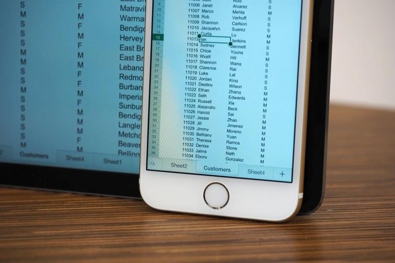
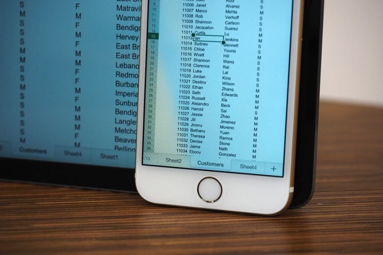
Additionally, Microsoft added viewing modes to Excel and Word that make it easier to read documents on the iPhone's smaller screen. In Excel, there's a full-screen mode, which is exactly what it sounds like: a view-only mode where you won't have to worry about hitting any random cells with your finger. In Word, this works a bit differently. There, it's called "Reflow," and it's kind of like the difference between a mobile website and the full desktop version — the high-fidelity original looks better, but Reflow view makes it easier to read on that small screen. With PowerPoint, there's no special mode, per se, but you will find that it runs mostly in landscape mode.
This would also be a good time to talk about performance. In particular, I like how quickly my iPhone 6 toggles between the standard and Reflow views — in that sense, it's really not like switching between mobile and desktop websites! In general, too, the three apps feel responsive. Which isn't surprising, really — Office for iPad runs briskly, as does Office 2013 on the desktop, for that matter. All the Office apps I've used recently have been fast.
All told, I'm pretty smitten with the new Office for iPhone apps. Now that they have feature parity with the iPad version, there's very little I would change. (It is annoying that you still can't add images to documents unless they come from the Camera Roll — what about OneDrive?) For some people, particularly those who depend heavily on Google Drive, the new Office for iPhone won't be enough — at least as long as Microsoft continues to not support Google accounts. For everyone else, though, the new Office may have just made every other productivity app obsolete.