Uber updates its look
With a new app and logo design, the ride-hailing company wants to appear more approachable.
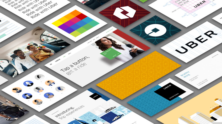
Uber has new app icons, a fresh logotype, and region-specific background colors and patterns, company co-founder Travis Kalanick shows off in a blog post today. The new icons for both the rider and partner apps include a "bit" at their centers, a hollowed-out square that represents the company's technology. Plus, they feature colors and patterns specific to whichever country you're in. The Uber team crafted these colorful backgrounds by studying the architecture, art, fashion and environments of the relevant regions, but eventually the company plans to go even further and create custom patterns for individual cities.
The new logotype is "less fussy," deleting the trailing lines at the beginning and end of the company's name. Uber says these changes are an attempt to humanize the company (and probably to distract a wary public from its recent struggles with lawsuits and protests).
"Uber started out as everyone's private driver," Kalanick writes. "Today we aspire to make transportation as reliable as running water, everywhere and for everyone. Our new brand reflects that reality by working to celebrate the cities that Uber serves."
Here's Uber's new rider app icon:

And the driver app icon: