Facebook redesigns its news feed -- again
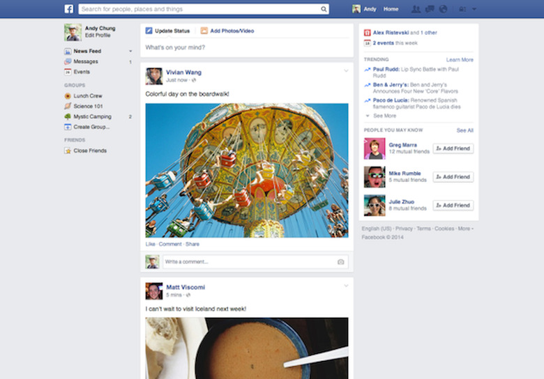

In a never-ending bid to make its news feed easier to use, Facebook has changed its look yet again. For one thing, the font will now be in Helvetica for Macs and Arial for PCs, which will make it look a lot like the fonts already in use elsewhere on your computer. Further, different shared stories will no longer have indentations when a friend leaves a comment, and will instead be separated out into its own post for the sake of a less messy interface. The left-hand column, previously cluttered with icons, is now much lighter and cleaner. Lastly, shared photos will now be in full-width, while multiple photos will be presented in a collage. The roll out begins today, so keep hitting refresh — hopefully you'll get to see it before Facebook's next round of redesigns.
Update: As Re/code explains it, this latest redesign is a result of poor testing of the design it showed off last March. That particular look was only rolled out to a small percentage of users, almost all of whom disliked it, which prompted a complete UI rethink. Therefore if the left-hand column above doesn't look all that different to you, it's because you never received last year's redesign in the first place. The primary difference that you'll see in the latest redesign is that the photos on your news feed will be much bigger.