Spotify's quest to get it 'just right' through balanced design


In the heart of Stockholm a team of designers and engineers have been hard at work, mostly in secret, overhauling one of biggest names in music. (And no, we're not talking about Icona Pop or even an ABBA reunion.) On Birger Jarlsgatan, a street that divides the neighborhoods of Ostermalm and Norrmalm in the Swedish capital, sits the home of Spotify. Not all that long ago it was the undisputed king of subscription music services. Today it is just one of many major players in the exploding marketplace with would-be usurpers, from Google to Beats, surrounding it on all sides.
Over the years it's shoehorned in new features and accelerated its international expansion, but the design stagnated. Its iTunes-like desktop client didn't just look dated, it was cumbersome and many of its features bordered on obsolete. Its mobile apps and web player filled a need, but lacked the polish and stability many mainstream customers demanded. So for the last several months a team led by Michelle Kadir (Director of Product Development) and Andreas Holmstrom (Lead Communications Designer) have been toiling away to bring Spotify into the 2010s. That means a flatter more playful look with soft edges and large images. But the company also bucked the trend towards lighter color palettes by slathering its UI with enough black to make Tomas Skogsberg proud.
Even though it was in desperate need of a fresh coat of paint Spotify had to be careful when it came to reimagining its flagship product. It has amassed tens of millions of users. Even if only a small portion of those pay monthly subscription fees, their patronage results in ad revenue. The guiding philosophy was that of "lagom" — a Swedish word which roughly translates to "just right." Basically, a redesign had to be a quest to find the perfect balance in the new Spotify experience. A balance between being distinctly new and modern, but not unfamiliar; feature rich, but not overwhelming; beautiful, but not over-designed.
The first and most critical step was gathering user feedback. That, of course, included the standard set of surveys and unsolicited missives from customers. But engineers and designers also watched people using the apps. Even if a user couldn't articulate what was important to them or what was wrong with current experience, the acute eyes of Spotify's experts could spot the problem simply by watching a person's behaviors. Though the company was reticent to highlight its own weaknesses, it would cop to users being confused by the inconsistent UI across platforms. It also found that people preferred the darker interface elements that Spotify favored during its earlier days.
They even ran separate focus groups with users who had never used the service before, which made it easy to spot the more counter-intuitive and confusing elements of the experience. Those users were at the front of the company's mind when it also chose its new typeface and icons. They're clean, rounded and simple. In a word: approachable. And that accessibility extends beyond simple looks. The engineers aimed to simplify almost every task to make sure that the app was doing "the heavy lifting" not the user. Primarily that effort focuses on exposing the most commonly used functions, but it also means fully implementing search-as-you-type for quickly surfacing results.
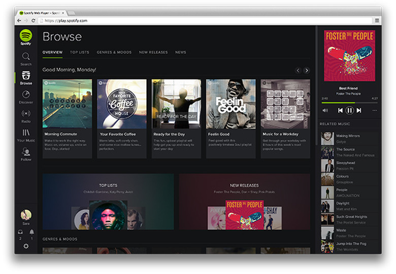
The return to dark roots is immediately apparent when you fire up redesigned web player. The gray panels are replaced with a stark black backdrop. Against that absolute absence of color the other elements of the UI seemingly float in empty space. And that's the point. While others like Google are trying to flatten their interfaces as much as possible by putting white on light gray, Spotify is trying to separate the content from the rest of the UI. The dark backdrop mimics that of a movie theater — black is the color of entertainment to hear the designers tell it. That choice alone sends a message about the purpose of the app. And while you're probably not going to listen to your music in fullscreen mode it sends a certain message to the user when the rest of the UI simply fades into the background.
Movie theaters and Swedish concepts of moderation aren't the only influences at play, however. Looking at the new Spotify apps it's hard not to see the distinctive mark of social networking. In particular the company appears to have borrowed heavily from Google+. Albums, artists and users are all represented as cards in the primary browsing view. They're not as heavily adorned as they are in Google's "social backbone" but there is an obvious resemblance. Most notably when clicking through to an artist's page, which contain round "profile" pictures against a large header image that fills out the rest of the pane. Individual user profiles are laid out very similarly. When you see a round image it sends the user a visual cue that this a person or persons, allowing them to quickly distinguish between a direct link to content like an album and a profile.
Whether or not Spotify succeeded in embodying the principle of lagom is entirely subjective. While some may find the large rounded icons and social network-influenced flourishes instantly welcoming, others may be turned off by its simplicity. But the intended goal is obvious. By blending the old with the new and putting its focus on content Spotify is trying to bring balance and uniformity to what has until now seemed scatter-shot.