Google Search: A visual history

"To organize the world's information and make it universally accessible and useful."
That was one of the primary goals Larry Page and Sergey Brin set when they launched Google in 1998 as a privately owned search company. Since then, the Mountain View-based outfit has branched out, creating a mobile operating system, mapping service, cloud-based productivity apps, branded devices and, now, smart thermostats. All of those offshoots, however, always point back to the company's original aim: search. That baseline service is something Google's been making refinements to ever since its inception. A practice that continues to this day, with the company constantly improving upon the usability and design of its search-based offerings. This means cleaning up a UI when needed, and launching new features that serve up that much-lauded universal accessibility in short order. What may come across as a small box centered in a vast expanse of white is,
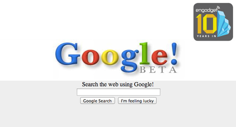
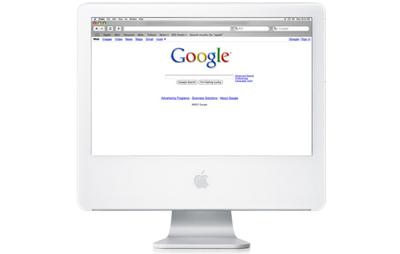
1998-2001: Primary Search
For the first few years of its existence, Google.com was purely a search engine with its now iconic box and "I'm feeling lucky" hunting option. The latter was meant to help users discover new sites during the course of their queries.
2001-2007: Totally Tabular
If you needed to conduct an image-based search, Google added tabs just above the search box in 2001 to make the task much easier. These would take on a variety of looks in the years to come, but at launch, they were nestled up under the ultra-recognizable multihued logo.
2006-2007: Tabs Take Over
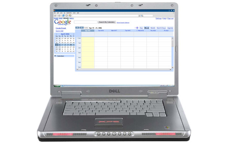
Tabs didn't just stop there. They also briefly crossed over to Google's Gmail and Calendar, offering useful links atop those interfaces. Those apps have since been cleaned up drastically, but there was a time when both were weighed down with clickable, tabbed options.
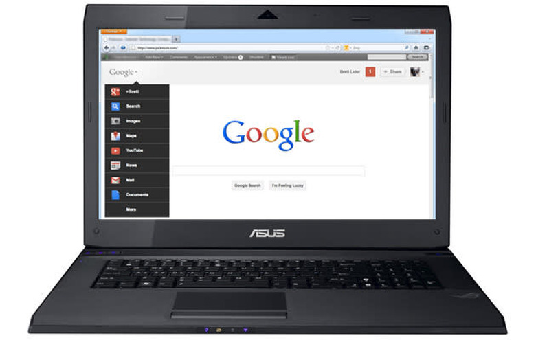
2007-2011: Navigation Bar
Some folks didn't take too kindly to Google moving that tabbed content to a navigation bar at the top of the page. For a span of about four years though, search links and app access rested there.
2011: The Google Menu
In an effort to clean up that navigation bar, Google opted to tuck those handy search categories and its suite of apps into a drop-down menu at the top-left corner of the UI. The bar itself stayed put, adding Google+ access and notifications on the right-hand side.
2012: Google Now
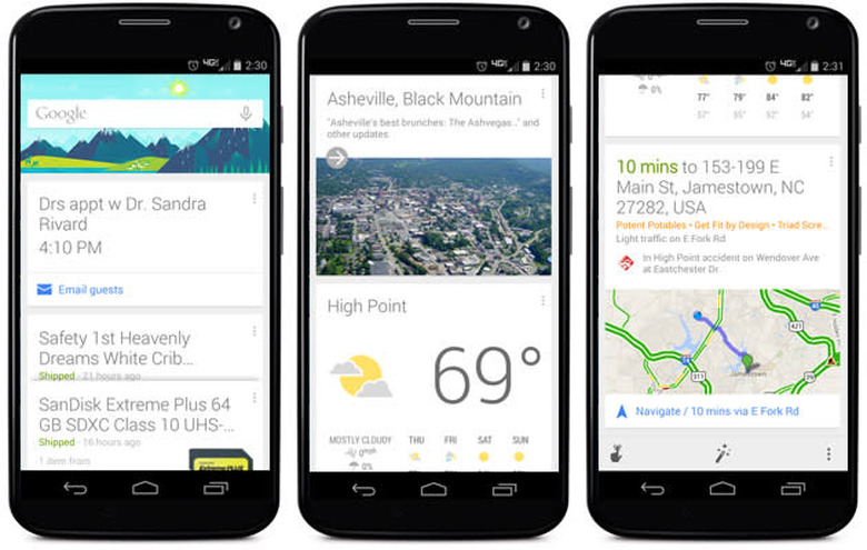
With the release of Android 4.1 Jelly Bean, the folks in Mountain View introduced a new type of mobile search product: Google Now. This card-based system draws upon user habits and search histories to display everything from weather to packages ordered, flight status and the latest scores from your favorite team. Google's even extended Now's reach beyond just Android, making it available on both iOS and the desktop in the years since its release.
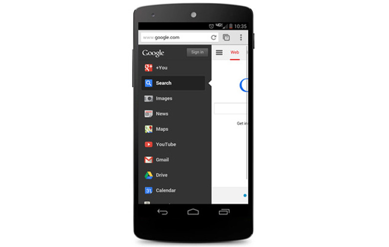
2014: Tidied Up With Voice Search
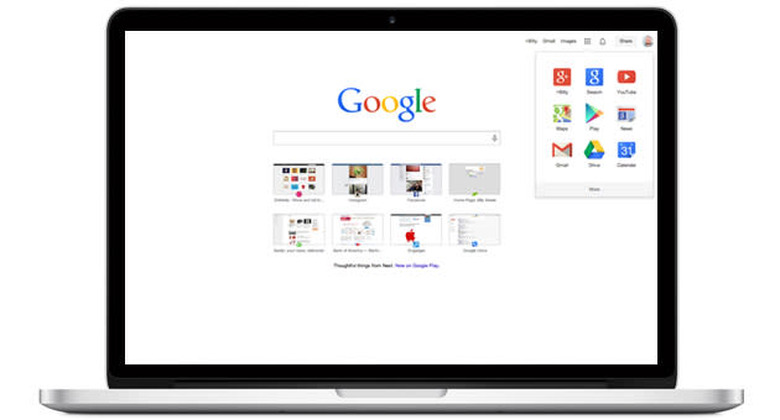
It may not look like much has changed, but that top navigation bar has been tweaked again. This time, Google's cleaned it up by moving that handful of links to the top-right corner alongside notifications for Google+. There's even another drop-down menu for accessing those trusty Google Drive apps and a handy list of sites that you visit most. To top it all off, the search box that's been there from the very start now features voice search.
Google Doodles
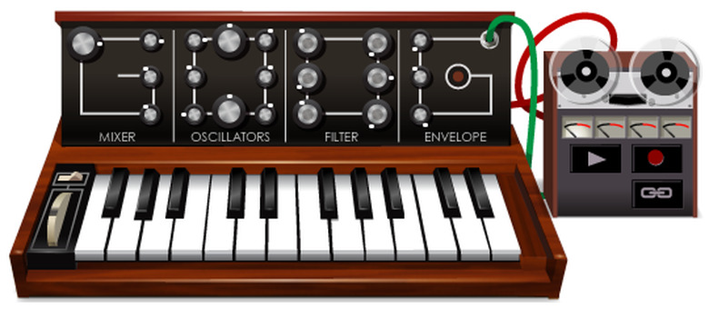
Even before the company was officially incorporated, Google Doodles were a thing. The first was posted in 1998 to announce the attendance of Page and Brin at Burning Man. Since then, the artwork has been used to celebrate all kinds of events, from the Olympics to birthdays of influential folks. The Doodle team has been keen to add a heavy dose of interactivity throughout the years, too, as evidenced by one of our favorites: a recordable Moog synthesizer for Robert Moog's 78th birthday.
Mobile-Minded
"You don't need to be at your desk to need an answer," reads entry number five in Google's "Ten things we know to be true."
Browser-based search on mobile has largely taken on the look of its desktop counterpart. Even today, there's a side-mounted app tray to keep the main page focused on hunting for crucial info. Most Android users have a handy window on their home screens and Google's apps pre-installed, so there's no real need to hit the search web page directly. In terms of the standalone Search app, though, it primarily drives the aforementioned Google Now.
Always Searching
To say that the folks in Mountain View have expanded the search engine since 1998 would be a massive understatement. It's quite clear many of Google's other products harken back to its prowess in handling queries. From Nexus to Now and Glass, there's little chance that search won't continue to drive all that Google does — no matter how its look may change.
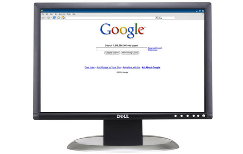
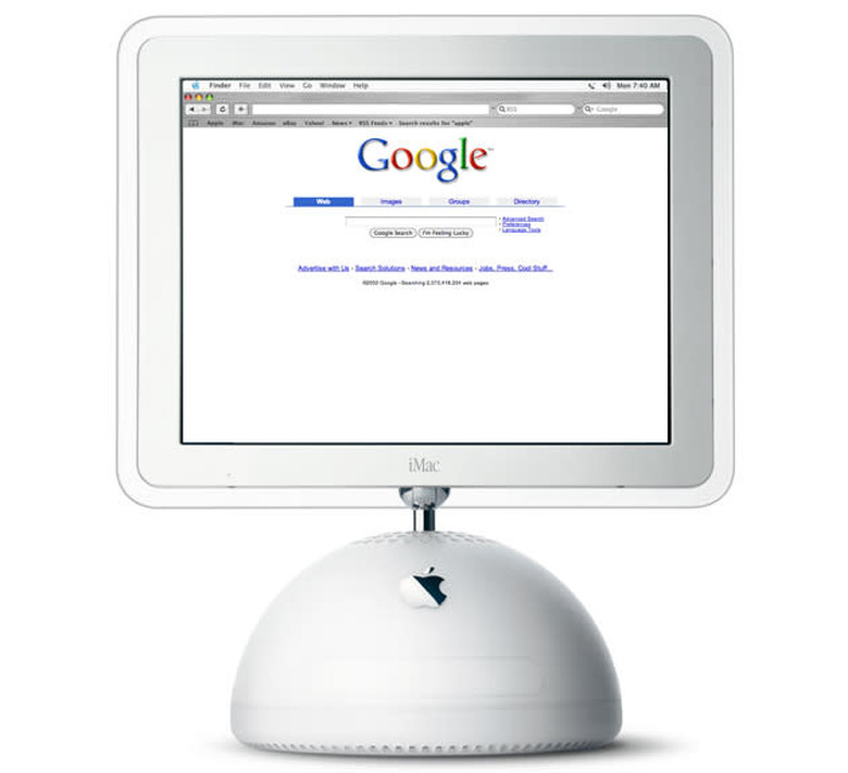
Desktop screenshots courtesy of Google, except for the 2014 image.