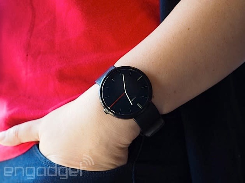
Moto 360 review: It's the best Android Wear watch, but that isn't saying much
When it comes to wearables, fashion trumps function. That's the mantra Motorola went by when it designed and developed the Moto 360, and judging by the enthusiastic response the watch received when it was unveiled earlier this year, plenty of people agree. The Moto 360 is undoubtedly the best-looking of the three inaugural Android Wear watches (the LG G Watch and the Samsung Gear Live are the other two), with its premium leather strap, chamfered glass and circular design. As Motorola designer Jim Wicks said in an interview, "We wanted to hit that 'Whoa!' mark." And so it did. But is that enough? In the past few days, I struggled to like this watch, even though it's the best Android Wear device available today. Allow me to tell you why.
Hardware
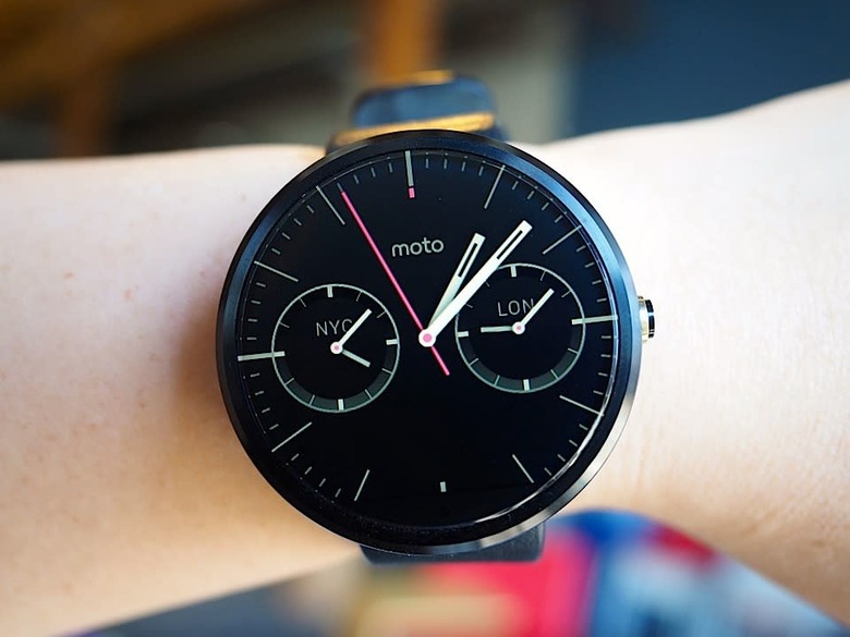
The Moto 360's claim to fame is that it's the first Android Wear device with a round face. And that's a big deal. As I said, when it comes to an item that you wear on your person, it's crucial that it looks good. Compared to the other two Android Wear watches on the market, the Moto 360 looks the most like an actual timepiece partially due to that round design. Indeed, one of the reasons Motorola went with a circular design is that it believes a round face is simply more watch-like. Of course, there are traditional analog watches with square designs too, but the 360's round face does make it stand out in a sea of square smartwatches. Motorola made a conscious decision to make the 360 more watch than gadget; more mainstream than early adopter; more SoHo than Silicon Valley.
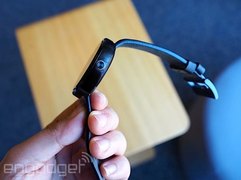
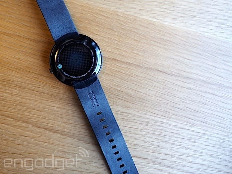
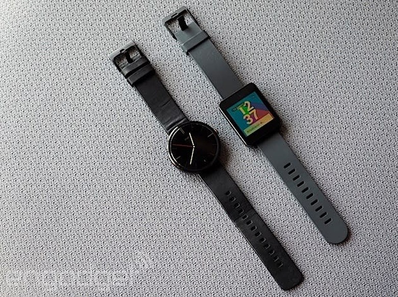
That thought process included not just the shape of the watch, but also the materials used to make it. The housing is constructed from glass and stainless steel, and the leather strap is sourced from a high-end Chicago tannery. It's a smartwatch that actually feels comfortable when worn; the leather feels much softer and more flexible than the rubber straps on the G Watch and the Gear Live. What's more, with the leather strap, the Moto 360 is also quite a bit lighter at 49 grams (the G Watch weighs 63; Gear Live, 59). In other words, the 360 not only looks like a regular watch, but it also feels like one.
If you can't decide on just what color to get — the initial watchbands come in black, dark gray or light gray — the straps are thankfully interchangeable. However, do note that you'll need to visit a jeweler to swap them out and Motorola says the 360 is only compatible with straps made specifically for it. Later this year, Motorola plans to release a Moto 360 with metal bands, which is more in-tune with the style of the thick metal housing.
That brings me to one of my problems with the Moto 360. While I don't deny that the Moto 360 is well-crafted, its 46mm diameter and 11.5mm thickness paired with the leather bands make it much too big for me. I felt a little embarrassed to be wearing such an enormous, attention-grabbing timepiece, and my husband remarked that it looked like I had a hockey puck strapped to my wrist. During a tour of Motorola's headquarters recently, we were told that the 360 was designed for both men and women — apparently large watches are trendy accessories for some folks these days — but I'm simply not one of them. Of course, this is based entirely on personal preference. And again, even though it's not to my taste, the Moto 360 is still one of the most striking smartwatches I've seen yet.
Display
The primary reason for that is the circular display. It goes practically edge to edge with pixels spread across the entire surface, leaving a sliver of a bezel around it. The result is a watch face that's nearly all screen, which isn't something you can say about the Gear Live or the G Watch. That's a good thing, especially as the Moto 360's screen is a touch smaller at 1.56 inches across, resulting in a 320 x 290 resolution that translates to 205 pixels per inch. It's not the sharpest display by any means, but it's also not bad for such a tiny screen; it seems clear and colorful enough to me.
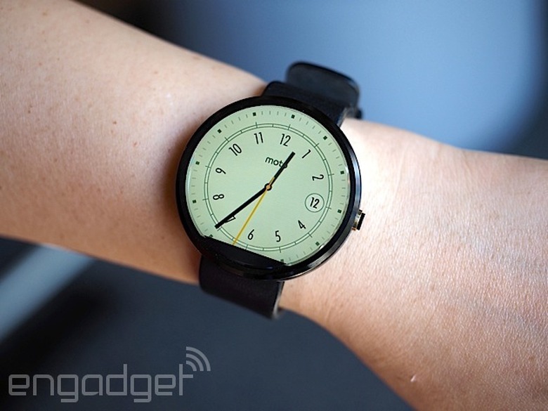
Unfortunately, there's a rather noticeable black slice at the bottom that mars the display's circular perfection. Motorola says that in order to maximize the screen size of a small and round display, it opted to house the watch's display drivers and ambient light sensor in that little wedge instead of creating a thick circular bezel. If that is indeed the trade-off, I agree that the edge-to-edge chamfered glass is a better option. But if you're even the slightest bit of a perfectionist, that tiny, little black slice might be difficult to un-see.
Additionally, round displays and Android Wear don't always get along. Motorola apparently worked closely with Google to ensure that the UI would play nicely with a round screen, and it succeeded — for the most part. Text occasionally gets cut off at the corners, especially when scrolling through messages and long lists. Also, the beveled sides make the circular border look a touch jagged at certain angles, especially against a white background.
Speaking of that ambient light sensor, the Moto 360 is also the first Android Wear watch to even have one. That means that unlike the G Watch and the Gear Live, the 360 supports auto-brightness, which is extremely handy considering the 360 is equipped with a backlit LCD that would otherwise be unreadable in bright sunlight. It's naturally not quite as crisp as the e-paper display on the Pebble, but it's legible enough that I could make out the time and read my email notifications. And seeing as turning on maximum brightness would likely put a big dent in the battery life, I'm glad the sensor is there.
It's important to note here that the ambient light sensor is separate from a Moto 360 watch setting called "ambient screen." This feature is off by default, and what that means is that the watch will go completely black when it's idle or not in use — it'll only light up when you lift the watch to look at it. When ambient screen is turned on, however, the 360 won't immediately go black when idle. Instead, it dims just enough so that you can still tell the time if you casually glance at it. But if you happen to take the watch off and leave it somewhere, the display will eventually go black, even with ambient screen enabled.
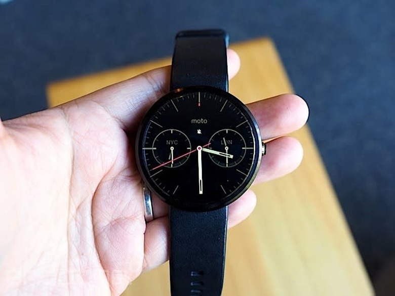
In addition to tapping the screen or lifting the watch, you can also activate the display by pressing on a small protruding crown on the right. If you hold it down, you'll bring up the watch's settings menu — a welcome little shortcut, as getting to it would normally take a number of steps. Pressing and holding on the screen will bring up a selection of watch faces that have been customized for the 360's round display. You can adjust the different watch face settings even further with Motorola's own Connect app. I like the Dials face option the best because it lets me see what time it is in two other cities — a handy thing when you work with a global team.
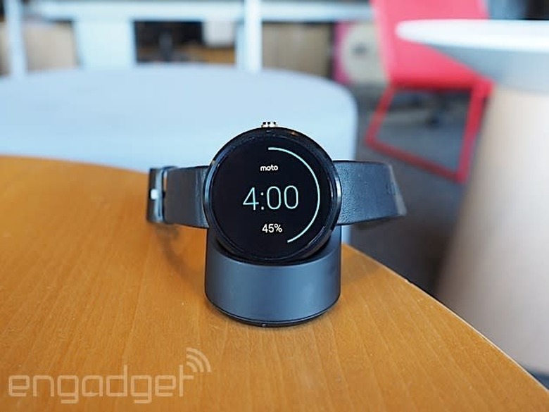
Now, you might be wondering how you charge this watch; it's not like there are any ports to plug in a cable. Instead, the Moto 360 charges wirelessly via Qi magnetic induction. Just set it inside the included charging cradle and the watch will get the juice it needs to keep going. When docked, the Moto 360 will display a digital clock along with how much charge it still has. This way, you can use it as a bedside alarm clock if you like. It works as promised, but I do wish Motorola had included a USB-only cable in the box in addition to one that requires a power outlet. Since the 360 charges via the Qi standard, you could theoretically charge it on an existing Qi wireless charger if you happen to have one already.
Features
Phew. That was a lot of words just about the watch's design. But seeing that most of the watch's features are the same as the other Android Wear devices — Google isn't allowing manufacturer-specific skins — the 360's main differentiator is its design.
But if you'd like a brief recap, here's what Android Wear offers. Beyond just telling the time, Android Wear is a platform that transmits what's on your phone to what's on your wrist. If you allow it, you'll see everything from emails to Twitter notifications to Google Now cards popping up on the watch. There's some notification anxiety as a result — having to scroll through all of those can be a pain, especially as you can't quite ignore them as easily as you might on a phone. As with the other Android Wear watches, you navigate through the 360's interface by swiping and tapping on the watch's touchscreen display. A key component is voice commands, where you can say things like "Navigate" to find directions or "Call a car" to request a Lyft ride. For more details on Android Wear, check out our full review.
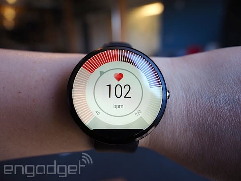
Beyond Android Wear, the 360 does have a couple extra features that bear mentioning. Remember that Motorola Connect app I alluded to earlier? That's also where you can track your steps and heart rate, because the 360 not only has a built-in pedometer, but it also has a heart rate sensor as well (it's located on the underside of the watch). As with the Gear Live, you do need to hold your wrist relatively still for the sensor to read your beats per minute, but it only takes a few seconds.
Additionally, the Moto 360's heart rate app also comes with an activity monitor that tracks how active you are in a day. Once you enter in your vital stats (height, weight and so forth), the app will attempt to divvy up your daily heart activity into three categories: "Inactive," "Active" and "Vigorous." Motorola's goal here is for you to get at least 30 minutes of moderate activity a day for five days. As the 360 periodically keeps an eye on your bpm, it'll know to notify you if you're almost or at your goal. From my experience with the 360, achieving this 30-minute moderate activity goal is pretty easy — just walking around the house and the local farmer's market got me to my goal before noon. Still, it's a noble enough objective and gives us the illusion that we're trying to be healthy.
Battery life and performance
There's probably a subset of you that completely disregarded everything I've written above and came right down to this section. And I don't blame you. After all, what's the point of a watch that runs out of battery in the middle of the day? The problem, of course, is that the Moto 360 isn't a normal watch. Just like the other Android Wear devices, it comes with a rather dinky battery. The official specs state 320mAh, though a recent teardown reveals that the battery actually has "300mAh" printed on it. Motorola's official statement is that the battery offers a range of 300 to 320mAh, but opted to print just "300mAh" due to the lack of space.
Regardless of which it is, the battery is still tiny. Under heavy use, the 360 barely lasts the day. With the ambient screen mode on, I had it so that it would notify me of every incoming email, message and notification from apps like Twitter, Facebook and Google Now. I also tried out a couple of different navigation routes and used voice commands several times throughout the day. In about 12 hours, the 360's battery life dropped to 9 percent. It's not pretty, to say the least.
However, in the days after the initial thrill of playing with the 360, I found myself hardly ever using the watch in such an active manner. I mostly just relied on it for timekeeping and notifications — I rarely bothered using it for voice commands or navigation, since, well, I could just use the phone for that. With this kind of minimal use, it got to around 23 percent after 12 hours, which is enough to last through a typical day. But if you're not going to use a smartwatch as a smartwatch, that kind of defeats the purpose of getting one. Plus, even with such skimping, I still had to charge the watch every night.
Under the hood, the Moto 360 has a TI OMAP3630 processor, which is surprisingly old technology — we're talking the kind of chip used in the Droid 2. Yet, I didn't encounter too much sluggishness when swiping through the menu or scrolling through messages. I did notice the occasional hiccup when trying to remove notifications — sometimes it took a couple of swipe attempts instead of one — but they were few and far between.
The competition
Android Wear is so new that the Moto 360 only has two other direct competitors, at least for now. When it comes to look and feel, however, both the Samsung Gear Live and LG G Watch pale in comparison to the 360. Unfortunately, better look and feel come at a price — the watch is far more expensive at $250 with a leather strap and $299 with a metal one. Worse, the battery life here is the shortest of the bunch.
Additionally, the 360's honeymoon period as the only round-faced Android Wear watch will be short-lived as both LG and Samsung are trying their hands at circular designs too. If the 360's rotund face is the only factor you're considering in a smartwatch, you might do best to wait to see if you like those. It's worth noting, for example, that while the 360 has that black slice at the bottom of its circular display, the upcoming LG G Watch R doesn't. From a brief hands-on we had with it at IFA, however, we can definitively say that the 360 is still the nicer, more premium option.
I'd also be remiss if I didn't mention the most recent rival to the Moto 360: the Apple Watch. It remains to be seen how intuitive the UI is in real-world use, but in terms of design and style (not to mention app support), it looks like the 360 has some serious competition afoot.
Wrap-up
With its stylish good looks, comfortable feel and overall premium build, the Moto 360 is the Android Wear watch to beat. When it comes to design, at least, it outclasses everything else on the market. Aside from aesthetics, the 360 offers many of the same features as its rivals, including a heart rate sensor and a pedometer, plus some other goodies like wireless charging and an ambient light sensor.
Even with the design, though, Motorola didn't totally get it right. The 360's large size is a legitimate concern for narrow-wristed individuals, and the experience is dampened by various imperfections that include cutoff notifications and that "flat tire" at the bottom of the screen. What's more, the battery life is actually worst in class — and that's saying a lot considering other Android Wear watches also need to be charged once a day.
All told, the smartwatch landscape is so new that I'd recommend waiting to see if something better comes along. Sure, the Moto 360 is the best option right now, but it might be obsolete in just a few months. That said, if you want to jump on the Android Wear wagon now, the Moto 360 is your best bet.
