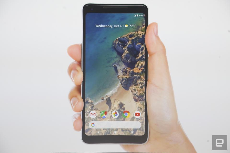
Google’s cleaner Pixel 2 UI puts search front and center
Out with the search stub in the screen's top left, in with the return of the full search bar at the bottom.
Last year, Google's first Pixel phone came with a few surprises -- including a new proprietary launcher that shifted around icons and the user interface. But it seems the rumors about the Pixel 2's refreshed UI were true: The Google search box has been moved to the bottom, while the top area has been devoted to widgets showing time, date, weather and the next appointment in your calendar.
The translucent rectangle is gone, giving you an uninterrupted view of your sweet background. Notification dots and PiP are new to Android 8.0 Oreo, but already available on the Pixel 2. In short, Google's new smartphone only made mostly iterative changes on its UI. But re-extending the former "pill" search tab into a full bar as well as bringing it down to the bottom returns it to the spotlight -- like Google wants to re-centralize it in the user experience. Otherwise, killing the bottom grey box and minimizing the top widget bar's text aligns with Google's trend toward cutting the cruft away for a simpler, cleaner UI.
Follow all the latest news from Google's Pixel 2 event here!


