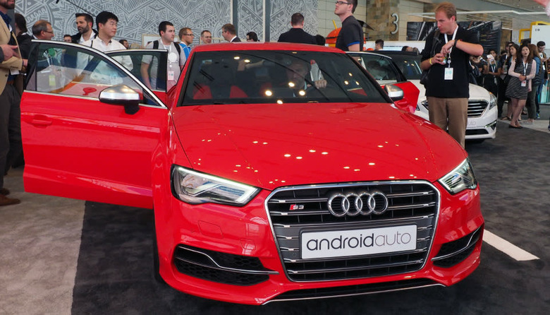
Google gives us a simulated ride with Android Auto
Meet Google's answer to Apple's CarPlay: Android Auto. It's a new platform announced today at the annual orgy of software and hardware development known as Google I/O, and it puts the (almost) full power of Android in your car. Why almost? Well, despite the fact that the system leverages your smartphone to power your car's infotainment system, you don't get access to all your apps. It has a limited selection of options that are suitable for use on the road and optimized for an in-dash interface, and I got to see several of them in action in an Audi S3.
Getting started with Auto is easy: You just plug your phone into the micro-USB cable wired into your car. For now, wired is the only option, but Product Manager Dylan Thomas said that the Android Auto team is in the process of evaluating wireless solutions. Regardless, once your phone's connected, your car is endowed with the powers of Android. In the Audi, we got to see how the system works without a touchscreen, though other manufacturers, like Hyundai, are using such an interface. The Android Auto framework is built to function with either, according to Thomas, and it's up to the individual manufacturer to decide what's best for its customers. Whether you're using a button-and-knob solution or a touchscreen, voice control is universally available to control things, too. And the voice control worked really well in the Audi. When asked whether Google had best-practices recommendations for in-car microphone setups, Thomas informed me that his team is working with the manufacturers to do so.
In practice, navigating through the apps in the Audi was easy, whether the hardware or voice controls were used. On screen, users get a consistent look no matter the app, and a universal nav bar that persists beneath all apps that gives you direct access to the voice dialer, navigation and music apps, along with your app tray. Despite the consistent layout, each app can be customized with different colors and icons to suit varying features and tastes.
For example, the Google Play Music app gets orange accents, while Spotify is swathed in green, but both have play/pause and track controls in a row at the bottom with album art filling the top two-thirds of the screen. A vertical ellipses icon located to the right of those controls grants access to an overflow menu filled with the custom iconography (and features) for each app. By using the same template for each app, Google is making the interface easier to navigate, which helps avoid confusion behind the wheel (a very good thing). Similarly, Google Maps sports a simpler interface that has fewer, larger location labels than its desktop or mobile implementations — again, to make it more car-friendly.
In summation, our brief time with Android Auto was a positive one. Voice controls worked well; apps look good; and navigating the system was relatively easy and intuitive as a result.
Zach Honig contributed to this report.

