The Big Picture: a heat map of the 'entire' internet
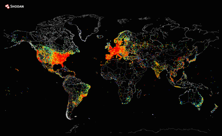

As the saying goes, a picture is worth a thousand words. In this case, though, let's say it's worth millions and millions of internet connections. Thanks to John Matherly, founder of Shodan, a search engine which focuses on helping companies locate internet-connected devices, we are getting a pretty detailed look at how the web looks on a map. While Matherly's tweet says the picture shows where "all devices on the internet" were located after he pinged them, that might be a bit of a stretch. Still, the image manages to give us a really good idea of the internet traffic across different parts of the world. And we reckon it's beautiful.