Hulu Plus on iOS looks a lot flatter and cleaner now

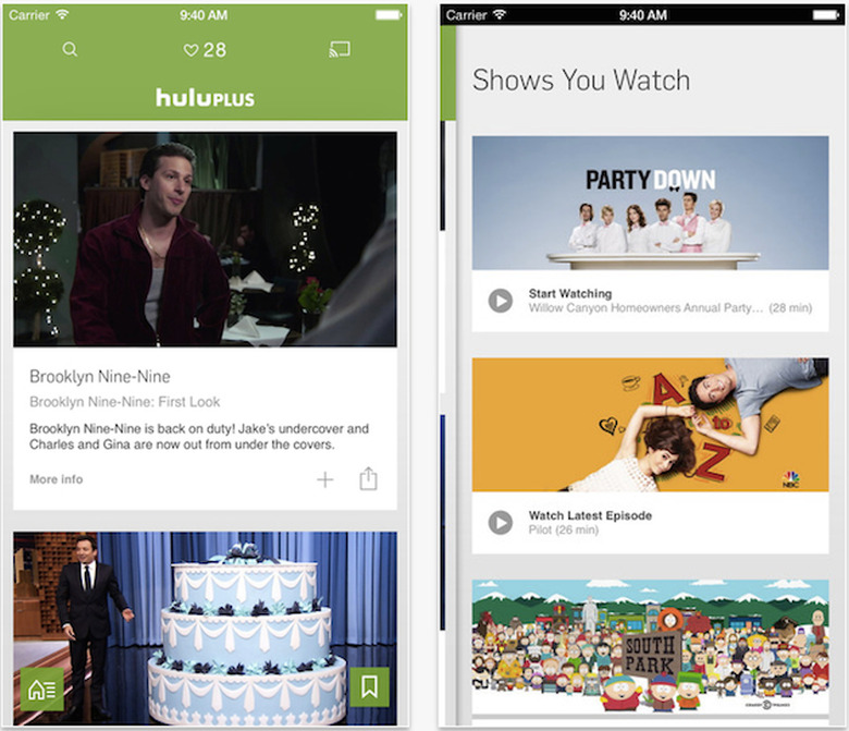
The word "reimagining" can be a bit scary at times. At its worst you get stuff like Johnny Depp playing Willy Wonka, but on the other side of the coin is SyFy's Battlestar Galactica. Hulu's redesigned iOS app seems to fall on the latter portion of that spectrum. The application's gotten an overhaul, with a keen eye toward making it cleaner and, above all, easier to use. First things first: the landing screen is now divided into three sections; Home, Shows You Watch and Navigation. Home is where content curated by Hulu resides, while Shows You Watch and Navigation are pretty self-explanatory. The kicker is that now when you swipe either left or right from anywhere within the app, you'll pull up either of the latter, respectively.
The streaming outfit didn't neglect the video player itself, either, tidying up its appearance and adding controls for captions and Chromecasting within the viewing window. It all resembles HBO Go and YouTube's Android apps a bit, but compared to what Hulu on iOS looked like recently it's hard to complain. When those on Google's mobile OS will see a similar patch is up in the air for now.