Morpheus mech game 'Rigs' uses color to make VR less overwhelming

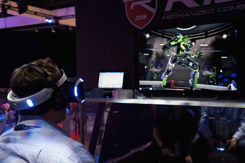
My most vivid takeaway from PlayStation 4's new Project Morpheus game Rigs wasn't what I expected. Sure, the first-person mech shooter handled like a dream at 60 frames per-second, and targeting my enemies simply by gazing at them was impressive. But how fluid the locomotion was and how aiming system performed were nothing compared to the game's use of fun, vibrant blocks of color to keep the mood light and subtly nudge me in the right direction. I spent a ton of time in virtual (and augmented) reality at E3 this year and it was Rigs that was perhaps the easiest game for me to pick up, play and not feel like I was floundering about. Sorry, EVE: Valkyrie. With smart color palette choices developer Guerrilla Cambridge, responsible for PS Vita's Killzone: Mercenary, was able to tell me exactly what to do and where to go without saying a word.
For example: When your mech is destroyed, you go through an automatic eject sequence where you're propelled high above the arena. From this vantage point you're given a handful of different respawn zones to choose from, each denoted with a green symbol. Once I chose where I wanted to return to the action from, the same green was onscreen again, this time in a sort of bubble that blocked out the outside world and then melted away once the action began again. It was a way to give a brief break from the game's super-quick action. Every time I saw that green on the map, i immediately knew that it was associated with getting a new mech.
In Rigs the fastest way to earn points is by jumping through a gigantic yellow ring that sits horizontally, high above the center of the map. This has a color associated with it too: yellow. The ramps leading up to it and even the ring itself are yellow. Again, it's an immediate association between a color and an objective or direction that immediately conveys what you need to do without the need for an onscreen prompt or other explanation. As developer Tom Jones (no, not that Tom Jones) tells it, those associations are key for more than one reason.
I really appreciate how the team uses color in the game because I'm a huge nerd for color. I spend way too much thinking about palette and color psychology. I mean, it took me three weeks to figure out the colors I was going to use in my apartment.
Tom Jones: To get it right, yeah.
Exactly. Rigs uses color in a really smart way to direct players where to go. Green means i'm respawning right now, and to get to that respawn point in the ari, I look for that green spot. Yellow is going toward the goal. How much thought and consideration went into getting that right?
TJ: From the outset we wanted to make a colorful game. We wanted to make a world that people would enjoy. It's a sport so we needed it to be vibrant and colorful, it shouldn't be a dystopian future or anything; it's a sporting arena. That was really important. The harder challenge was finding not doing something that's overwhelming.You can do too much [with color] and it's like a visual overload.
Yeah, you have to be careful about using too much color because it can confuse the player.
TJ: It's kind of being selective in areas and landmarking areas, as well. It's a multiplayer game so you need to call out areas on the map. I think one of the things we've done in VR is to push more of the colors to the background so the areas are more defined by bigger colors which are more easy to find in VR as well.
Does VR present different challenges for using color and your color palette?
TJ: The challenge is not doing anything that's too overwhelming to people. Bigger blocks of color tend to work better than smaller pockets. It's very hard with color obviously, because warm and cold tones can change your perception of depth within a scene and that can play with you a little bit when you're in VR. We've struck a really good balance now and it really works for what we've got.
Check here for everything happening at E3 2015!
This interview has been edited and condensed