Microsoft's next big update to its Office apps: a new font
Get ready to see Aptos whenever you're getting work done.
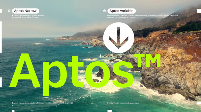
If you've used Microsoft productivity suites this millennium, you're in for a big change... visually, at least. After 15 years, Microsoft is replacing the default font in 365 and Office apps, Calibri, with something new: Aptos. It may look like a simple sans-serif font (and it is in default form), but Microsoft is betting that you'll like it thanks to its sheer flexibility.
Aptos works with many languages. There are four different font weights, and serif variants if you need something less hypermodern. Creator Steve Matteson (who made Windows' first TrueType fonts) waxes poetic about Aptos including a "little bit of humanity" and evoking the personalities of Carl Kasell and even Stephen Colbert, but the end result is a font that will theoretically be easy to read and eye-catching whether you're writing a school essay or prepping a company presentation.

The font has already been available as Bierstadt as part of a feedback gathering effort, but is rolling out as the default font in Excel, Outlook, PowerPoint and Word for hundreds of millions of people starting today. Everyone will see it within the next few months. It'll still be available under its old name, as will the four fonts that didn't make the cut (Grandview, Seaford, Skeena and Tenorite). Like Calibri, Aptos will be pinned to the top of the font picker but won't be mandatory.
Yes, it's just a font — like those redesigned Office icons from 2018, Aptos will have zero impact on your ability to get things done. As one of the most noticeable elements of any app, though, the new default font will change the look and feel of tools you might use every day. And like Apple's San Francisco font, it reflects an evolving technological landscape where a typeface has to be le on a wide range of devices and screen sizes.