iOS 7: phone call changes

Your iPhone does so much cool stuff, especially now that it's running iOS 7, that it's easy to overlook the device's primary function: it's a phone! Apple's latest mobile operating system brings significant cosmetic and functional changes to the Phone app. Here's what you can expect when placing and receiving phone calls with iOS 7 on your iPhone.
Looks
Permit me an understatement: this app looks way different on iOS 7. It feels lighter and "roomier," if that makes sense. The large "Call Back" and "Delete" buttons are gone from Voicemail, for instance. So is all of the black, replaced with lots and lots of white. Let's begin by looking at the icons in the lower tool bar.
Favorites
The Favorites icon has been re-designed, though not as dramatically as the others. Right away you'll notice that iOS 7 puts each contact's photo next to his or her name in the Favorites list, which is nice. The blue arrow that always lived on the far right in previous versions of iOS has been replaced with a tidy information icon. Tap it to reveal a complete re-working of that contact's information screen.
Hey, the pinstripes are gone! Yes sir, they are. So are the clearly defined fields for phone numbers, email addresses and so on. Now, you get a crisp, white field and your buddy's info in a much thinner font. There are icons, too, next to specifics like phone numbers, iMessage address and iChat.
There's also a notes field and an option to block a caller. Not that'd you'd block one of your favorites, right?
Recents
The clock icon has been re-designed, as expected. What's unexpected is that, instead of reading 3:00, it now reads 9:00. Why? I don't know.
Again, the disclosure triangle from previous versions of iOS has been replaced buy an information icon. The information available here is the same, save the option to block a caller, but the presentation is so much nicer. It's amazing how "bulky" some of those old UI elements feel after a few weeks with iOS 7.
Contacts
Another re-designed icon. This time, the little person's head is in a circle. There's not too much new here: you get a list and a search field.
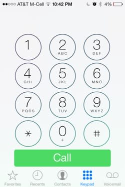
Keypad
Circles! Lots of circles. The squared-off icon is gone and so are the buttons. Now, 12 circular buttons and a big 'ol "Call" button rest of a field of white. Here's what's neat: when you press a button, a bit of your wallpaper's color(s) can been seen "behind" them.
I must admit, I found the new keypad jarring at first. I've gotten used to it, but really, it's kind of shocking the first time you place a call.
Voicemail
This looks great. The presentation starts with the information on the caller, including name, number and state/country of origin. Next, the player features a play button and scrubber so you can quickly move back and forth through a message. You can also tap Speaker, Call Back and Delete. It really looks great and the revised player is nice.
Talking
When placing or receiving a call, the contact's image is blurred out behind the keypad. The usual buttons -- mute, keypad, speaker, add call, FaceTime and contacts -- are also rounded. The end button that appears during a call is a big, hard-to-miss rectangle and in line with the overall aesthetic. Finally, if you navigate away from an active call, the "touch to return to call" button is a much brighter green than it's been. It almost looks 5c green.
iOS 7 changes so much and we'll have full coverages of the good, the bad and the flat all day. Keep coming back for our complete exploration of iOS 7 for iPhone and iPad.
