Life Analytics fails to provide life analysis

Life Analytics seems to want to do what Moves tried to do: provide you with a record of everywhere you've been but with some graphs to show you how you divide your time among the places you inhabit or visit. However, unlike Moves, which was purchased by Facebook and subsequently seems to have been forgotten and no longer seems to work (at least, not in iOS 8 on any phone I've tried), it provides no map view and any information it provides is confusing and the UI is, for want of a better word, ugly.
On first run, the app encourages you to define home and work by using a map and a slider to choose a radius (to geo-fence what is and is not "home" or "work", handy if you live or work in a place where the GPS signal is more variable than setting a specific point would allow). That initial process was clunky and the on-screen directions tell you to tap one button to finish the process while the actual button has a different name. That done, I left the app alone for a few days and went about my life so I could build up some location data and then get some analysis of my life.
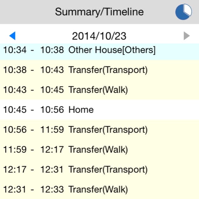
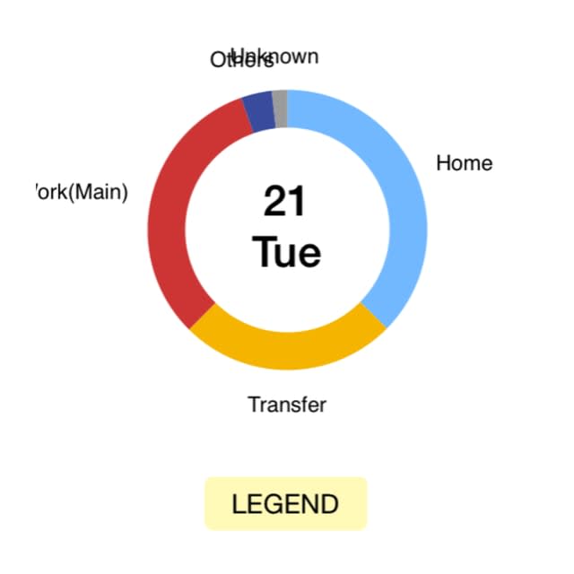
After a few days, I looked at the app again and what I saw was less than helpful. Now, to be completely fair, I work from home, so I get that this would confuse the app as to when I am at work and when I am at home, so I do not hold it against the app that it shows me at both in equal measure as opposed to, say, being at work for 8-9 hours and then home for the rest. Even taking that into account, the analysis is wonky at best. For example, every single movement I make around my home is listed as some form of transport (again, to be fair, it may be getting very confused by my work and home being the same place). Sometimes, that transport is listed as walking, sometimes as bicycle (I must move around my house faster than I realized!)
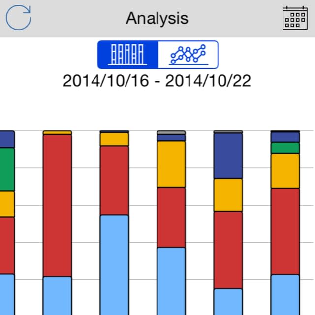
The charts themselves are poorly drawn with labels overlapping or oddly cropped on the sides of the screen despite the fact that there's plenty of pixels left to provide more of the words themselves. The summary charts showing multiple days are not very useful as the legend defining the colors is off the far left requiring you to scroll back and forth to see what is what. If you make changes (as I did in trying to define work as another location just to see if the transport issues got fixed) they only apply to anything from now forward, not to anything in the past. The large, prominent ad on screen at all times certainly didn't help either.
All in all, I found little to like about Life Analytics. If you are interested in tracking your movements and seeing how and where you spend your time, I suggest you look elsewhere. So much of what the iPhone represents is elegance in design and the love of working with something well crafted and with a nice UI. Life Analytics is anything but. Life Analytics is at least free and, while it claims compatibility with a wide variety of devices, the app description says that the motion co-processor is required meaning it should only be compatible with iPhone 5s and up.
