1
At least one UK government department is reportedly done with X
UK attorney general Richard Hermer told his staff his office was quitting X, according to The Guardian and The Observer.
Read More
UK attorney general Richard Hermer told his staff his office was quitting X, according to The Guardian and The Observer.
Read MoreRivian is being sued over the self-driving capabilities of its early vehicles, or lack thereof.
Read MoreYou don't have to have a Pixel Watch to use Google Wallet. Here's how to set it up on your Galaxy Watch.
Read MoreWhether you hate subscriptions like Kindle Unlimited or simply want to get away from Amazon for whatever reason, you'll find plenty of solid options available.
Read MoreAkai updates the MPC One and Key 37 with better processors, additional RAM and more storage.
Read MoreAdobe has added its Firefly AI tool to some of its most important apps.
Read MoreWaymo is recalling over 3,800 of its self-driving taxis due to a software issue that could cause them to enter closed freeway construction zones at speed.
Read MoreSennheiser joins the open-ear earbud craze with its first clip-on design.
Read MoreVSCO's new Studio Pro app can batch edit photos and match the style of a reference image.
Read MoreMidjourney has announced its first hardware project, and it can do more than make cute AI pet photos.
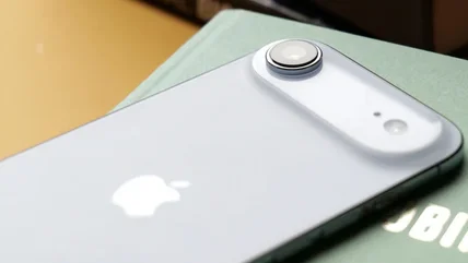
Read MoreThe ultralight may become a permanent fixture in Apple’s smartphone lineup.
Read MoreEpic Games is making generative AI a big part of upcoming versions of Unreal Engine.
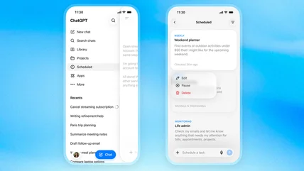
Read MoreAnthropic's tools are getting chummy with each other.
Read MoreHere's what to expect when the manufacturer stops supporting your smart fridge.
Read MoreCarvana is converting old car dealerships into test drive centers.
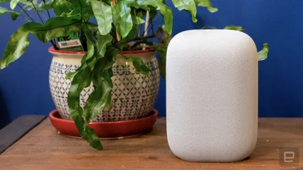
Read MoreUpgrades include 360-degree audio and deeper integration with Google's Gemini.
Read MoreThe White House app will be automatically loaded onto DHS staff’s work phones, Politico said.
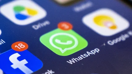
Read MoreWhatsApp is finally catching up to rivals with disappearing messages.
Read MoreLego's gonna show us all how it's done done done.
Read MoreFIFA, which has strict policies around advertising, reportedly had the Bayern player tape over the Beats logo of his headphones.
Read MoreThe Dell XPS 13 is now available, starting at $599.
Read MoreSnap CEO Evan Spiegel sat with us to discuss the Snap Specs, privacy, parental controls and more. Spoiler: He says "computing" a lot.
Read MoreIn some markets, new Xfinity customers can get their wifi set up same-day.
Read MoreWear OS 7 is now live for Pixel watches, with a new interface, notifications and Gemini features.
Read MoreGoogle has started rolling out Android 17.
Read More