iOS 7 after a couple of days

Our brains are pattern-making machines. When our patterns are disrupted, it takes some time to build new pathways and embrace the future. So it is with iOS 7, Apple's first major overhaul of its iPhone operating system (now iOS) since the iPhone debuted in 2007. I wrote up some very quick impressions as I used iOS 7 in New York, but here's what it's like a few days in.
Music
Music and sound have always been a part of the Apple experience. After a couple of days of using iTunes Radio, it's possible I may not use my other music apps nearly as much anymore. That's not to say Pandora, Slacker, TuneIn, Spotify, Rdio or other services don't have value. They absolutely do, but the integration, polish and choice available on iTunes Radio is going to quickly gain mindshare in the market. Not to mention the audio quality is quite good and adding channels is easy. There are few commercials, and the ones played don't sound terrible. iTunes Radio is a hit.
As for audio, the new alerts and ringtones in iOS 7 are interesting. They sound electronic, but with smoother edges than the older, more naturalistic sounds (which are still available under "Classic" if you're looking for them). Here again we see the older world of iOS, which attempted to mimic the real world, being swept away for an entirely new, artificial-but-comfortable experience. I like the tones, but getting up at 4am the other day was tough with a more subdued alarm.
My only question is: who went nuts on the reverb for the lock sound?
Phone

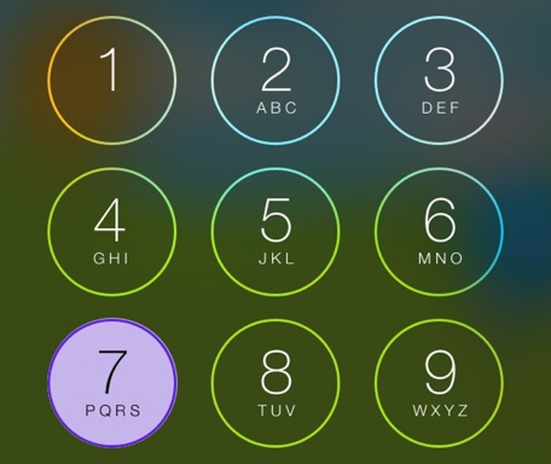
The minimalist tendencies and fine lines of iOS 7 are a little too "less" for the phone app, except in the case of the phone functions. I prefer the larger buttons in some places and actually like the look of the keypad (which allows slivers of your wallpaper through). Still, as with so many of the default iOS interfaces, there's so much white. I even tried going into Accessibility and inverting colors, but that's no good if you are normally sighted as I am. No, I would much rather Apple give us some customization here. Some different phone faces would be neat as well, and surely that's not an engineering feat of any great magnitude.
My favorite feature in the iOS 7 phone app is the pictures by contacts in my Favorites. Apple, more of this is what we need. Lists of tiny type on white backgrounds just reminds us of all the paperwork we thought would be digital by now and all the websites we have yet to read on our Reading List.
Photos
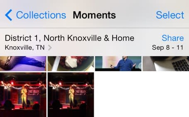
Years, Collections, Moments are all fantastic. Sharing, as I mentioned before, is beefed up with an easy way to send groups of pics through email, to Flickr or a half dozen other ways/places. AirDrop is also heavily featured, and it's lovely. I did love the integration of AirDrop but obviously we'll have to wait until more iOS devices can use it.
My favorite feature in the Photos app is the ability to perform some basic edits on my images. I absolutely loathed opening iPhoto on iOS. If my thumb used a Fitbit, using iPhoto would have shown up as a marathon, I swear it. Having these key tasks right in front of you when you are browsing photos is so essential, I have to wonder why it didn't happen earlier.
It can be a bit jarring, when you're comparing Apple apps to others, to see that the sharing methods used by Apple are often nicer than in other apps. Since the options are available, it's a little weird when a developer doesn't use the icons and buttons provided as part of the OS. For example, the Twitter app uses small rectangles with text in a series for sharing. The touch targets are smaller, there's no iconography to guide you, and you are more limited. It's not an Apple thing, it's just third-party developers rushing to flatten apps without fully utilizing what's new in iOS 7. Here's hoping Apple's examples make a difference with time.
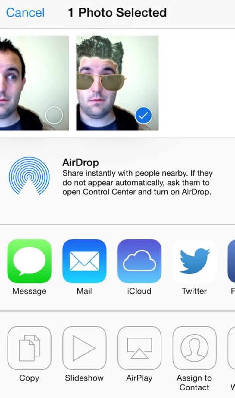
Apple's method above, Twitter below
By the way, if you're looking for how to share a photo to Photo Stream, it's now the iCloud button. That pattern has changed as well, and it's better than before.
Visual effects
The more you use iOS 7, the more stuff like icons flying in makes sense. One of the problems I had in the past was remembering where apps were. Now that I'm zooming in and out of them, I'm retaining that better. Of course, now that Spotlight is even easier to get to (just swipe down on the main part of any home screen), that makes remembering where I put things less of a problem.
With folders, you're basically getting the same experience, but Apple has chosen to show fewer apps in the window at a time. You can swipe within, but when you go to move stuff around and you're not in a folder, for some reason everything is shifted over, so you may see what appears to be an empty folder.
Speaking of weirdness, I did notice a few very brief visual glitches once in a rare while. These didn't add up to much, and I feel like there aren't as many bugs in iOS 7.0 as some had led me to believe. Swiping among screens of apps doesn't hang up as much as it did on iOS 6.
The blurs, the movement, even parallax in isolation don't mean much. When all of these are combined there's a magic there, as they add up to a very fluid experience. One where you feel more connected to where things are. For a pattern-based brain that tends to think in 3D, that's important.
Voice Memos
OK, why are people not dancing in the streets over this? Voice Memos is finally a decent app! There are live waveforms. The buttons are more logical. And someone had the brilliant idea to actually make you name a file before saving it — it's as though this were a Lilliputian Mac app. I love it, but I am prone to recording thoughts at odd hours, which is why I suffered through the earlier version of Voice Memos.
Notes and Reminders
I'll admit I don't use these much. For making notes I tended to use Byword or Drafts. For reminders I set calendar appointments (with Fantastical) or used OmniFocus. While the design alone isn't winning me over (it's interesting that there are still some faint paper textures in these apps), I'm increasingly swayed by Apple's use of iCloud to sync data. Reminders could, in theory, simplify my life. Notes already do what they need, but I will say I am thankful there's a lot less yellow on my screen.
Still, with Notes in particular it again points out how I'm starting to crave options in iOS 7. Look at Pocket or Instapaper's options: text sizes, colors are variable. Apple, give us something here. Not everyone can have a white screen burning a hole in their retinas all day — the fact that this is immuatable in Ive's world almost typifies the Ivory Tower thinking that sometimes dominates Apple's decisions. At least I have Byword, with its pleasing white-on-black text and font options.
Passbook
I mentioned Passbook before but I forgot to mention that I absolutely hate this icon. It barely stands out on almost all of the Apple wallpapers, and the colors mock me when I use my Adventure Time wallpaper. I know a lot of people gripe about its usefulness, but making it Guy Incognito isn't helping.
iTunes Store
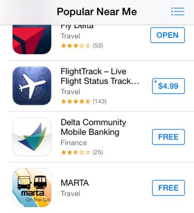
Apps popular near Atlanta's airport
Apps Near Me? I thought it was a gimmick, but now I'm a believer. While I was in New York it found subway and other useful apps, and here in the backwoods it uncovered apps from my local media outlets. Handy!
Patterns old and new
The old number selector was actually nice. You instantly understood it. I'm a little concerned that the newer, more subtle version is more confusing. I get it, but I get it because I'm familiar with the older version.
Speaking of old and new, I am liking the Calendar less over time. I finally found out where list view went (tap the magnifying glass in the corner), but you can no longer add items from that view. Why? It's slightly less annoying to add something to the Calendar, but not by much. I feel like this is an area of neglect — calendars are still just grids and boxes, but I think with Siri out of beta we won't get much innovation here. It's easy enough to add an event with Siri, so this is my old guy brain complaining.
Safari
As I said earlier, I like the new Safari overall. What I'm finding troublesome is bringing the UI chrome back (the upper text entry field and lower buttons). It took me a while to realize that you can tap the top of the screen to bring them back. Still, the buttons appear magically sometimes, so that's nice.
I tend to use a few email apps, depending on my situation (am I doing project work or clearing the decks, for example). I have never enjoyed Apple's mail applications, be they desktop or mobile. I have suffered through them, glorious tap after tap. While iOS 7 doesn't blow my email-hating mind, it's not a step backwards either. Apple's revamped email app is, in a word, serviceable. The nice touch here is that you can swipe a message and see "More" plus "Trash" (or "Archive" for Gmail) and more gives you the Forward, Flag, etc. options. Oh, and you can move the email to Junk! Or wherever, really. That's handy.
Notification Center
I didn't use this one much because one barfed-up list of notifications is generally noise for me. The new Today view is slightly more useful than info-barf, so there's some progress. I would still like customization here beyond a few toggles. Once upon a time Apple made Dashboard Widgets, and they were good. How I would love to see a similar tech implemented here. Think of them as mini-apps. Web clippings would be cool too, but I'm not holding my breath.
One question: Where's the weather? This appeared for some in previous builds (I am told), and the notice at the bottom says "Weather and stocks provided by Yahoo" but there's no toggle and no weather in Notification Center. Even stranger is that some are seeing weather, but I'm not. Luckily I find Yahoo's weather app to be superior and it's on my home screen. No matter what I did, I couldn't get weather to appear, even though Apple's own Weather app works fine and looks better than before. [Update: Weather appeared, magically. Likely a server error on Yahoo's end or something wacky in location services. False alarm, I guess.]
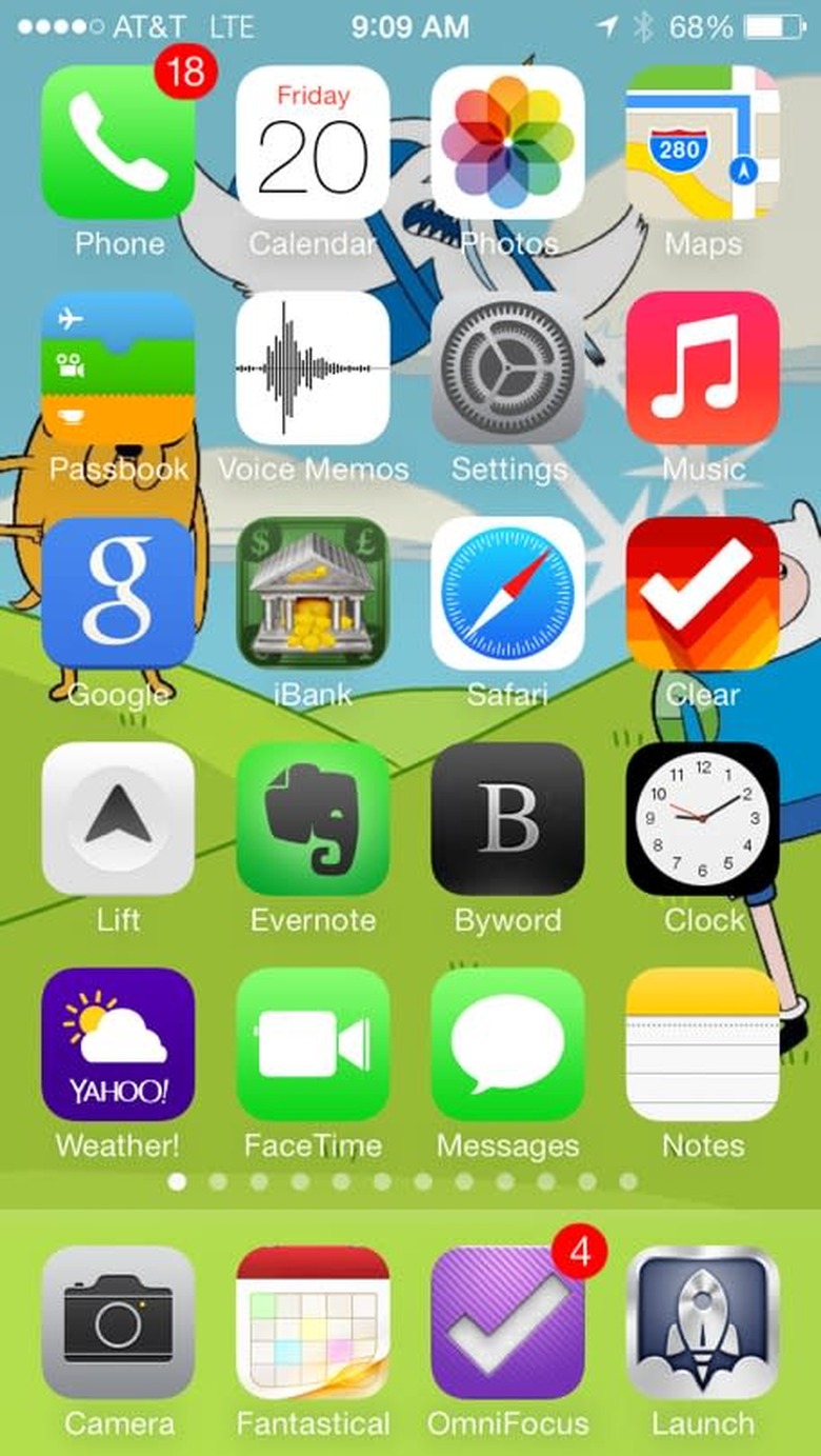
Fitting right in
Speaking of my home screen, posted below, it's becoming painfully obvious which apps are falling into line and which aren't. Older icons begin to look gaudy by comparison, and that's saying something for as horrible as that Safari icon looks.
Swiping up to get to Control Center was the easiest new pattern to create. I love it, and still say it's one of the best new features of iOS 7.
But beyond the skin-deep app updates, I am sincerely looking forward to apps with more iOS 7-only frameworks built in. From M7 applications to apps taking advantage of Apple's new hardware, we are really just seeing the glimmer of dawn here.
One more thing...
Colors. They are flat, they are bold and they are everywhere in iOS 7 where there isn't a sea of whitespace. What's driving me a little crazy right now, however, after using iOS 7 for a couple of days, is that the colors are making me want an iPhone 5c. I don't need one. I can't afford one. But doggone it if 7's colors don't match the scheme of the 5c lineup so perfectly. I bought my daughter a 5c in pink (she loves it) and it's not a jealousy thing, I swear. It's the genius of Apple's hardware, software, design and engineering teams all working together. The 5c seems to be a harmonious blend of hardware and software. While the 5s feels like the elder of the tribe, the 5c is a playful pup, much like iOS 7.
I feel like Apple could have been even more whimsical with iOS 7, but it showed restraint, and I'm glad. As we saw in early iterations of OS X, too much "effect" in an OS can be distracting. Sure, I'd like to have some options in iOS 7, maybe even turn off the zooming one day, but Apple could have made it worse. Instead, iOS 7 is better in almost every way. I don't see myself missing iOS 6 at all, and I'm going to install it on my iPad this weekend.