OS X Yosemite preview: the Mac gets a major makeover

The last time Apple released a new version of OS X, we came away feeling a little... underwhelmed. Don't get us wrong: We'll never say no to a free software upgrade. But despite a handful of new apps and features, last year's Mavericks release still felt like the same old OS X. You can't say that about Yosemite, though. The company's next-gen operating system ushers in the Mac's biggest makeover in years, with a flat, streamlined look inspired by iOS 7. Yosemite works more like iOS too, particularly the part where you can route phone calls to your desktop. You'll also enjoy improved Spotlight search, with results that include news, local restaurant listings, Wikipedia pages, movie times and quick unit conversions. Safari works much the same way, and includes some enhanced privacy settings, too. Right now, Yosemite isn't quite finished -- it won't arrive until sometime this fall -- but you can sign up for the public beta, which will open tomorrow for the first million people who enlist. In the meantime, I've been using an early build for a week now. Here's a quick preview for those of you who can't wait till tomorrow.
Look and feel
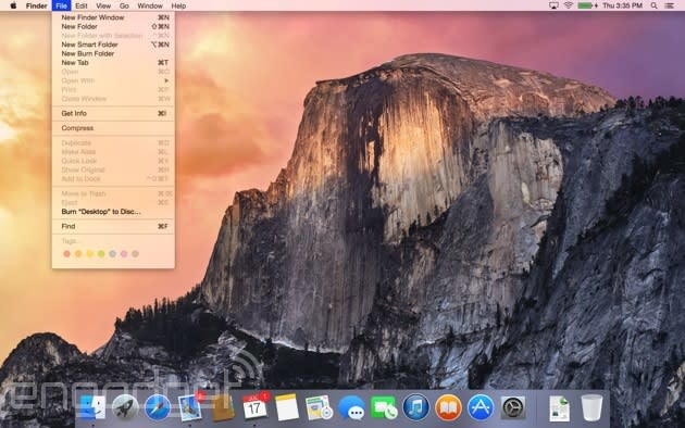
You'll notice it as soon as you restart your machine: OS X Yosemite takes many, many cues from iOS. There's the dock, for starters, which features redesigned, flatter-looking icons for all of Apple's built-in apps. The menu bar now sits flat with the rest of the desktop -- not that it ever really got in the way. Throughout, too, Apple has moved to a new, less condensed font, and it's also adopted some of the same icons used in iOS (check out the "share" button in Finder, for example). Even the "stoplights" for closing, minimizing and maximizing windows are flat -- no 3D shading here. Oh, speaking of the stoplights, the green button now allows you to bring windows to full-screen. You should get used to it pretty quickly.
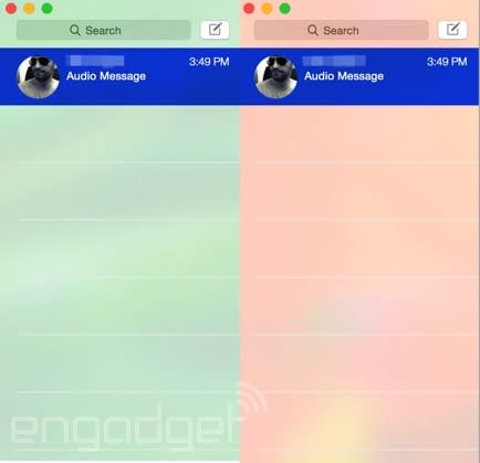
Open up Finder -- or any app, really -- and you'll see the left-hand pane is translucent, and will turn to the color of your wallpaper or whatever files you happen to have open in the background (see above for an example). The menu bar inside apps is translucent too, and it's also significantly narrower, allowing content to stand front and center. If I'm honest, all those translucent panels are just a visual flourish. A cool flourish, but a flourish nonetheless. Yes, the slightly see-through bits up top remind you there's more to see if you keep scrolling, but you could have figured that out anyway.
Not that I'm complaining about a fresh coat of paint. This new release feels modern -- so much so that it makes my old Mavericks system feel shamefully dated. What's nice is that even as you start installing third-party apps, the OS continues to look clean. Programs like Firefox have those flattened stoplights, for instance, though they don't currently show the translucent panes. At the same time, as current as the OS feels, it's still easy to find your way around; no one, and I mean no one, will feel lost inside OS X. Mail looks like Mail, and Safari looks like Safari. They just look better.
Spotlight
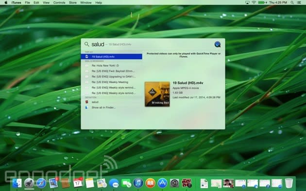
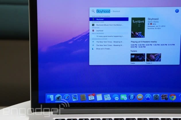
OK, I spoke too soon: There is one thing that works differently, and that's Spotlight search. Whereas before, your search results appeared in drop-down form in the upper-right corner of the screen, clicking the search button now brings up a big ol' search bar in the middle of the desktop. But it's not just the placement of the search results that have changed; they've gotten quite a bit smarter, too. From here, you can convert units and measurements, preview Wikipedia entries and news stories, and pull up friends' contact information, complete with phone numbers, email addresses and websites you can click on from the search bar.
Apps are included in search results too, as are things you may have purchased from iTunes. You can also pull up more personalized information, such as local restaurant listings and movie times, but you'll need to have "Spotlight Suggestions" checked off under location settings in order for that to work. In cases where the keyword is a little ambiguous -- "numbers," for example -- you'll see any Numbers spreadsheets you have saved, as well as a prompt to open the Numbers app itself. Ditto for "apes" -- I'll get movie times for Dawn of the Planet of the Apes, as well as any emails where someone was talking about apes (and yes, I do have some).
All told, it feels a little like Smart Search in Windows 8.1, though there are things Apple can do that Microsoft can't, and vice versa (Windows, for instance, lets you go to specific settings from the search results). To be clear, iOS 8 will show the same kind of Spotlight search results as the Mac, but what I particularly like about the desktop version is how self-contained it is -- you can pull up search results without having to open a new window. Of course, if you click on a news story, Safari will open a new tab, but that makes sense -- you can't do everything in the search interface, after all.
Safari
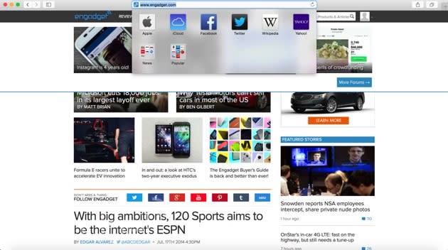
It's more of the same in Safari: The newest version of Apple's built-in web browser shows previews of search results, with snippets of things like Wikipedia pages. The favorites bar, too, reminds me of the new Spotlight search -- just click on the URL and you'll see a pop-up window beneath showing your bookmarked sites. It's nice because on the one hand, your favorites no longer take up unnecessary space in the browser, but they're there when you need them, and you don't have to navigate away from your current page to see the list.
In addition, Apple redesigned its "tabs view," where you'll see a mixture of tabs from both your Mac and any iDevices you own (obviously, you need to be signed into iCloud on every device for this to work). From there, you can close tabs remotely, so long as the remote device is running either Yosemite or iOS 8 (if all you want to do is open remote tabs, you just need iOS 6 or higher, or Mavericks on the desktops side). The tabs window also stacks pages from the same site, which helps keep things tidy. Meanwhile, Safari's "share" button now shows recent shares. It's also "extensible," which is to say you can add extensions to share via more apps, even if they aren't part of the default sharing menu.
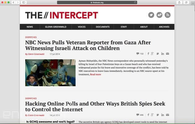
The latest build of Safari also includes a couple important nods to privacy. DuckDuckGo, the do-not-track search engine, is now one of four default search options, with Google, Yahoo and Bing being the other three. Additionally, you can now open private browsing in a new window, even if you already started a regular browsing session in a different window. (In Mavericks, once you turn on private browsing, you're turning it on for every subsequent window and tab you open.) As you open new tabs in that private window, they'll be private by default. The private browsing window is also easy to tell apart, with a "private browsing enabled" banner and a lock symbol in the address bar (check out the screenshot above to see what I mean).
Messages
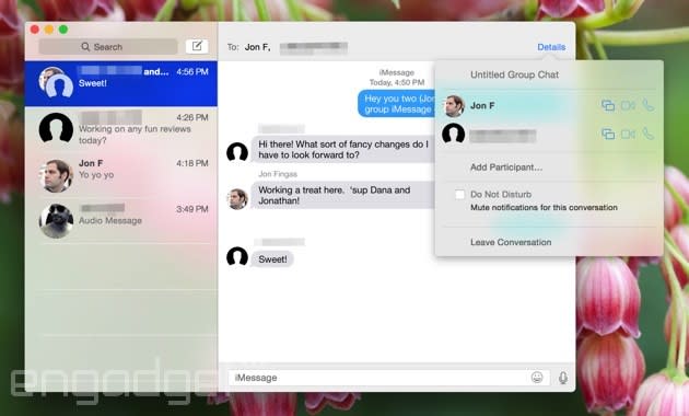
More than any other app mentioned here, Messages is the one that now feels most like iOS. With this new release, you can mute or leave conversations, or add someone to an existing group chat -- all features you'll find on iOS 8 when it comes out. Additionally, if your texting partner is using iOS 8 and has elected to share their location, you can view a map inside the Messages app that shows where your friend is -- a handy feature if you're trying to meet up in real life. Also, you'll now see a Camera Roll-type stream on the right side, showing all the photos and videos you and your friends may have exchanged over the course of the thread. Naturally, that includes shots from both Macs and iOS devices.
If you ask me, the ability to mute or leave a conversation both seem like no-brainer features, and I'm glad Apple's adding them to both OS X and iOS. The "add participant" feature is particularly convenient -- until now, if you wanted to bring somebody to the conversation, you had to start a whole new thread from scratch. The only catch here is that you need at least three people in the conversation to add another. That means if you and Joe are planning a Sunday brunch and decide Jane is invited too, you won't have the option to just loop her in. Needless to say, I hope Apple rethinks the "three-person" requirement between now and the fall.
Finally, Apple added a "Soundbites" feature that lets you send short, pre-recorded audio messages in a normal texting thread. (This feature is also coming to iOS 8, though you don't need an iOS 8 or Yosemite device to receive these audio clips.) It's all very self-explanatory, really: Just click the microphone button and start talking. And take your time. The limit for Yosemite devices is 100MB, which amounts to a lot of talking -- several hours, according to Apple. Thankfully, you'll have a chance to review your message before sending -- in that sense, it's more akin to a voice mailbox greeting than an actual voicemail. Even after you send it, you can either hit "keep" or let it expire after two minutes, à la Snapchat. Meanwhile, the sender can also choose to keep the message, or allow it to self-destruct two minutes after viewing it.
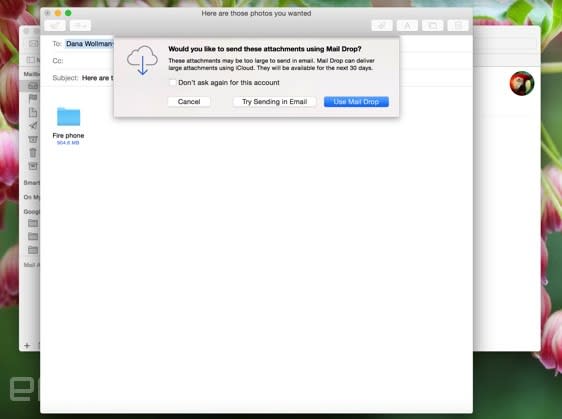
The built-in Mail app has seen a couple changes too, even though the inbox itself looks the same as ever. The first of these features is Mail Drop, which uploads large attachments to iCloud instead of Gmail, or whatever your mail service is. If your recipient is using OS X Yosemite too, they'll just download the attachment in Mail, as they normally would. If they're not on Yosemite, they'll instead get a download link that will work for up to 30 days. Aside from the ability to skirt attachment-size limits, the nice thing about Mail Drop is that attachments don't count against your iCloud storage cap.
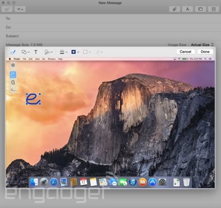
The second new feature is called Markup, which gives you an easy way to -- wait for it -- mark up attachments from inside the Mail app. Just hover over a PDF or image after you insert it into your draft email, and click on the "Markup" option that'll appear over on the right side. From there, you can add shapes and text, complete with formatting options like text colors and different fonts. You can also sign documents if you like by either signing with your finger, or using your Mac's iSight camera to photograph your signature on a piece of paper.
Lastly, you can draw on the document, at which point Markup will attempt to smooth out your scribblings if you happen to make a shape it recognizes. If you dash out a crooked arrow sign, for instance, Apple will give you the option of swapping in a straight, more professional-looking one instead (you can also keep the crooked one, if you wish).
Calendar and Notification Center
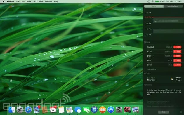
It's been about two years since Apple added the Notification Center to OS X. Fundamentally, it works the same way it always did, with pop-ups appearing in the upper-right-hand corner of the screen when you receive a new email, have an upcoming calendar appointment, et cetera. The difference here is that in addition to the usual "Notifications" column, there's now a "Today" view that combines any and all information that might be relevant to you throughout your day: reminders, the local weather, stock prices, a world clock and a summary of your calendar appointments. Stocks and weather, in particular, can sync with iOS 8, so your stock list, say, will be consistent across your Mac and iPhone. Unfortunately, none of my devices are currently running iOS 8 (it's not out yet), so I wasn't able to test that feature. Soon, hopefully.
In short, the new "Today" view feels like an updated version of the ol' Mac dashboard, with some of the classic widgets in one place. Of course, the dashboard is still there if you want it -- old habits do die hard, after all. Personally, though, I don't see why you'd use the dashboard if you didn't have to; it's much easier to just open the Notification Center and take in lots of information at once.
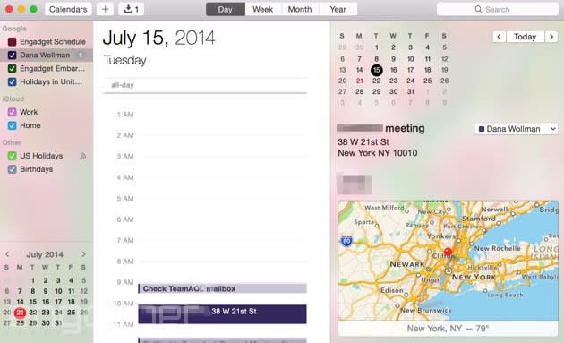
Meanwhile, the Calendar app also has a redesigned day view, with an inline, full-height inspection pane sitting alongside a list of all your appointments for the day. From there, you can see lots of details pertaining to a given event, such as location, the weather forecast, a map, a list of attendees and a miniature month calendar. What can I say? It looks nice. The only thing I would add is the ability to zoom in on the map without having to open the standalone Maps application.
Integration with iOS
I saved this section for last because iOS 8 isn't out yet, which means I can't actually test any of the features that tie into OS X Yosemite. That's a shame, because iOS integration really is the big story here, even more than those flat new icons. I'll of course revisit this when I eventually write my full Yosemite review, but for now, all I can really do is explain what these iOS features are and how they work.
And explain I shall. Perhaps the flashiest of these features, as I said earlier, is the ability to field calls from your desktop. As on an iPhone, you can accept or reject the call, or set a reminder for five minutes, 15 minutes or an hour. To make this happen, just sign into iCloud on both devices, and make sure both your Mac and iPhone are connected to the same WiFi network. Meanwhile, your Mac can automatically tether with your iPhone, so long as they're within a close enough distance. Also, when you do tether, you'll see your phone's battery life and signal strength in the menu bar. Finally, the Messages app will now show both iMessages as well as SMS texts from non-iOS users. What's more, you can send SMS messages through your Mac, with the texts ultimately routing through your phone (again you need to be signed into iCloud on both devices, and be on the same WiFi network).
So far, I've mostly enumerated features that let you control your phone from your Mac -- texting, receiving calls, et cetera. But Apple has also added some features to OS X that make it easier to transfer files between devices. Perhaps the biggest development is iCloud Drive, which allows you to store your files on iCloud and then access them on any device. Meanwhile, a new "handoff" feature means that whatever you're doing on one device, it will show up on the other -- open tabs, documents in progress, et cetera. Finally, your friends on iOS can send you things through AirDrop even when you don't have Finder open.
Wrap-up
For anyone who thought OS X was getting stale, that it was evolving a little too gradually, you'll definitely want to check out Yosemite: It ushers in a new, iOS-inspired design, along with some new, iOS-like features. In my week of testing, I've found the updated look to be more visually pleasing than the previous version, yet still easy to navigate. The new features are generally welcome too, though some admittedly feel more granular than others. Of course, the most important updates to the OS generally have to do with iOS integration -- never have Macs and iPhones worked in lockstep the way they will here.
The thing is, those are precisely the features I didn't get to test out: With iOS 8 reserved just for developers right now, it's impossible to say how well these features work in real-world use. We'll be back in the fall with a full review, but for now, this latest OS update looks promising, especially for people who also own iPhones or iPads (and that's a lot of you, I'm guessing). Don't take my word for it, though: Join the public beta program so you can get hands-on yourself.


