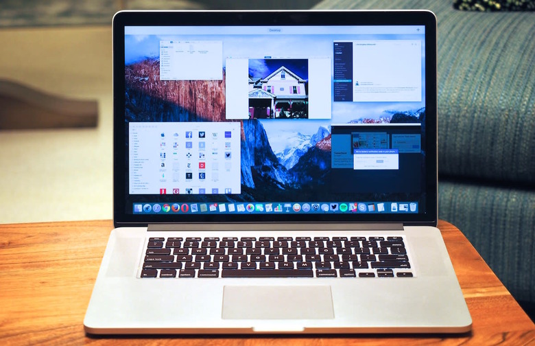
OS X El Capitan review: A modest update, with some welcome changes
When I first previewed OS X El Capitan, Apple's latest Mac operating system, the software wasn't quite finished, and it also wasn't available to anybody without a developer account (that's most people). Since then, though, Apple has released El Capitan in a public beta program, so that anyone with the guts to install non-final software could try it out. Tomorrow, the OS will be available to the general public, and the version that ships will be virtually identical to the Gold Master build that early adopters are already using. That means for some of you, then, exactly nothing I've written in the following review will come as a surprise. But for folks who are perhaps more skittish about downloading a work in progress to use as their daily driver, I've endeavored to revisit El Capitan, taking care to clarify what's been added since my initial preview. Suffice to say, my thoughts remains the same: While this is clearly not as big a release as last year's update, all of the changes here are welcome, and a few were even overdue.
Getting started
Odds are your computer meets the system requirements for El Capitan. (If it doesn't, we need to talk about why you're suffering in silence with such slow hardware.) To install the update, you'll need a machine with at least 2GB of RAM, 8GB of available storage and an existing software build of OS X 10.6.8 or higher. (That's Snow Leopard, last updated in 2011.) You'll also need some free time, because depending on your internet connection, the 6GB file could take a while to download and install.
In addition to the new 12-inch MacBook, El Capitan runs on MacBooks from at least late 2008, MacBook Pros from mid- to late 2007, MacBook Airs from late 2008, Mac Minis from early 2009, iMacs from mid-2007, Mac Pros from early 2008 and Xserve servers from early 2009. As ever, even if you have qualifying hardware, not all features will work, depending on how old your machine is.
Same look and feel (almost)
Once you're in, you'll notice that very little has changed, visually. El Capitan has the minimalist, flat aesthetic introduced in Yosemite, with flat, 2D icons and semi-see-through menu bars. Apple did introduce slightly different system fonts for English- and Chinese-speaking users, but for my part, I didn't notice until someone pointed it out.
There's also a cute new feature called Find My Cursor that is exactly what it sounds like: It helps you find your misplaced cursor if you can't see it on the screen. Just shake your finger back and forth on the trackpad and you'll see the cursor become large enough that it'd be hard to miss.
Multitasking
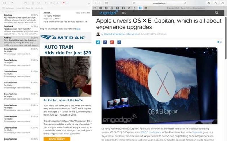
All told, the few visual changes there are all have to do with multitasking. Chief among them is Split View, which allows you to run two apps side by side at full screen. The implementation is similar to what Windows users have been enjoying for years, with the ability to use a slider running down the middle of the screen make one window either wider or narrower. From there, you can interact with each app independently — say, zoom the text on one, but not the other. You can also hover with the cursor and start scrolling in either window, without having to click on the one you want to use. It's a welcome, perhaps overdue, feature, and one I quickly made good use of: Even as I drafted this review, I kept TextEdit open on one side of the screen, with Safari on the other, allowing me to do research as I wrote.
There are two ways you can enter Split View. One is to click and hold the green stoplight button, the one typically used for going full-screen. It's easy once you know to do it, but as I said in my preview, I'm not sure this will feel intuitive to first-time El Capitan users who haven't read up on the feature (not necessarily Engadget readers, mind you, but more casual users out there). For what it's worth, Microsoft's implementation — clicking and dragging a window toward the edge of the screen — still feels more intuitive, even if the end result is basically the same.
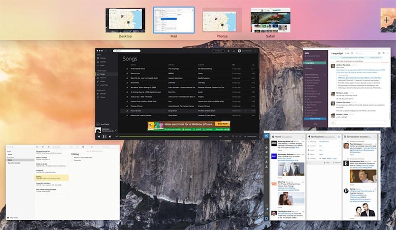
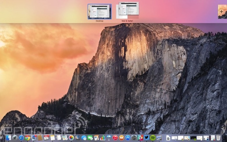
The other option is to drag a window on top of another window in the Spaces Bar in Mission Control. Speaking of the sort, the ability to drag anything into the Spaces Bar is an altogether new feature in El Capitan. So, I can not only create a Split View screen that way, but also drag any window up there to create an additional desktop. In any case, because each full-screen Split View layout is its own desktop, you can easily switch to a different desktop using the usual trackpad gestures: either by swiping back and forth with three fingers, or swiping up with four fingers to get to Mission Control.
One more note on Mission Control: It works the same way as before, which is to say, you swipe up with four fingers to get a bird's eye view of everything you have open. Now, though, the thumbnails for each window are flat, and although they're arranged to match where they are on the desktop, these previews no longer overlap with each other, making them easier to find. It's a nice touch, although I confess I didn't find the old layout with the stacked windows particularly confusing.
Spotlight
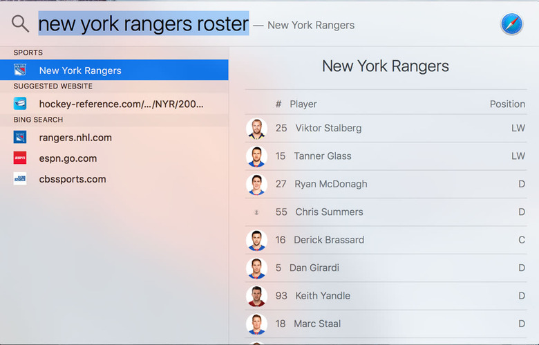
OS X's built-in Spotlight search received a major overhaul in last year's Yosemite release, gaining the ability to display Wikipedia previews, web search results, movie times and iTunes purchases. Starting last year, too, Spotlight has been redesigned as a search bar that sits in the middle of the screen, with all the search results contained within that box. This year, Spotlight for both OS X and iOS 9 has gotten a little smarter: It can also serve up results for a few more topics, including stocks, sports, transit and web video. In addition, Spotlight now responds to natural language commands, like "apps I installed this week" or "documents I edited in September." Lastly, the search bar itself is now movable, as well as resizable.
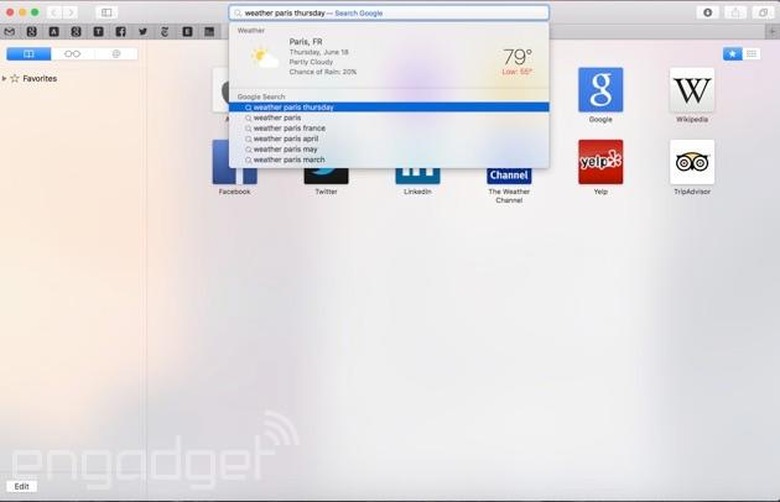
To give you some usage examples, if I type in "AAPL," I'll see Apple's own stock ticker symbol pop up, along with the most recent price and stats like the opening price, trading volume and 52-week high and low. For weather forecasts, you can type in phrases like "weather," "weather Boston" or "weather Boston Tuesday." Web video results come from sites like YouTube and Vimeo. It's a handy feature — if you know what clip you're looking for; because you only get one to hit for videos, it's better if you know the title of the video you want to see, instead of searching by topic. Interestingly, though, if the web video you're searching for is actually a TV show, you'll instead see Spotlight results for iTunes and whatever website you can stream it on — say, Hulu or AMC.com.
Additionally, you can use Spotlight to access system settings. So, if I type "sound output," the top hit will be "Sound" in system preferences. And, while the preview version let you look up sports rosters and schedules, this feature at first only worked with NBA and Major League Baseball teams. Now it also works with the National Hockey League, National Football League, college football, Women's National Basketball, men's and women's college basketball, the English Premier League and other European soccer teams. So good news for you, sports lovers.
Apps
Safari
Apple's newest browser, Safari 9, brings a few useful features, some more important than others. Starting with the bigger stuff, Safari adds pinned sites. If you've used a similar feature in other browsers like Chrome, the concept here should seem familiar: When you pin a tab, it shrinks down; it's always open, with no "X" button allowing you to close it. When you launch Safari, your tabs will always be there, and in the same order (unless you choose to rearrange them). When you click a link in a pinned tab, that link opens in a new (non-pinned tab). So if your pinned tab is Facebook, you never have to navigate back to the home page after you click on, say, an Engadget story.
In my case, there are no fewer than nine tabs I look at multiple times a day, seven of which are related to my job as an Engadget editor. To the extent that the number of open tabs on my desktop reflects the amount of work I have to do, it's convenient to be able to shrink down some of those tabs to help save space (and make my workload seem less intimidating in the process). The only downside with pinned tabs is that you don't see in-browser notifications for sites like Facebook. In fact, during my testing, there was a point where I had double Facebook tabs open: the pinned one, and then another to keep up with an ongoing Facebook Messenger conversation.
Another handy feature is the ability to not just find, but also silence noisy tabs. I make that distinction because there are other browsers, like Chrome, that also show you were loud autoplaying videos are coming from, but don't give you a fast and easy way of shutting them up. Here, you can tap the speakerphone icon in the tab to quickly mute it. From there, you can right-click on the tab to see others that might be playing sound, and then either jump to those, or choose to mute them.
Wrapping up, Safari 9 also has Spotlight suggestions, to match the system-level Spotlight search. So, you can get previews of stock and weather information here too, for example. Safari also now supports AirPlay video, which means you can play video from a webpage to your Apple TV, without the webpage taking over your desktop. Lastly, there are new fonts and themes in Reader mode, including "Sepia," "Gray" and "Night."
Photos
Back in February, before Apple was even talking about OS X El Capitan to the public, the company released a major update to iPhoto. The update was so big, in fact, that the app took on a new name — Photos — and gained enough editing features that Apple decided it would replace Aperture. Underpinning this new app is iCloud Photo Library, which allows you to access your photos on any other device where you're signed in with your Apple ID, whether it be a Mac, iPhone or iPad. Even in Yosemite, the version of OS X that came out last year, I've been using the Photos app to access my iPhone Camera Roll on my desktop, which I can then use to upload to Facebook, attach to emails, send as text messages and what have you. An optional setting (disabled by default) lets you pull in photos from other sources as well, such as Instagram and Layout.
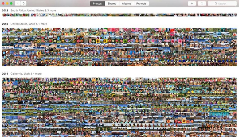
The app itself has a whole new look, with sorting options similar to Photos on iOS. That is to say, by default photos are presented according to the occasion ("moment"), but if you zoom out on your trackpad, you can take a wider view and instead sort pictures by week, month or year. Zoom out as far as you can possibly go and you'll see your photos arranged in a colorful mosaic of tiny thumbnails, which you can preview by holding down the trackpad and scrubbing the cursor over each photo.
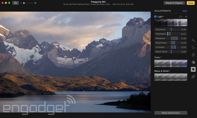
As far as editing tools, there are the basics, for starters: cropping, auto-enhancing, straightening, rotating and a suite of Instagram-like filters. You can also make batch edits, including adding a location or changing metadata. Dig deeper and you'll find some more advanced options, including sliders for light, color and black-and-white. From there, you can use a drop-down arrow to see even more sliders for all the different things that'll factor into that final calculation. With black-and-white, for instance, you get granular control over the intensity, neutrals, tone and grain. I suspect these features are mostly there to appease advanced users who otherwise would have mourned the loss of Aperture, but there's also nothing to stop a beginner from playing around with these sliders to better educate themselves. If at any point you make a mistake, you can double-click a slider to return it to its default values. There's also a "Revert to Original" button if you'd rather go back to square one.
For the most part, Photos now looks a lot like it did in February, but there are a couple new features making their debut this week. Chief among them is support for Live Photos, which Apple only unveiled to the world earlier this month when it announced the iPhone 6s and 6s Plus. For those not in the know, Live Photos are pictures with a little extra: a few seconds of video and audio recording on either end of the still photo.
Finally, this new build of Photos brings support for third-party extensions that allow you to take advantage of other photo apps' editing tools. In addition to the time-saving aspect — the fact that you don't have to open a third-party app in addition to Photos — this move could appease veteran Aperture users, who would rather have more tools than less. While Apple promised third-party extensions when it first unveiled the new Photos app earlier this year, extensions won't actually be available to download until tomorrow. Extensions can be downloaded from the Mac App Store, either bundled with an app or distributed on their own. Although some developers, like the folks behind Pixelmator, have gotten a head start, most developers are only just getting the chance to access these tools for the first time. So, we should be seeing more extensions hit the App Store as the season wears on. Personally, as an Engadget editor posting lots of hands-on photos, I'd really like to see one for batch-watermarking.
Maps
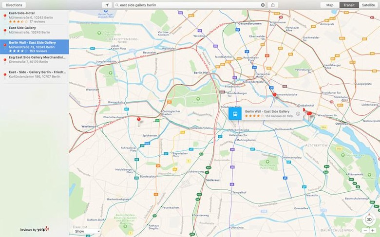
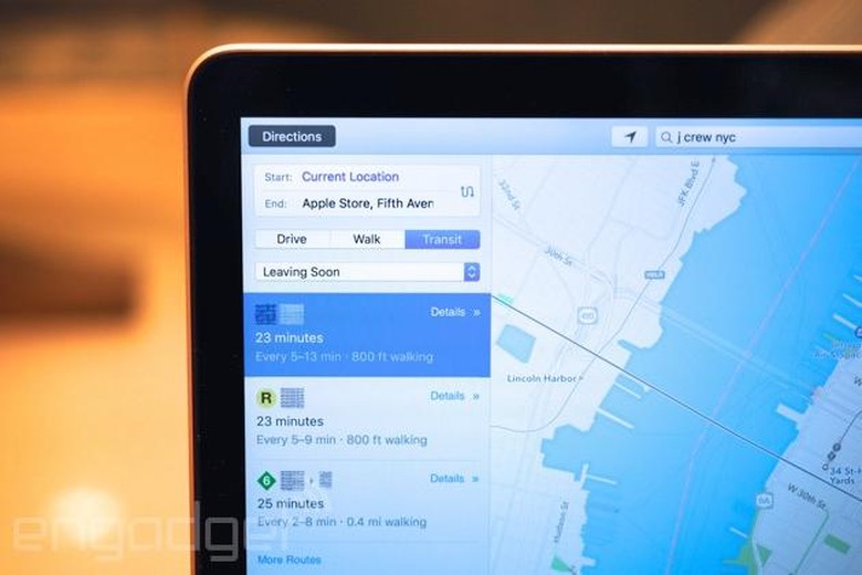
Apple's Maps app brings one improvement, and that's the addition of built-in transit directions, including subways, buses, ferries and commuter rail. So far, Apple is supporting the following cities: Baltimore, Berlin, Chicago, London, Mexico City, New York, Philadelphia, the San Francisco Bay Area, Toronto, DC and over 300 in China. The technology is built on HopStop, which Apple acquired two years ago, and is shutting down next month. As on HopStop itself, you can designate when you'd like to leave or arrive, and Maps will plan your route accordingly.
In addition to step-by-step directions (which you can also now view on the Apple Watch, by the way), you'll see color-coded maps designed to match the color of whatever train line you happen to be taking. In New York, for instance, if you're taking the Q to the 2, that means you'll see a yellow line stretching across the screen, which eventually turns into a red line when you transfer to the 2. If you're passing through a station with multiple entrances and exits, the app will tell you which one to go through, for efficiency's sake. Lastly, Maps includes so-called station place cards that list all the transit lines and schedules for a given hub.
Notes
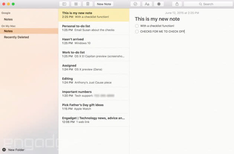
The Notes app in OS X has been updated to match the new Notes application in iOS 9. That means you can format your to-do lists with checklists, and also drag in various multimedia elements, including photos, video, PDFs, audio clips, map locations and iWork documents. Once you do that, you can click on a separate "attachments" view that lets you home in on the individual files you've added to notes over time. Lastly, you can share to Notes from most of Apple's built-in apps, like Maps and Safari. Third-party developers will be able to build this option into their apps as well.
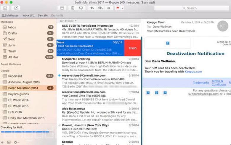
Like the rest of OS X El Capitan, the Mail app brings a series of modest changes that add up to a nice, although maybe not groundbreaking, update. When using the program at full-screen, you can jump between multiple tabs for various email drafts you might have in progress. When you minimize the tabs to focus on your inbox, the tabs live at the bottom of the screen, not unlike what happens to your drafts in Gmail. Speaking of the inbox, the new Mail app borrows some touch gestures from iOS, including swiping left on the trackpad to delete, and swiping right to mark as unread. Also in the inbox, the search field responds to natural language requests, similar to the way Spotlight search handles queries. Inside your messages, Apple can also detect either new people or potential new events, and prompt you to add either a new contact or calendar entry. Finally, Apple promises generally faster performance, with messages appearing up to twice as fast.
Performance
Apple promises generally faster performance in El Capitan, extending to everything from app-launch times to graphics-intensive apps to everyday navigation around the OS. Part of this is thanks to the addition of the Metal graphics engine, already used in iOS, which Apple says can improve PDF rendering times by 50 percent and webpage rendering by 40 percent. Other stats: Apple claims Photos and other apps open up to 40 percent faster, that switching apps is up to twice as fast, and that opening a PDF in Preview is up to four times quicker. That's not to mention the email-loading I just mentioned, with Apple claiming messages will appear up to twice as fast as they did in Yosemite.
All told, the performance has, in my experience, been very snappy. Apps are quick to go in and out of full-screen; in and out of Split View. And when I am using Split View, by the way, my MacBook Pro responds briskly when I use three fingers to swipe between desktops. The only hiccups I did see weren't specific to El Capitan. Both Google Maps and Engadget's publishing system load slowly in the browser, with some tiling, but that was true across browsers, not just in Safari. As far as maps go, I got used to using the built-in Maps app, which is much faster and more responsive to pinching and zooming. I would love to see a browser maps app respond just as quickly, but so far I haven't found it.
Speaking of browser performance, by the way, I ran some benchmarks across different browsers on both El Capitan and last year's Yosemite release. As you can see, pretty much every major Mac browser performs better with the updated software; not just Safari.
| SunSpider v.1.0.2 (ms)* | Google Octane** | Mozilla Kraken (ms)* | JetStream 1.1** | |
|---|---|---|---|---|
| Windows Edge*** | 92.73 |
24,382 |
1,328.9 |
133.85 |
| Internet Explorer*** | 98.4 |
14,080 |
2,302.97 |
N/A |
| Chrome 45 (Yosemite) | 222.5 | 24,690 | 1,270.6 | 140.42 |
| Chrome 45 (El Capitan) | 154.0 | 30,924 | 982.7 | 188.9 |
| Firefox 41 (Yosemite) | 208.0 | 23,511 | 1,203.9 | 140.12 |
| Firefox 41 (El Capitan) | 160.6 | 29,068 | 953.4 | 180.22 |
| Opera 32 (Yosemite) | 229.5 | 22,874 | 1,354.7 | 129.87 |
| Opera 32 (El Capitan) | 177.8 | 30,499 | 997.4 | 184.52 |
| Safari 8 (Yosemite) | 179.6 | 20,398 | 2,188.6 | 139.25 |
| Safari 9 (El Capitan) | 126.1 | 30,430 | 1,208.8 | 202.21 |
|
*SunSpider and Kraken: Lower numbers are better. ** Octane and JetStream: Higher numbers are better. *** Engadget ran these tests on a Dell XPS 13 laptop. |
||||
Wrap-up
As I wrote this review, my curious coworkers kept asking what I thought of OS X El Capitan. It's okay, I said. I like it. But that's mostly because I also liked the previous version, Yosemite. This newest upgrade is a modest one, bringing lots of small improvements to last year's release. With the possible exception of Split View multitasking, I'd be hard-pressed to choose a standout feature that really defines the OS. So, if you weren't impressed with Yosemite's flat design and tight integration with iOS, you won't find much here to get excited about, especially if you're considering making the switch from Windows, which has had split-screen multitasking for years now. If you're a loyal Mac user, though, and appreciated the big-picture changes that came with Yosemite, you'll likely welcome the various tweaks here too, especially those performance gains. Can't ever have too much speed.
