Sky's redesigned Now TV app hits the big screen ahead of new box


Sky might be gearing up to launch a new Now TV box next month, but that doesn't mean it's ready to forget about all the users of its current-generation streaming puck. Preparing for the arrival of its new Roku-inspired hardware, Sky has today released a fully redesigned Now TV app for its original Now TV boxes. If you're a regular user of the Now TV mobile apps, you'll recognise a host of familiar UI elements that've made the transition to the TV screen. And if you've only poked at the Now TV app from the comfort of your sofa, then you're in for an even bigger treat.
Before, the Now TV app for Sky's inexpensive streaming puck was built around horizontal carousels that didn't show a great deal of content at any one time. The new, grid-based layout floating over a black background is much easier on the eye, and lets you see more content at a glance, as well as extra info like synopses in an adjacent panel. The main menu is now hidden off to the left of the screen, rather than being buried beneath content cards in a carousel of its own. Moving from a linear UI to a gridded one is the main visual change, but Sky's slipped some new features into the updated app, too.
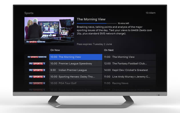
For starters, genre-based movie searches are said to be much improved, and if you're after a new series to binge-watch, each show now has a complete list of seasons and episodes available through Now TV. One of the biggest new features is undoubtedly the live TV EPG. Previously, all you were able to see was a string of the Sky channels your Now TV subscription entitled you to view, and what was currently being shown on those channels. In the updated app, however, you're faced with an EPG-style list that gives you a brief summary of what's on now, and what's on next. But, enough from us -- your Now TV box will almost certainly have updated automatically by now, so you're free to have a poke around the new interface and features for yourself.
