LinkedIn mercifully redesigns its cluttered homepage
It looks like LinkedIn will soon be much easier to navigate.
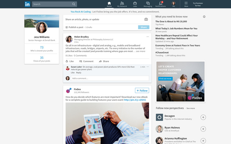
LinkedIn, the professional network that everyone loves to hate, is rolling out a big redesign on the web. And as is often the case with social networks these days, LinkedIn appears to be taking serious "inspiration" from another company — in this case, Facebook. (Just take a look at that screenshot!) Regardless of where this inspiration came from, it's long overdue. LinkedIn has definite utility, but it also has a long history of being obtuse, cluttered and just plain difficult to us (and the less said about LinkedIn's email practices, the better).
That's changing with this redesign, which LinkedIn says is the biggest desktop redesign in the service's history — and probably the biggest change to LinkedIn since Microsoft bought it last summer. The main screen is still a feed of content and updates from people in your network, but it looks like navigation has been significantly streamlined. The top navigation bar features seven self-explanatory sections: home, messaging, jobs, notifications, me (your profile), my network and search. Below that navigation bar, posts from your network are surfaced immediately — it's a lot nicer than the clutter that fills up the old LinkedIn homepage. You can still drop a status update, share an article or write something longer right from that home feed, but the interface element is simpler and takes up less screen real estate.
Messaging has also been revamped — after turning the old inbox into a messaging app meant for quicker back-and-forth conversations, LinkedIn has moved it into its own UI element that floats over your home feed, much like Facebook Messenger or Google Hangouts.
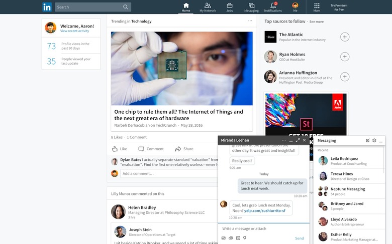
LinkedIn says it has also revamped how it serves posts to your home feed, using a combo of human-curated and algorithmic suggestions. As with similar feeds (like on Facebook). The new feed is also theoretically smarter about showing you trending topics and news from industries you care about, but without actually seeing it in action it's hard to say how different things will be here.
Search will also soon include the ability to look through posts as well as just people, companies, schools and groups. The service is also now offering better profile suggestions to get users to fill out as much of their personal info as possible. Lastly, LinkedIn will offer a little more detail on who is looking at the things you share so you can see if you're reaching people of interest.
As useful as these new features might be, though, the real jewel here is the fact that LinkedIn's historically cluttered interface might be a bit friendlier now. Whether that'll be enough to convince users to browse their feeds rather than just use the site to update their online resume or look for jobs remains to be seen, but it's a step in the right direction. The new interface will be rolling out to all users "in the coming weeks."