Google rolls out a simpler sign-in page
The company will release another version with more Material Design components in the coming months.

When Google announced last month that it's rolling out a new sign-in page, it promised a new interface with Material Design components as part of its efforts to give G Suite a more cohesive look. We'll have to wait a bit more to see it, though, because the one it's currently rolling out has a scaled-down Material Design theme. The tech giant didn't reveal if it came across issues that prevented it from releasing the redesigned sign-in page, but it's worth noting that the version hitting your accounts this week is already a month late.


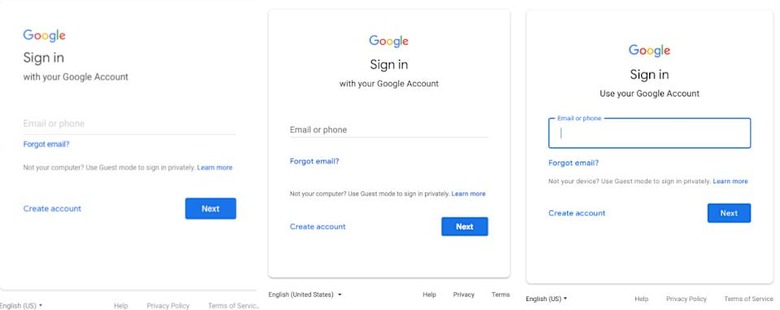
From left to right: old, new and upcoming sign-in pages
That said, the sign-in screen that's rolling out still looks quite different from the old one, with a centered heading and a more distinct card-like appearance that's core to Google's Material Design motif. What's missing is the blue border around the text box, which is what was supposed to be the most prominent change in the interface. That doesn't mean Google changed its mind completely, though: it says that element "will appear in the coming months."