Netflix is testing a navigation bar on Android
It's replacing the app's slide-out menu with a bottom navigation bar.
Netflix is looking to replace its slide-out menu with something much more visible and easier to access, based on the new user interface it's releasing to beta testers. As Android Police has noted, the streaming platform has started testing a navigation bar at the bottom of the screen, completely getting rid of the hamburger menu you'd have to tap to get to the slide-out panel. The new design will make it easier to access your offline downloads and to see what's coming soon. Netflix also moved the Search function from the upper right portion of the screen to the bottom bar, where it gets a bigger icon.
Last year, Netflix rolled out a server-side UI change that also gets rid of the slide-out menu. It wasn't released as an official update, and it looks like random users are getting it whenever the company wants to install it on their devices. I personally received the UI change over 24 hours ago or so, and as you can see in the screenshots below, its navigation bar is not quite identical to the new one.
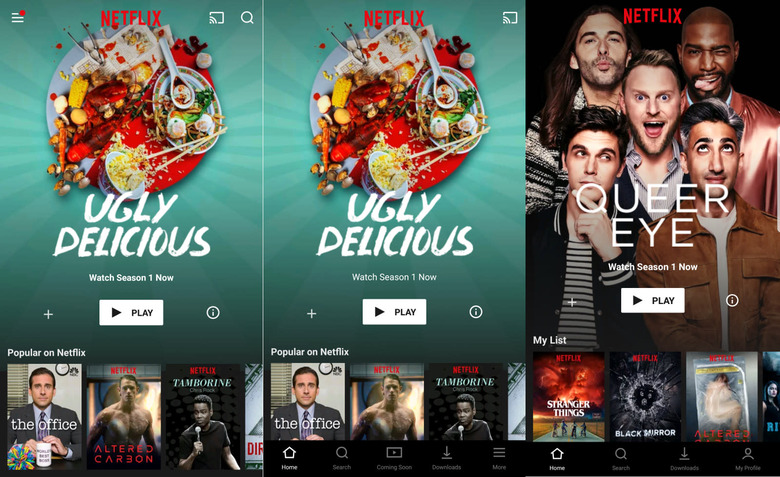
[Image credit: Android Police (left and middle) / Mariella Moon (right)]
The original UI change I received a day ago only had four icons in the navigation bar. It has since gotten the "Coming Soon" icon, but has retained My Profile that's been replaced with the More hamburger menu in the new version. If you haven't gotten a server-side update to your UI, your best bet is to join Netflix's beta tester program or sideload the APK courtesy of Android Police.