Pinterest made its app more accessible to the visually impaired
Greater contrasts and better screen reader support are among the changes.
Pinterest announced some design changes this week aimed at making its app and website more accessible for the blind and visually impaired. The company partnered with Lighthouse for the Blind and Visually Impaired and collected feedback from individuals with various levels of vision impairment to better understand Pinterest's limitations and what could be improved. Pinterest employees also tried to experience the issues firsthand by wearing visual-impairment goggles or attempting to navigate the app with only a keyboard, Co.Design reports. "We tried to help [ourselves] understand all the different disabilities people might have when they use Pinterest," Long Cheng, the company's lead designer, told Co.Design.

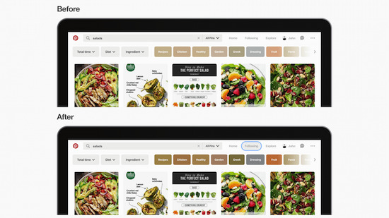
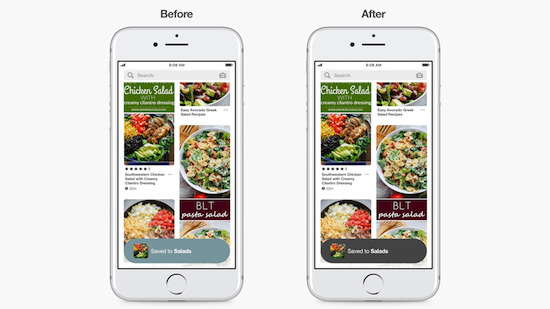


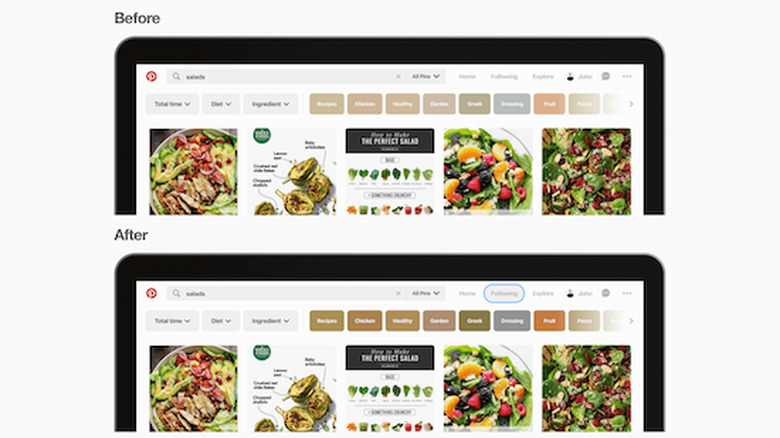
Included in the changes that resulted from that work is better screen reader support, which will improve signing up, browsing and saving. Additionally, the UI now features greater color contrasts to make text more readable and outlines around active buttons and menus to make it easier to see which part of the site is currently in focus. And for those who are colorblind, color is no longer used to denote action or meaning. It's instead used only to boost legibility and aesthetics.
Pinterest says it's currently adding these new features to its iOS and web platforms. They should expand to Android sometime soon.