Google improved Android Auto by making it act more like your phone
After five years, Android Auto finally gets a facelift.
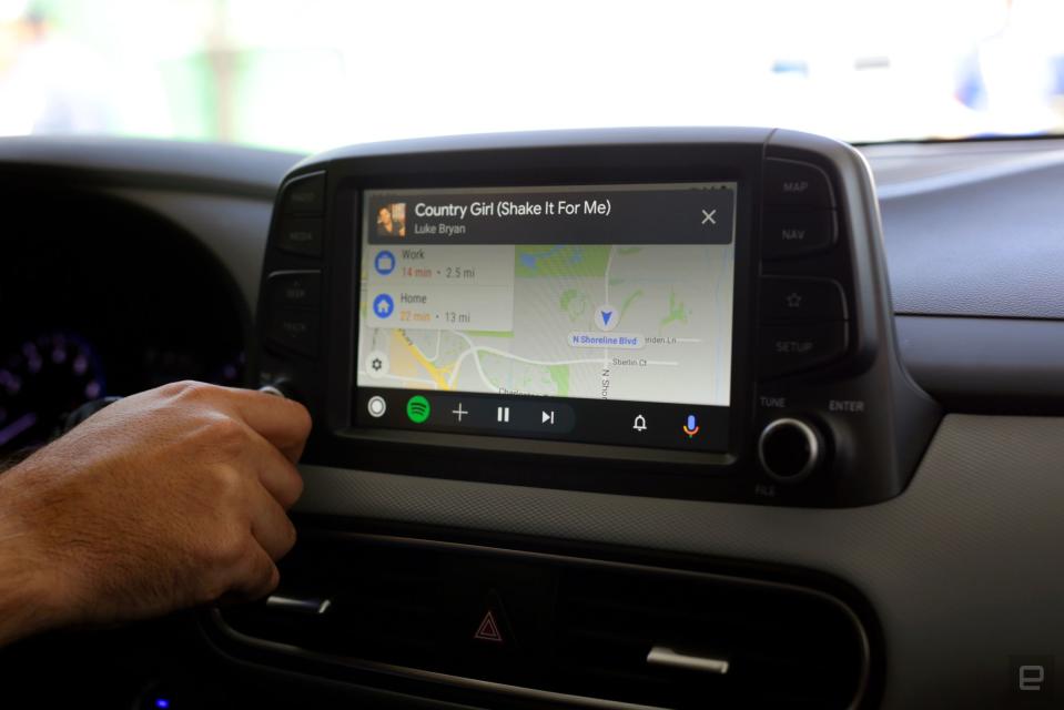
Every year, Android gets a chance to reinvent itself on smartphones with new features and new design flourishes. The same can't be said of Android Auto, Google's phone-powered in-car interface: It's tremendously helpful for drivers, and its feature set has grown over the years, but the UI hasn't changed since it debuted in 2014. That won't be the case for much longer. Yesterday, Google announced that a new, redesigned version of Android Auto would start appearing in cars this summer, and wouldn't you know it: The company set up a 2020 Hyundai Kona on-site at its I/O developer conference, complete with new (but not quite final) software. As someone whose experience with Android Auto is mostly limited to rental cars, even I found some elements of the original Android Auto design maddening. Thankfully, this new software addresses a lot of those pain points, mostly because it doesn't feel like it was designed for a car. "After many years and a lot of customer feedback, we understood that users don't want yet another experience they have to learn," said Rod Lopez, Google's Android Auto product manager, in an interview. "They would like to stick to the models they know and understand, particularly the one on the phone." With "Android" in the name, you might expect Android Auto to already act like a smartphone. After all, it takes what's happening on your phone and translates it to run on your car's center display. The reality wasn't nearly as elegant, though: When you connect your phone to the car, Android Auto springs to life with a dated, card-centric interface that looks like it came straight out of Lollipop. If you were listening to something before plugging the phone in, it just stops. And perhaps most frustrating of all, you never really have an easy way to access all your Android Auto-friendly apps. Those earlier version of Android Auto felt unpolished, which Lopez attributes to the team's desire to build the proper foundation first. "I think back when we designed the first version of Android Auto: The emphasis was on making a product that was somewhat limited in functionality," he said. "So that we could make sure it was the right experience for driving." The experience was right in a way, because it gave Google the opportunity to learn how to tune Android for cars displays. But it's only now that Android Auto is starting to feel nuanced. Complete. For one, Google understands that if you're connecting your phone to your car, there's a good chance you want to navigate somewhere. That's why, unlike the old card-filled home screen, the new Android Auto just drops you into Google Maps. Oh, and it'll keep playing whatever media you had going before you plugged your phone in. It's a small touch, but one that Android Auto users have apparently been clamoring for. It doesn't take long before these phone-like design flourishes become apparent either: There's a thin status bar that shows off the time, battery level and connection status. Down below, there's the equivalent of the standard Android nav bar, with new, car-specific options. Tapping a tiny bell icon brings up all of your notifications, which you can read yourself or have Google Assistant read to you. Much like how recent versions of Android lets you switch between two apps with a single gesture, a widget at the bottom of the screen will offer a shortcut to another app it thinks you might need soon. If another app is already running -- like if Spotify were playing music while you were looking at a map -- the widget will instead show you media controls. I haven't spent enough time with the new software to see if it can accurately suggest apps for me to use, but if nothing else, it speaks to a level of thoughtfulness that didn't exist in earlier versions of Android Auto. In a way, that mirrors the general trajectory we've seen with Android itself; beyond just adding interesting new features, Google has made a concerted effort to make its mobile OS more proactive about helping users. The most notable change here might be the new app launcher, which functions just like it does on your Android smartphone. Tap a button to open it, tap an app to launch it, and get on with your day. If that sounds simplistic, well, it is. It's also a huge improvement over the segmented, slightly convoluted approach Google previously used. "We had these buttons down here where you could find your media apps, but then you also had the navigation section with your navigation apps," Lopez said. "It didn't really resonate with users, and they got really confused." More user testing suggested that people would prefer an interface that mimicked one they were already familiar with, even if it isn't as "extensive" what's available on phones. New to the fold are shortcuts to Google Assistant actions (denoted by a tiny Assistant molecule icon). These live in the launcher just like apps, and once you tap one of them, Assistant will spring to life and give you a weather forecast or tell you what's on your agenda. For now, there are only a handful of Assistant actions, but Lopez confirmed that Google was working on more and that he'd ultimately like Android users to be able to create their own in-car Assistant shortcuts. It's not clear exactly how long this redesign has been in the works, but now that it's almost ready, it can't come soon enough. The update sands down enough of Android Auto's rough edges that I think people who liked the platform before are in for a pleasant surprise. As for the people who will buy a car this year and beyond, they're going to get a version of Android Auto that simply makes more sense.


