What we're buying: 'Typeset in the Future'
A book that describes typography design in science-fiction movies.

We may receive a commission on purchases made from links.
This week, Senior Editor Kris Naudus takes a look at a book that will please both sci-fi nerds and design geeks. 'Typeset in the Future' explores the typography and design in science fiction movies such as 2001: A Space Odyssey, Star Trek, and more.


Kris Naudus
Senior Editor
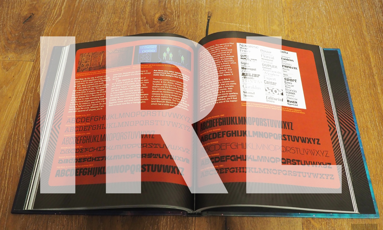
What does the future look like to you? Flying cars? Rockets? Robots everywhere? Everyone has different ideas, but one thing that many movies seem to show is that the font Eurostile Bold Extended will be everywhere. Those rounded, lengthened letters can be seen gracing signs, advertisements and even the sides of spaceships in plenty of science fiction shows and movies. At least, this was what Dave Addey noticed when he was watching 2001: A Space Odyssey.
As a designer, he understands how things like font choices can heavily influence a work. Not just how well we read the text but also how a typeface can even set a mood — Comic Sans is meant to be playful (and is often mocked when used incorrectly) while Blackletter tends to be thought of as more forbidding.
Addey ended up analyzing the entire film's use of lettering and graphics, eventually turning it into a website called "Typeset in the Future." Now that site's been turned into a book packed with a lot more things to read about, including some new movies and even a few interviews from luminaries like Star Trek graphic designer Mike Okuda and Total Recall director Paul Verhoeven.
As the first movie he tackled, 2001 gets the deepest dive, but to be fair it's also one of the most design-heavy. Certain fonts like Eurostile Bold Extended and Futura Bold have become synonymous with " the future" to audiences just from overuse, but there are other visual cues that directors like to use as well. Ever notice that whenever a video is broadcast or played back, there's always scan lines on it? That's a visual signal to the viewer that "you are watching TV," even though only CRTs would boast such lines. It's something I never gave a lot of thought to, but now I can't help but notice it all the time.
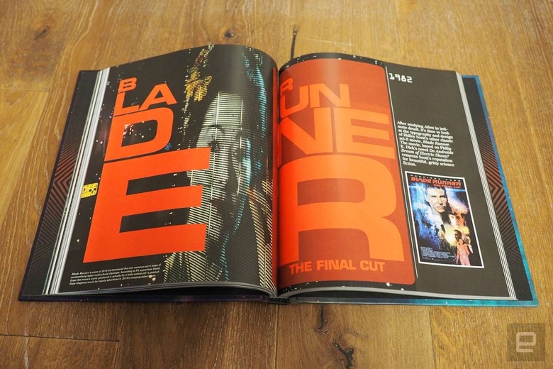
From there he continues forward chronologically, from Alien to Star Trek: The Motion Picture, Blade Runner, Total Recall (one of my favorite films of all time), WALL·E and ending on Moon, which is notable for its use of emojis. (By the way, that's an interpunct in the middle of WALL·E, not a period or a dash.) Star Trek is probably the weakest cinematically, but that's because it's really an introduction to the wider world of Trek design, as best exemplified through Okuda's work on shows from The Next Generation onwards.
LCARS immediately comes to mind — that's the brightly colored UI that Starfleet computers use, which was designed to give the impression of a lot of information being presented but not legible enough to be distracting to the viewer. It was also made that way because it was cheap and easy: All the LCARS elements were actually plastic overlays, which were more cost effective and easier to maintain than control panels with buttons. But that hasn't stopped nerds from recreating it in various skins and self-contained programs over the years, just so they can have that "authentic" Trek experience. That design aesthetic also carried over into physical objects as well: The pill-shaped labels that grace cases, canisters and other containers throughout the Enterprise were just an easy way to brand rented equipment as Starfleet-issue without damaging them. It's amazing how many displays and labels we think of as "iconic" are really just products of convenience for the Star Trek teams.
The book walks through each film step by step, frame by relevant frame, which makes it an excellent companion if you choose to rewatch these films. I already know that I want to watch WALL·E again, because there are so many visual details I didn't pick up on that tell you more about life on board the Axiom (as well as on Earth, of course — did you notice the hyper inflated bills strewn about?).
It's a coffee table book, which means this isn't something you'll be lugging about. I certainly appreciated the extra page space. One big downside is that many of the pages are printed black and many of the images themselves are pretty dark, so find yourself a well-lit room to get the most out of this tome. At least it reads quickly, leaving time to get back to watching the movies themselves. Whether you're a sci-fi nerd or design geek (or even a bit of both), Typeset in the Future will have you analyzing stagecraft in a whole new way.
"IRL" is a recurring column in which the Engadget staff run down what they're buying, using, playing and streaming.