Google and Microsoft are working to make web forms more touch-friendly
They also gave web forms a modern look.

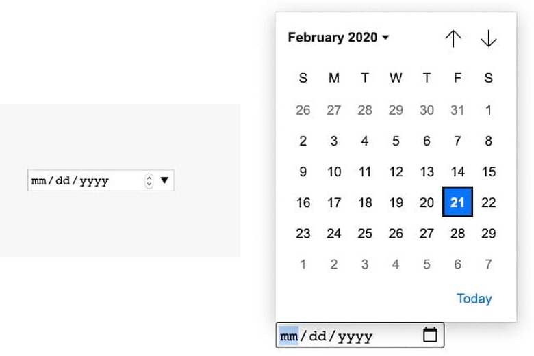
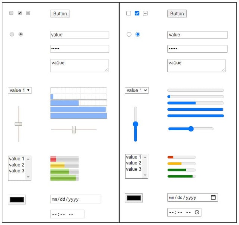
Google and Microsoft have redesigned native form controls — buttons and various input elements you see on web forms — to look more harmonious and be more touch-friendly. They spent the past year working together to design a new theme and make built-in form controls better for Chromium browsers, which serve as the basis for both Edge and Chrome. One of the changes they came up with will make date input forms a lot easier to tap on a touchscreen device.


The old design's tap target is too small and may be hard to hit on a phone or tablet, because it wasn't created with touchscreen devices in mind. To improve user experience, the companies made the tap targets bigger and added support for swiping and inertia when scrolling.
They also gave form controls a more modern look, redesigning them so that they'd appear like part of a matched set when used together. That means gradients are replaced with more flat and simple design elements inspired by newer user interfaces.
These changes are now out for Edge on Windows and may roll out as part of Google's experimental features for Chrome 81.