Apple Watch Series 7 review: It’s all about the screen
On something as small as a smartwatch, even a fraction of an inch matters.
We may receive a commission on purchases made from links.
The main difference between Apple's Watch Series 7 and the Series 6 is just a larger display, but it makes an outsized impact on a device as small as a watch. Apple also generally enlarged the UI, making things easier to read and navigate. To make better use of the bigger canvas, the company also added some new watch faces and a full QWERTY keyboard for replying to messages.
The other changes to the Series 7 are less obvious, like a new SiP (system-in-package), faster charging and overnight respiratory tracking. For those coming from the last generation, this might not feel like a significant upgrade. But the larger display does make a meaningful impact for anyone that's upgrading from a Watch SE, Series 5 or older.
Design and hardware
Even though its screen is bigger, the Series 7 still manages to retain basically the same footprint as its predecessor. It's a hair heavier than the Watch SE and Series 6, which makes sense since its case is slightly larger. Unlike previous generations, which came in 40 and 44mm sizes, this year you can choose between 41mm and 45mm. The difference is barely noticeable at first.
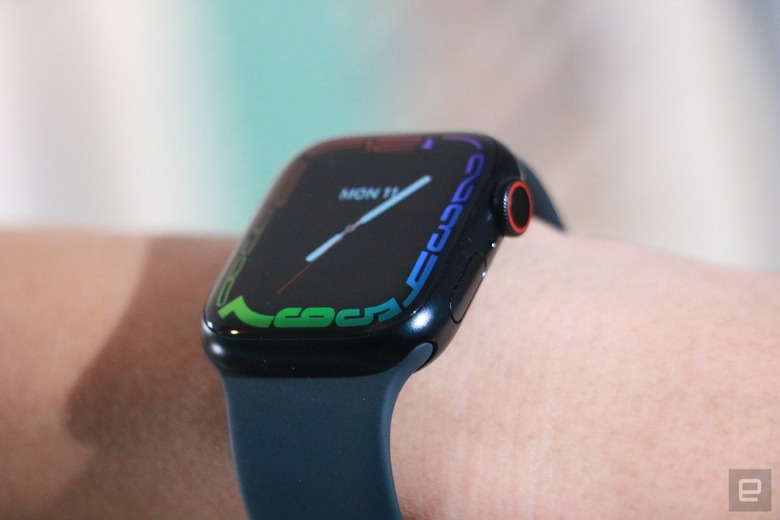
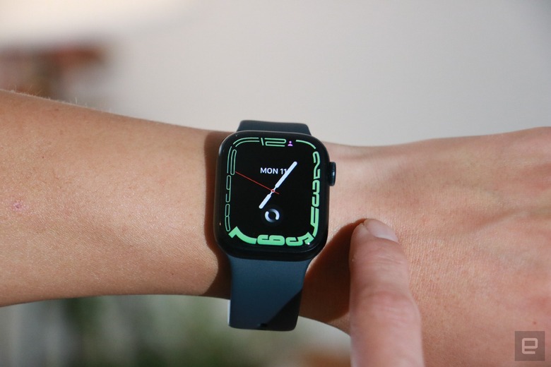
Once I turned the screen on, though, I was struck by its roominess. This was when this main design change became obvious. Apple used a refractive edge here to make it seem like the display curves slightly along the sides and it helps the face feel even more expansive. The bezels have been whittled down to just 1.7mm (0.07 inch) compared to last gen's 3mm.
Oh, and a quick shout here to its durability: It's the first Apple Watch to be certified IP6X for dust resistance. Since I'm in reviewer mode, I've been very careful to avoid situations where I might damage the device. But I'll admit I've already dropped the Series 7 once and it survived without a scratch, thanks to Apple's crystal covering that the company says is more crack resistant than on the Series 6.
Now, you're probably not comparing an Apple Watch to Android or Wear OS, but in case you were curious, Samsung's Galaxy Watch 4 is noticeably lighter than the Series 7. It also has a round face and thinner body. But really, if you're an iPhone user, you've probably never even thought about a Galaxy watch.
A big screen difference
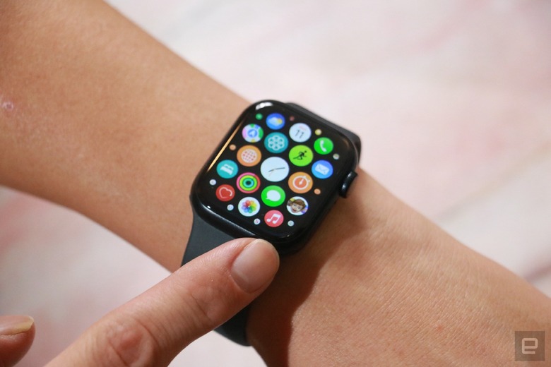
Depending on which Apple Watch you'd been using before, the jump in screen size may be less obvious. It's increased more than 50 percent from the Series 3 and 20 percent from the Series 6. Either way, the more spacious UI is helpful. Buttons for entering my passcode stretched out over the edges, and I didn't need to aim as carefully to strike the right keys. It's easier to hit the right settings in the control center, too, and I can see more of my friends' messages at once. My heart rate and time passed during workouts are more readable as well. Those with visual impairments will also appreciate that there are new larger font size settings available.
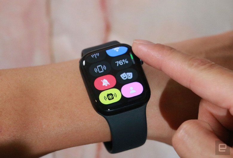
Though most buttons are between 12 and 27 percent larger, app icons are still squished together. That's a problem for those of us who use the grid view for all apps, but not so much if you're in list view.
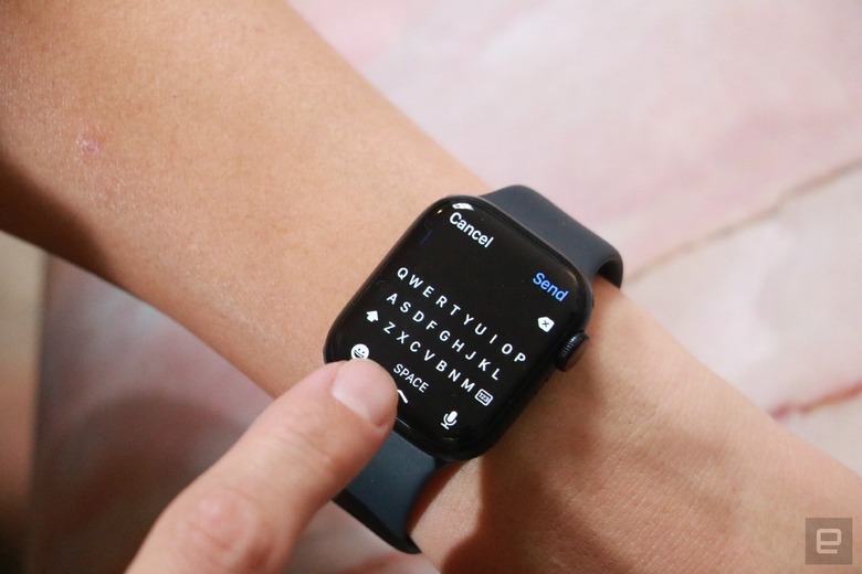
The extra space also means Apple was able to introduce a full QWERTY keyboard for replying to messages by typing or swiping on the screen. Compared to handwriting, dictating or emojis, a keyboard offers a bit more flexibility, especially when the system correctly picks up your swipes. But because it's so cramped, the accuracy rate is maybe 60 percent, and I still preferred using dictation. Plus, the new screen may be big, but it's definitely not big enough to make tap typing possible. Still, it's a good option to have.
In addition to enlarging most of the elements across the UI, Apple also added new faces that can display more information at once, like the Modular Duo. There's also a Contour style that pushes the clock's digits all the way to the edge where they warp and "melt" over the sides like in Salvador Dali's The Persistence of Memory. The remaining two are a Portrait face that we already saw in the watchOS 8 beta, and World Time, which is helpful for interacting with people in other countries. I used Modular Duo the most, though it's not very attractive, and when I wanted something prettier I just switched to one with my face as the wallpaper instead. (Just kidding: I use the "Artist" design or a cute animal background.)
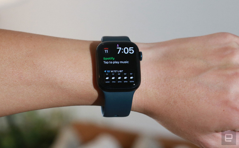
The new Modular Duo screen is the most useful. It lets you place two expanded complications on top of each other, while still showing the time and an additional small complication at the top. You can choose to show the world clock with a timer or your favorite stock's performance with Apple Music, for example. I went with a Spotify controller and the Weather forecast. Though the latter worked well, showing me hourly temperature and sunlight data on the screen, the Spotify complication was, in a word, trash. It just shows the words "Tap to play music," and I'd have to waste a tap and a second to pull up playback controls.
A second doesn't sound like much, but when I'm out running or juggling my groceries, I don't want to waste that time holding up my arm and watching my screen for more than a fraction of a second. I'm not going to harp on this because this is more of a Spotify problem than an Apple Watch issue, but given how many people use the music app, it would do both companies good to make this complication work better. I'd love to see more useful complications from other apps too.
One last note on the Series 7's screen: Though its actual peak brightness hasn't changed, Apple has tweaked the system so that the Always On display is up to 70 percent brighter when you're indoors. This way, it's easier to read if you have your hand hidden below a table while you're at a meeting.
Battery life, charging and performance
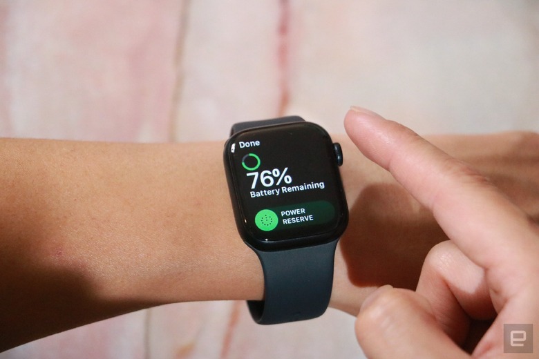
That pretty much sums up all the screen-related updates on the Series 7. But there are a few other noteworthy upgrades. The most significant of these is that it charges faster, and in about 10 minutes, I got close to 10 percent capacity. It reached almost 100 percent in under an hour with the new cable that Apple includes in the box. Meanwhile, the Apple Watch SE only got to about 60 percent in an hour.
You'll need both the new charger and the Series 7 to get these faster charging speeds, by the way. It's the coils on both the watch and the wireless disc that enable the higher rate, so this isn't something you can get just by running out and buying a new accessory. As someone who's constantly forgetting to charge my watch until I'm about to run out the door, I appreciate the faster speeds. That said, I still wish smartwatches in general lasted longer and took less time to charge.
Speaking of the battery, the Series 7 promises the same runtime as its predecessor, which is to say, about 18 hours. I generally found myself getting about half a day more from the new watch than the SE, despite the lack of an Always On display on the SE. The Series 7 usually stuck around for a day and a half, almost two, with the screen set to Always On, and tracking between three and five workouts. I also used the device to send plenty of messages and map my walks while I ran errands with the GPS on. That endurance is impressive given the larger screen, but it's worth noting that I haven't used the watch for sleep tracking yet.
The battery efficiency can be partly attributed to Apple's new S7 system-in-package (SIP), which is based on the same processor as the S6. In general, I didn't feel much of a difference between the Series 7 and the SE when launching workouts or getting Siri to text my friends. The Apple Watch has been and continues to be a responsive device that feels as fast as, if not faster than, its Android counterparts.
Sleep tracking, watchOS 8 and other updates
One area where Apple continues to lag the competition is sleep tracking. While companies like Fitbit and Samsung can use their wearables' heart rate monitors to detect what sleep zone you're in, Apple still doesn't offer that. And you'll need to make sure you have the Sleep Focus mode on (either manually or by setting a schedule) before the Watch will log your slumber. The others are all able to automatically tell when you've gone to sleep and don't need you to set a schedule. In fact, Fitbit has been doing it since 2015.
The Series 7 does usher in a new feature that logs your respiration rate while you sleep, and then tells you your breath-per-minute rate the next morning. Cool. Respiratory tracking is something that's coming via watchOS 8 and isn't exclusive to the Series 7, and the same is true of features like the new Mindfulness app, guided meditation sessions, redesigned Photos app, SharePlaying Fitness+ workouts and more. This means they're less likely to sway your decision on whether to get the Series 7 if you already have an Apple Watch. The main things exclusive to the Series 7 are the Modular Duo and Contour watch faces, larger font sizes and buttons, and the QWERTY keyboard.
Wrap-up
Though the differences between the Series 6 and 7 seem minor, it's worth a reminder that most people who own last year's model likely aren't looking to upgrade yet anyway. For anyone else who's looking for a new smartwatch, the Series 7 will be a satisfying purchase, especially if you've never used one before. WatchOS is a capable and comprehensive system that can help you track your workouts, automatically log your sessions, prompt you to be more active and mindful of your mental health all while being a great extension of your smartphone. It's not the best at sleep-tracking, though, so if that's a priority you might prefer a Fitbit. Despite its relatively high starting price of $400, what Apple offers is currently the best in the market, especially for the iOS ecosystem.
Update (at 4:45pm ET): This review was edited to correct an error in the display size comparison. The Series 7 is 50 percent larger than the Series 3, not the SE.