Google video teases all-white look for Gmail and other apps
The final versions could look different, but these are interesting nonetheless.

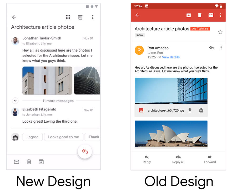
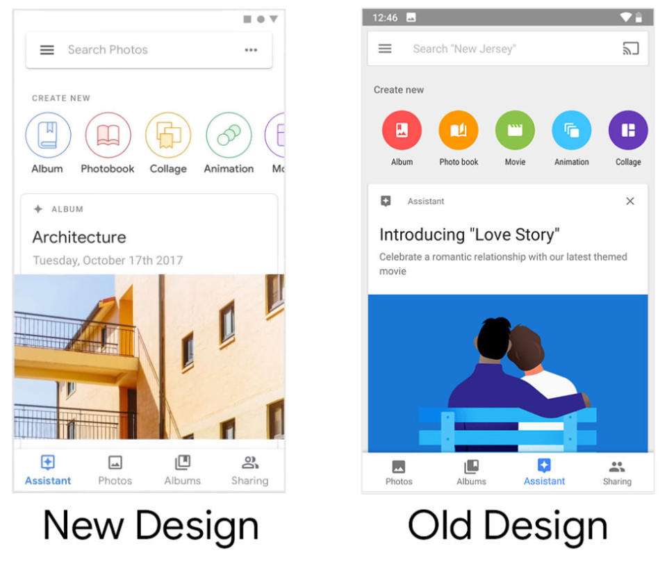

Google has been revamping its Material Design guidelines for internal and third-party products. We've already seen previews of how the look of Google's own products will change, from Android to Gmail to Chrome. A video just surfaced showing a glimpse of what those redesigns may end up looking like: Clean, all-white interfaces, according to Ars Technica.
The video was made by known Google design collaborators Adam Grabowski and Nicolo Bianchino, and per its description, seems to be a showcase of the Google Material Design team's updated system for internal use. Unfortunately, it has been either made private or taken down. But screenshots taken by Ars Technica show a much cleaner look for Google's mainstay products: Gmail on mobile, for example, has ditched its signature top red bar for a less noticeable white bar on the bottom. Google Photos has ditched its gray background for white and dialed down its vibrant buttons in favor color-outlined ones.

The previews of Drive, Travel and Google Maps have been similarly refreshed for minimalist looks with more white space. Of course, these are just work-in-progress shots, so there's no guarantee that these resemble the final designs -- but they do suggest a greater visual cohesion is coming for Google's apps.
