icons
Latest
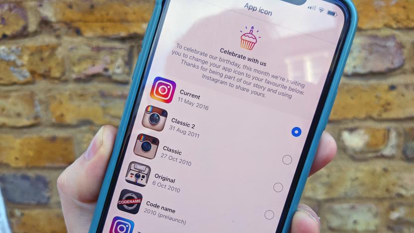
Instagram's classic 'Polaroid' icons return for its 10th anniversary
When Instagram launched 10 years ago today, the app world was more... skeuomorphic. To celebrate those pre-flat design days, the social network has introduced an Easter egg that lets you revert back to the Polaroid icons of yore, including the original October 6, 2010 Land Camera 1000 logo.

Spotify redesign makes it easier to play, favorite and download music
Today, Spotify is rolling out three new icons in its iOS app. The icons are meant to make it easier to add albums to your playlists, download albums to listen offline and quickly shuffle songs.

Windows 10 icons are getting an overdue redesign
Microsoft refreshed Office's icons last year, and now it's Windows 10's turn. The software giant is rolling out updates to the icons for Windows 10's core apps over the months ahead, starting with the Calendar and Mail apps in a new Release Preview for Windows Insiders in the Fast ring. The company's design team explained that it wanted to break away from the flat, colorless icons you see today in favor of ones that are at once more consistent with newer branding (including apps available beyond Windows) and different enough that you'll have an easier time finding the one you want.
Google vows to make Search 'better' after redesign backlash
Last week, Google upset desktop users when it changed the appearance of Search. The changes were relatively minor, showing companies' favicons next to link previews, but critics argue that the changes cluttered an otherwise clean interface and made it difficult to distinguish ads from search results. Now, Google is backtracking a bit. In a tweet, the company said it is going to "experiment with new placements for favicons."

Microsoft leak suggests hideous Windows Start menu could be coming
Today, Microsoft leaked what could be a new Windows Start menu. The company accidentally shared a Windows 10 internal build (18947) with its Insider Program, Windows Central reports. The most striking change is a completely redesigned Start menu that swaps live tiles for a grid of app icons.
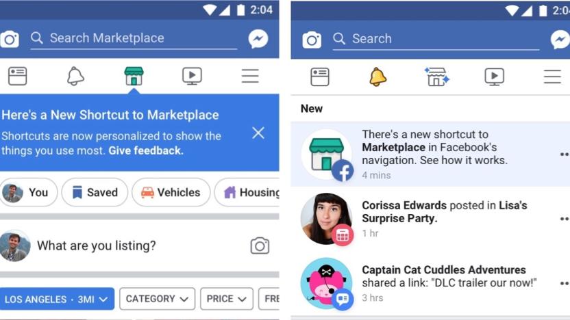
Facebook's app will personalize navigation to fit your social habit
Facebook adds new features on the regular. It has recently revamped its Marketplace section, made its news feed more friend-focused and changed algorithms to reduce fake news and clickbait. Now, Facebook is redesigning the navigation bar in its mobile app to better show you shortcuts to things you use most often. The company said that the new system should roll out globally in the coming weeks.

Google Now launcher forces Android apps to literally fit in
Anyone wringing their hands over the fact that their Android apps just don't line up flush will be delighted with an update to Google Now's launcher -- the de facto home screen for Nexus-branded Android phones like the 6P. In response to the fact that some Android app makers aren't following Google's guidelines, those rogues, the company has taken it into its own hands, forcing consistent icon size inside the launcher. The main difference: oversized logos chill out a bit, shrinking to fit Google's in-house apps and third-party app icons that followed the rules.

Here are the most popular emojis by state (kind of)
Emoji are insanely popular, despite the near-endless stream of stickers and GIFs that dominate our messaging apps these days. But depending on where you live, some emoji are more popular than others. The folks behind SwiftKey, the predictive keyboard app for iOS and Android, have been mining their community's usage via SwiftKey Cloud to see which icons rank highest across the US. They've come up with an interactive map, but to be clear -- each state's pick isn't based on sheer volume. As a spokesperson explained to Gizmodo: "To identify the 'top' emoji per state, we cross-referenced the list of emoji each state uses more than the US average with the emoji each state uses more than all other states." So there you have it. You might be able to poke a few flaws in the methodology, but it's still fun to see where different emoji are used more often. Georgia really likes the moon, for instance, and Utah has a soft spot for lollipops. Who knew?

Global Chat: Guild Wars 2's economy is broken
Guild Wars 2's economy remains a hot-button issue even two-and-a-half years after its release. In this week's exploration of the blogosphere, one writer pulls out all the stops to let you know what's broken about this MMO's economy -- and how it can be fixed. In addition to this thoughtful read, Global Chat will hear some snark on silly hotbar icons, pontificate about poor MMO names, deliver The Repopulation first impressions, and invite you to participate in a grand MUD experiment. Let's get going!

Apple emoji take on life-like roles in "Emoji Among Us" mockumentary
Apple emoji are among the best in its class, created with an attention to detail that is unrivaled on other platforms. It's not surprising that stock footage company Dissolve chose to use Apple Color emoji in its recent "Emoji Among Us" mockumentary about the explosion of these special characters into our daily lives. The short clip uses 68 emoji and creatively places them in everyday situations. Can you recognize them all? [Via The Awesomer]

Emojli is a social network composed entirely of emoji
Social networks love emoji. And those better-than-real-words icons love social networks right back. Emojli is possibly the next step in that blossoming relationship: a social network with "no words, no spam, just emoji." It hasn't launched yet, but the iOS-bound network already polices a rigorous picture-only username system. (Apologies, "Monkey Train", "Fireball" and "Kitty Penguin Space Invader" have already been taken.) According to its Twitter feed, registrations passed 10,000 earlier today -- and for folks worried about the service running out of emoji, over 250,000 two-icon combinations are available, as are even longer usernames. Pointless time-waster, a nonsensical joke, or the future of this connected life? Almost certainly one of the former, but if you want that single emoji that truly sums you up, you'd best rush along to that registration page immediately.

Apple emojis are best in class, and some were designed in less than 30 minutes
Once Apple added Emoji keyboard support back in iOS 5, messaging for iPhone users was forever changed. Forget old-fashioned emoticons, Apple's emoji characters let iOS users send all sorts of quirky, helpful, and flat out weird icons with just a few taps. But what may not be readily apparent to iOS users is that emojis sent to non-iOS devices typically look different than they do on iPhones and iPads. You see, emoji designs are rooted in text descriptions laid out by the Unicode Consortium. But the manner in which those descriptions are brought to life by artists are anything but uniform. Bianca Bosker of the Huffington Post recently took a look at how common emoji templates differ across varying companies. In one example, Bosker directs us to Unicode Character U+1F48 which encapsulates a picture of a dancer. I suppose it's much easier to appreciate Apple's own emoji set once one sees what the competitive landscape looks like. It's hard to dispute that Apple's offerings are more elegant and artistic than what's available from Google and Twitter. Of course, Apple has a long history of rich and detail-oriented icons. Case in point, below is a closer look at how emoji icons vary across different platforms, courtesy of Emojipedia. A full comparison of every iOS emoji and its Android counterpart can be seen here. Interestingly, Bosker was able to get in touch with Willem Van Lancker, a former designer at Apple who helped craft many of the icons in Apple's emoji set. Willem Van Lancker, a former Apple employee who designed hundreds of emoji for the iPhone, said he was dismayed to find that on Android devices, his icons' counterparts "almost [seem] to mean a different emotion." "It's a lot like spoken languages," he said. "Things are lost in translation." Van Lancker further explained that in coming up with Apple's set of emojis, designers at times took a look to Japanese emojis (where the trend first began) for inspiration and reference points. But with so many emojis in play, some designs were impressively whipped together in a half hour. Van Lancker said Apple consulted the Japanese originals, but the look of each emoji was ultimately up to its designer. "To be honest," he said, "when there are hundreds of these to be made, some of them were made in 30 minutes." Make sure to check out Bosker's full piece at the Huffington Post as it's full of interesting tidbits regarding all things emoji.

Susan Kare discusses icon design
Iconographer and graphic designer Susan Kare is a graphic designer and was a member of the original Macintosh team. Susan created -- if you'll forgive me -- some of the most iconic images in the history of personal computing, including the "Happy Mac," its companion the Sad Mac, the original Macintosh trash can and so much more, including the original Macintosh typeface. Susan recently gave a talk at the eighth e.g. Conference, and shared some of her history. There's a lot to love for Apple fans, including the story of her five-minute interview with Andy Hertzfeld, which ended with him asking Susan when she could start, as well as the birth of the symbol on the Command Key. Unlike some others, that icon is still in use at Apple. My favorite bit is her explanation for the Sad Mac and Bomb icons (above). "I designed them they way I did," she says, "because I was told they would never be seen by anyone." Well, not quite. It's a fantastic talk with lots of Apple history and thoughtful design, and definitely worth your time to watch.

Meet your new OS X Yosemite dock icons
This year's WWDC event brought with it the announcement of Yosemite, Apple's latest edition of OS X. Beyond Yosemite's new features and abilities, the operating system also showcases a general makeover of the look of the user interface, including brand new dock icons. Below you can take a glance at what you'll be looking on your home screen when Yosemite is released this fall. Here are Finder, Launchpad, Safari, and Mail: Here are Calendar, Notes, Reminders, and Contacts: Here are Maps, Messages, Facetime (with new Phone icons for iOS calls), and Preview: Here are iTunes, the App Store, iBooks, and Services: Finally, we have Applications and the new recycled plastic Trash bin: I, for one, will miss the old wire Trash bin:

Leaked icons indicate Android may enjoy a redesign soon
The Google I/O developer conference is just over two months away, but it's never too early to start opining about what the software giant is planning to show. Try not to be overwhelmed with excitement, kids: according to documents leaked by Android Police (seemingly confirmed by Google's own Partners page) new icons are coming. The new style is apparently referred to as Moonshine, and this flatter look is likely just a portion of an upcoming redesign. We're still awaiting details on what else may change, but for now, all we can do is look forward to new icons for Play Music, Books, Movies, and Games; as well as Google+, Calendar, People, Chrome, YouTube, Maps, Gmail, Hangouts, Camera, and the Play Store. Each of the icons appears to be more in line with what Google uses on the web. So is this just a foreshadowing that all of Android's design guidelines will see a similar overhaul? Hang tight -- we've got another couple months before we find out. In the meantime, feast upon a few more icons (the new ones are on the right).

The TUAW Daily Update Podcast for March 19, 2014
It's the TUAW Daily Update, your source for Apple news in a convenient audio format. You'll get some the top Apple stories of the day in three to five minutes for a quick review of what's happening in the Apple world. You can listen to today's Apple stories by clicking the player at the top of the page. The Daily Update has been moved to a new podcast host in the past few days. Current listeners should delete the old podcast subscription and subscribe to the new feed in the iTunes Store here.

App icons don't have to suck
The days of skeuomorphic icons are gone and in their place are clean, flat icons designs that, in theory, offer an attractive and modern feel. But when the desire for something simple comes at the cost of relevance, icons take a turn for the worse. Instead of overly elaborate and detailed icons that produced a busy and cluttered feel, the App Store is now overrun with icons that mean absolutely nothing and only serve to harm the appeal of the apps and confuse potential customers. To help illustrate this, I grabbed a handful of these too-vague-for-their-own-good icons and tossed them into our TUAW team chatroom. I asked what, if anything, each icon tells the user about the app itself -- or, if nothing else, simply what the graphic resembles. To be clear: This is in no way a commentary on the quality of the apps themselves (and indeed some of these are extremely popular and well-liked) but simply a call for developers to put some more thought into the most public face of their own products. What is it? A charging utility An app about Alton Brown's bow tie A soundboard with nothing but Gomer Pyle saying "Shazam!" What it actually is: Prompts, an app to help writers find inspiration. What is it? A fingerpainting app, but with only one color choice A Smurf penis A blue tampon applicator What it actually is: Vesper, a note-taking and archiving app. What is it? A how-to-make popsicles app (seriously, the fact that it's not this is a crime) Wild mushroom locator and index A ghost with diarrhea What it actually is: Fancy, a crowd-sourced shopping app with a social twist. And no, it doesn't tell you how to make popsicles. What is it? A digital pregnancy test A calculator... obviously "The Green Cross" for horrible people who don't like the Red Cross What it actually is: Gneo, a productivity app. What is it? A bacteria guide app A camera app that gives everyone in the photo green chickenpox A Yoshi ovulation tracking app What it actually is: thredUP, a clothing marketplace for women, kids and teens. What is it? An app that tells you when it's near sunset if you're on a cruise ship An orange juice review aggregator An app that lists all the words that rhyme with orange What it actually is: Level Money, a budgeting app. See what I mean? I get it; Creating a nice icon without an established brand logo to draw from isn't easy, but I promise you it can be done. Here are a few fantastic examples of app icons that are not only clean and attractive, but also offer a hint as to what the app actually does. What it is: Chefs Feed, a restaurant guide curated by actual chefs. What it is: Elixr, a social network and rating service for drink lovers. What it is: The Converted, an easy-to-use unit conversion tool. See the difference? Now please, put some more effort into your app's most important symbol before the App Store is filled with icons that are nothing more than simple gradients. Oh god, it's happening already.

Captain's Log: More Star Trek Online help for the new player
The news is out! Lobi are now accessible account-wide! They're no longer bound to a single character! While I would love to be able to write an entire column about how happy the change has made me, I won't make our readers endure it, but it sure was a fun way to start off this week's Captain's Log. The good news for some is that this week's column will be dedicated to the brand new players of Star Trek Online. This decision was triggered by an email I received from a reader who wanted to know how he could change his character's outfit without having to go to the tailor all the time. He was a very new player and was embarrassed to ask anyone else, and trusted I wouldn't make him feel a fool. It was then I realized that there are lots of little things in Star Trek Online that aren't obvious to new players. While many of those things are second nature to me now, I recall with bitter clarity what it was like to be so new that asking a stranger for help was akin to playing Russian roulette. So join me past the break as I touch on what all those tiny little icons on the HUD mean.

The Iconfactory talks "flat" icons
The Iconfactory is a design company that helps create interface designs and icons for various apps. With the impending release of iOS 7 and the flat redesign that's coming with it, the company has published a blog post detailing what the shift to flat icons means for designers. At first glance the idea of creating flat icons for iOS seems like it should be easier to accomplish. Iconfactory doesn't agree. In their view, creating flat icons requires distilling an image down to its most basic parts, while still retaining the recognizable details that users associate with the apps they use. In a new blog post, the design firm breaks this idea down further: If you assume that Apple's flat style makes it easier and faster to create a great app icon, think different. Those tiny illustrations have a tall order to fill. At a basic level app icons are a tool for getting us to pay attention, but we also want them to be beautiful images that make us say, "Wow, I want that." Just because flat looks simple doesn't mean it is. It's not about the style. Fundamentally it's about problem solving; crafting a small, unique image that creates connection with an app at a glance and makes us engage on a visceral level. To further help illustrate what it takes to transition an app icon into the flattened gems you can expect to see in the fall, the company has published a post showcasing the process they took redesigning xScope's Mirror app. For a look at the various stages of design the app's icon went through, including the final product, head over to their blog here. It's an interesting read for those of us who enjoy good design, but weren't blessed with the artistic chops to do it ourselves.

iOS 7 Clock app icon shows the current time... to the second
As more and more developers are getting their hands on the iOS 7 beta, we're starting to hear about some rather interesting little touches. The latest? The iOS 7 Clock app icon shows the current time, complete with moving second hand. This is according to an unnamed developer who sent in the above image and who is probably breaking the developer NDA... The clock is synchronized to the device's time, so that the red second hand reaches 12 just when the time indicator in the status bar changes to the next minute. Previous versions of the Clock app simply showed the clock stuck at 10:15 -- now the icon is dynamic. Perhaps we'll begin to see more dynamic icons coming from Apple and third-party developers in the future. There's also been some discussion over at iDownloadBlog.com about a page on the Apple website that shows somewhat different icons for some apps than what are seen in the current beta. Whether those are indicative of past or future designs is unknown. As one of our bloggers so succinctly put it, "BREAKING: Beta software contains icons that may be a work in progress (developing)."


