Before and after pics highlight iOS 7 design points
TapFame's before and after iOS 7 gallery provides a perfect showcase of iOS 7's new design touch points. Showcasing some of the most notable redesigned interfaces, it offers a one-stop link to compare and evaluate many of the most critical UI changes.
Edge to Edge Design
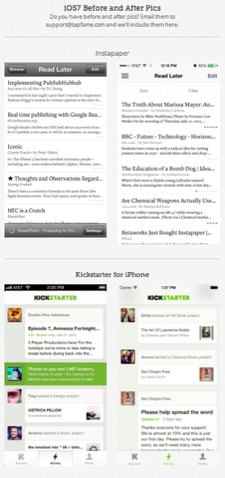
One of the biggest changes to iOS 7 is the introduction of edge-to-edge design. Standard interface elements like status bars (the bit with the time and the battery) and navigation bars (the large flat colored bars with the back buttons) no longer create a "frame". Instead they lie over the application, which stretches out to take advantage of every pixel.
You see this in the KickStarter example, where the scrolling table extends up behind the Kickstarter label at the top. The blurred smudges you see in the screenshot are actually bits of the table that have flowed behind. As you scroll the table, these smudges update, offering subtle but important contextual hints. Your iPhone's workspace, although offering exactly the same number of pixels, has now grown to encompass the entire screen.
Another great example of this trend is seen in the Cobooks Contacts app, where each table cell has grown to reach the edge of the device, without any retro paper-friendly indentation needed. It's a fresh and beautiful new presentation.
It's like getting a 15-20% boost in screen size, all for free. More importantly, it shifts the focus of the app from the ornamentation that surrounds it to the app itself. This is a critical design element for iOS 7.
User-Controlled Font Sizes
Fonts represent another huge leap from iOS 6 to iOS 7. Developers now select fonts based on the roles they play within the app. From headlines to captions, iOS 7 delivers fonts to the application based on how text is used. Even better, users control those fonts from a single place in Settings. When you adjust what is called Dynamic Text size, all the fonts across every compliant app update on your behalf.
If you have weak eyes (I do!) and need larger fonts, that single settings pane expands font size for every system defined role for you. Applications listen for a special notification which tells them to re-layout their entire interface to best match my personal viewing needs.
It's an amazing and fabulous feature and the side effect is that the fonts you see in the iOS 7 screen shots are all consistent in terms of their face selection and the roles they play within the interfaces. Look at the iRun Perth app. It offers a perfect example of multiple font roles within a single app. As one font adjusts, the others do in lockstep.
See-Through Controls
On iOS, controls refer to interaction items like buttons, sliders, toggles, and radio button. When you look at the Photo Investigator screen shots, what you see is the radical change iOS 7's see-through controls offer.
These color-coded controls integrate with whatever app lies beneath them, offering plenty of see-through areas so the controls augment the app rather than overwhelm them. Suddenly the controls become deferential to the app instead of visually taking them over. The change is profound, best seen in these side-by-side shots.
Every app defines a primary tint color used throughout the window. In this example it is red, although it changes on an app-by-app basis. That uniform color, picked up by the outline in the radio button switch at the bottom of the screen and the text for the go back button at the top, provides a coherent design touchpoint throughout the entire control vocabulary.
Borderless Interaction
Although I'm not entirely a full fan of borderless buttons, the RecordOrders screenshot provides a perfect example of why these new elements can be so powerful. Actions and options now blend into the main application area instead of being segregated by traditional button design. Of all the iOS 7 changes this has been one of the most significant and most controversial. When it works, it's fantastic. When it doesn't, users ends up confused.
Removing Familiar Patterns
Many familiar textures have disappeared from iOS 7: the lined background behind tables (see Days to Go), the obverse linen that represented the "under page" background. They are replaced with simpler, cleaner interfaces that don't have to compete with skeuomorphism.
Translucency
With iOS 7 you don't lose context, even when moving to other tasks. The National Debt app shows this with its translucent overlay (done, by the way, I'm betting using a slightly illicit trick that all the developers have been talking about this summer) as does the Stamps for Direct Mail app.
You see this as well with alerts, pop-ups, and modal dialogs that used to overlay and hide the interface behind it. With translucency, you retain the sense of previous work, and return to that presentation more smoothly. The faded visual hints mean you never really fully left, providing a more continuous UI experience.
Final Thoughts
I won't be surprised if iOS 7 gets a bit of a hammering as it debuts. The colors are strange, a lot of the interface looks different, but there are some amazingly strong design principles that are guiding this change. Although change is, and will always be traumatic, I applaud Apple for putting so much thought into powering those differences with an underlying philosophy of user deference and application strength.