Google News redesigned with a cleaner look
It has adopted a card format and gotten rid of anything that adds clutter.
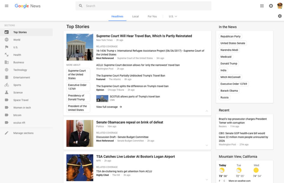
If it's been a while since you've visited Google News, now may be the best time to take a peek. Google has given its News website's looks a thorough cleanup, retaining key elements and giving you more control while getting rid of anything that adds clutter. In short, it doesn't look like a search results page anymore. Gone are the blue links and the article snippets. It has adopted a card format that groups related stories together and has relevant tags you can click to delve deeper into particular topics. Even better, clicking a link opens a new tab, so you don't have to click back to explore the other stories.
The design's best new feature lies outside the cards, though: you can now customize the menu on the left-hand side of the page. All you need to do is click "Manage Sections" to add new a new search term and to give that new entry the appropriate title. That could make following any unusual topic you may be interested in a lot easier.


