What we're buying: Lightroom on a new iPhone, Google's Pixel 2 cases
Additions to our tablets and phones.
This month, we're making the most of our devices, whether that's by testing mobile photo-editing apps, trying out an iPad keyboard that matches its surroundings, or simply just laying down a little too much cash for a pretty-looking Pixel 2 phone case.
Timothy J. Seppala
Associate Editor
I've been using Adobe's Lightroom on my phone for a few years now. It's never been the most user-friendly image-editing suite for iPhone (that'd be Google's Snapseed), but it makes up for that shortcoming with sheer power. Adobe focused on adding incredibly useful features to the mobile app, like support for both editing and capturing uncompressed RAW files and high-dynamic-range (HDR) photos.
Since I upgraded to the iPhone 8 Plus, the app has gotten even more useful. This is mainly because of the extra processing power afforded by the A11 Bionic processor. While Apple crowed at launch about how much games and AR would benefit from the chip, what won me over was that now it takes only a few seconds to export an edited RAW file at max resolution. On my old iPhone 6s, that would take anywhere from 20 to 30 seconds. In that time, I can export and upload five or six photos to Instagram on Apple's second-newest phone. What's more, on my old phone, using the "professional" mode brought everything to a grinding halt. Setting exposure and ISO was a chore, and a handful of adjustments were grayed out because the hardware wasn't capable enough. Dragging the white-balance selector around was a stuttery experience too.
That isn't the case with the 8 Plus, but I'm usually getting better results shooting in auto or HDR mode; I shoot only full manual with my Nikon, but I'm fine letting the computer take over on my phone.
More than that, even with the 8 Plus, making adjustments to ISO and shutter speed sometimes brings the app to a crawl. It's intermittent, though, and I rarely use the pro setting, so it's not a huge deal. Given how buggy iOS 11 has been for me, I'm willing to blame the system software and not Lightroom.
This brings us to HDR. Apple has made huge strides with the iOS camera app's HDR setting (it's turned on by default out of the box) and, depending on the use case, it often produces better photos than Lightroom does — especially in low-light situations. That probably has a lot to do with the new hardware's dedicated image signal processor. Snapping a photo at a concert using Lightroom results in an unusable image full of purple grain where the shadows are, and outdoor shots at dusk typically don't fare a whole lot better.
For instance, a photo taken of the gaping hole in my parents' garage roof blew out all the highlights and turned everything a sickly yellow, while the default camera app looked approximately like what I saw onscreen when I hit the shutter. Daylight HDR photos usually look overprocessed and unnatural, but every now and again the shadows and highlights aren't blown out and I get better results than with the iOS camera.
As far as actual editing goes, Lightroom is as good as it ever was, if not a little better, thanks to the device I'm using it on. Aside from the speed improvements I mentioned earlier, editing on the 8 Plus' bigger screen is a lot more enjoyable than on my 6s. It's also easier to see fine details and how different adjustments like sharpening or clarity affect them. Holding my phone in landscape makes editing an even more comfortable experience. Editing tools tuck into the right rail and expand when I tap on them, and disappear just as quickly.
I keep mobile photos and shots taken with my Nikon camera siloed off from one another and typically don't edit iPhone shots anywhere but on my phone. And for that, Lightroom CC is great. It doesn't quite allow for the more stylized edits I favor for my DSLR stuff, but for throwing a set of pictures to Instagram after an impromptu photo walk through my neighborhood, it does the trick. And if I want to get really crazy once I get back to my laptop, I can always use the Lightroom camera to grab some RAW files. Will the app's shortcomings, like wonky HDR, stop me from using it? No, because for me it's still better than Snapseed's mostly gimmicky editing tools and iOS' bare-bones options for tweaking.
Rob LeFebvre
Contributing Editor
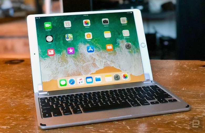
There are plenty of reasons to use an external keyboard with an iPad, including better accuracy and comfort when typing for extended periods. I have my favorites, of course, like the Logitech K811, which can hold up to three different devices in its memory. However, being able to physically attach one onto an iPad is my own personal holy grail for iOS-capable input devices. The Brydge 10.5 iPad Pro keyboard is what I've been looking for — an input device that makes my iPad look like a laptop with a good-looking, protective form factor. It has backlit keys, doubles as a clamshell case for your 10.5-inch iPad Pro and comes in space gray, silver, gold or rose gold to match the finish on your precious iOS device, turning it into a MacBook mini of sorts. The keyboard has the same thickness and rounded design as the iPad Pro 10.5-inch, making it the perfect companion for my tablet of choice. It also works with any other device as a standard Bluetooth keyboard, of course.
The Brydge keyboard has nicely spaced keys, and, while they're not full-size, they are easy to hit and use, even when touch typing. The keys are responsive, and the F and J keys both have a little raised bump on the lower half so you know where to place your fingers for touch typing — just like a MacBook.
At first, I had a little trouble hitting them with enough force to register a key press, but I was able to train my fingers to do so within just a few minutes. There are three brightness settings (low, medium and high) for the backlit keyboard so you can match the brightness of the keyboard to the ambient light from your iPad and the room. There's even a small handrest below the keys themselves — not enough room to rest my admittedly large hands in their entirety, but roomy enough to rest part of them during long typing sessions.
Why not just get an Apple-made Smart Keyboard, though, which is thinner and adds less weight to your iPad? Well, aside from the extra $20 it costs and the lack of backlit keys, Apple's own input device is pretty flimsy in comparison. Sure, it's more spill-resistant than the Brydge, but the Smart Keyboard isn't really my favorite way to type on an iPad when it's in my lap; it feels flimsy. The Brydge, however, is made of the same metal construction as the iPad itself. The Brydge's hinge keeps the iPad at the exact angle I want without flopping around at all. I'm able to use it on my lap when I sit with my legs extended to my coffee table in front of me (my usual posture), as well as in a cross-legged position while sitting on my bed or in a large chair. I can also see it being pretty fantastic for tiny lap trays in the coach section of an airliner, where a larger MacBook might have trouble fitting in (especially if you're behind one of those travelers who insist on leaning their seat back during the flight).
The Brydge feels so much like typing on my MacBook Pro that I have to keep reminding myself to touch the screen and not search for a touchpad. It's a solid, useful, stylish peripheral that has boosted my writing productivity on my iPad.
Mat Smith, Engadget
Mat Smith
Bureau Chief, UK
I like to hop between Android and iOS phones, but one of the minor frustrations I've found with Google-powered smartphones is the relative lack of case options. If it's not an iPhone or a Samsung Galaxy slab, there's often not much to choose from, or it's a bunch of unremarkable plastic or rubbery sleeves. I wish I were brave enough to carry my phones around "nude," without a case, but that's not going to happen.
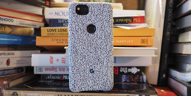
Imagine my surprise, then, when Google's own Pixel 2 family launched with official case options that are actually attractive, eye-catching and well, desirable. When all phones are mostly all the same — slabs of metal and plastic in metallic hues — the case represents one last attempt to deliver some kind of self-expression. I have the completely black Pixel 2, which means that my case, the "midnight" color, is the only way I can get a splash of neon orange on my power button. (The "cement" number also tempted me with its minty blue button.)
The case is downright tactile: the outside is a knitted fabric slightly similar to the Google Home Mini speaker, a nylon-polyester material with a pixelated look (get it?) that stands out. It's still a solid case, and that does mean it adds a bit of thickness to either the Pixel 2 or the Pixel 2 XL, but neither of these phones was particularly chunky to begin with — it's not a major complaint, but if you wanted a slender case for your phone that only minutely affects its thickness, this isn't the one for you. Cleverly, despite its rigidity, these cases are compatible with the squeeze-to-launch Google Assistant motion. I rarely use the function, but I was surprised that something so solid could still deliver my squeezing efforts. That "welded silicone" logo on the rear of the case doesn't come cheap ($40 / £35), but the fabric case is now making my Pixel 2 a conversation point. And it's a positive one.
"IRL" is a recurring column in which the Engadget staff run down what they're buying, using, playing and streaming.
