macOS Mojave is out today. Here’s what to expect.
An assortment of small refinements add up to a solid update.
While Apple didn't talk much about Macs at its big iPhone event two weeks ago, we did learn that macOS Mojave would be released on September 24th. Well, here we are. I've been testing a final build of Mojave for the past week or so, and while it's not radically different from what we detailed in our extensive preview three months ago, it's worth highlighting what you can expect when you update your computer today.


Installation and general performance
As in years past, you'll install the Mojave through the Mac App Store. The whole process didn't take much more than an hour on a 2017 15-inch MacBook Pro, but your mileage will vary depending on how fast you can download the installation file and how fast your computer can chug through the update. The oldest computers that can run Mojave are 2012-vintage iMacs, Mac Minis, MacBook Pros and MacBook Airs; if you're running one of those, the installation will probably take a good bit longer.
Immediately after the update, my machine's overall responsiveness seemed slightly slower, but that may have just been the computer adjusting things post-installation. The next day, things seemed just as fast and fluid as they were before the upgrade. Unfortunately, I haven't tried the update on an older machine yet, but our editor-in-chief, Dana, has been running the beta on an already slow iMac we have lying around (one that uses a traditional hard drive), and she has some regrets. We can't say exactly how things will work on your computer, but it's probably safe to say that if you upgraded to High Sierra last year without incident, you'll be fine this time too — especially if you're using a Mac with solid-state storage.
Embracing the dark side

Mojave's new Dark Mode is the biggest UI change for macOS since 2014's Yosemite update, which ushered in fresh icons, translucent effects and new fonts from iOS 7. If you don't enable Dark Mode, Mojave looks essentially unchanged from High Sierra. But turning on Dark Mode (and pairing it with a dark desktop picture) does make the OS feel different. Apps like Notes put text on a black background, while Calendar takes the colors of your various events and makes them seem a bit more neon against the dark backing.
My impression of Dark Mode is generally positive. It's attractive, and a nice way to change things up in a UI that has otherwise remained unchanged for several years. Also, seeing some of my daily apps like Photos, Messages and iTunes get a re-skin is just fun (if you're a particular kind of nerd, I guess). I hope that developers take the time to adopt the new UI, though, because right now the overall experience feels a bit disjointed. It can feel jarring jumping between Apple's updated apps and ones that aren't, like Chrome.
More problematic is the fact that so much of what we do on computers these days is so unavoidably... bright. As I write this, I'm using Pages in Dark Mode, but the white background of the text entry window is simply screaming against the dark window elements in the app and nearly every other one I have open. The same happens when I browse the web: so many webpages feature text and images on a white background, which makes the transition to darker apps feel abrupt.
Mojave has a few other UI tweaks worth noting. A new dynamic desktop feature adjusts the lighting and color of two wallpapers throughout the day. The basic Mojave Desert scene essentially tracks where the sun would be throughout the day and night, while "Solar Gradients" does a good job of emulating a clear sky as the sun rises and sets. Meanwhile, the familiar Dock now has a section that shows recently used apps, just like the Dock on the iPad. Being able to see recent apps is definitely useful, while the dynamic desktop is just fun to check out every hour or so. Unfortunately, right now there are only two dynamic options. Apple added dynamic wallpapers to iOS 7 back in 2013, but seven options there haven't been added to since then. I hope Apple doesn't similarly abandon dynamic desktop on the Mac and adds more options for it in the future.
Staying organized

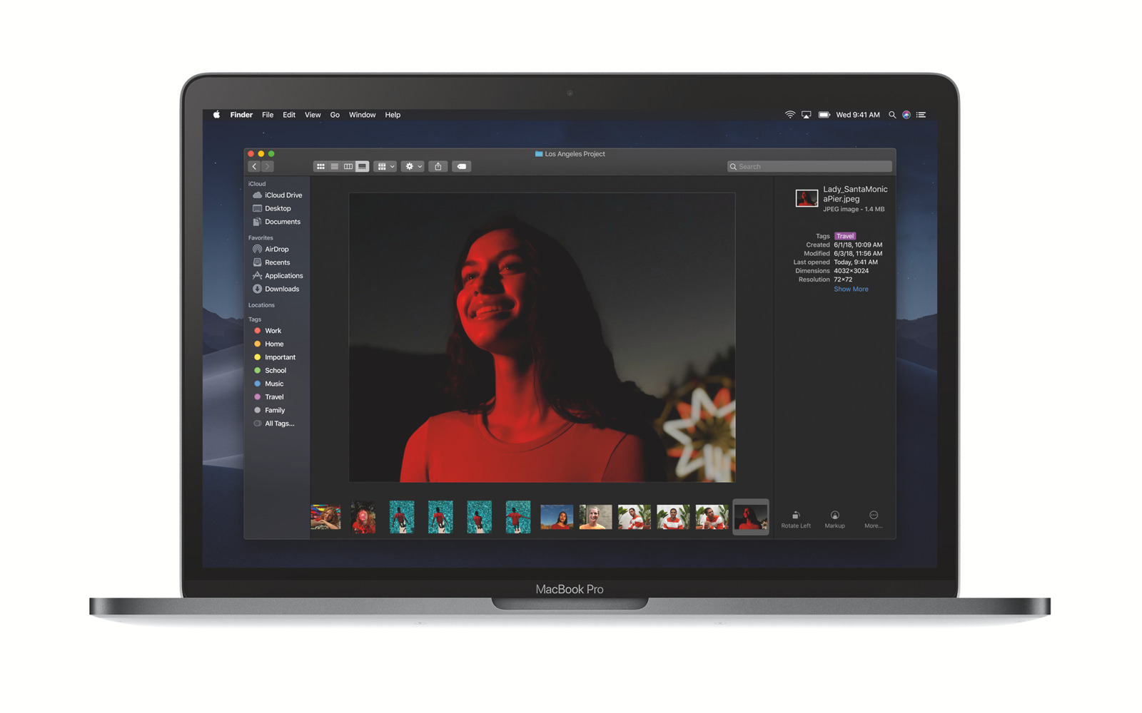
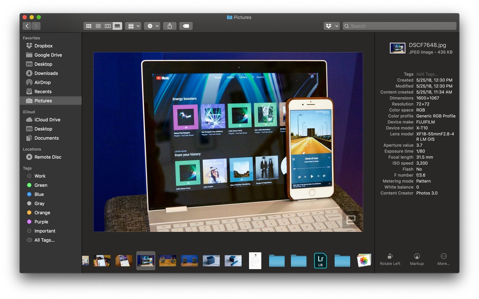
I've mostly talked about visual tweaks, but there are several new features worth trying in Mojave. The Finder, perhaps one of the oldest macOS interfaces, has received a significant upgrade. The new "Gallery view" shows a filmstrip of a folder's files at the bottom, with a large preview taking up most of the window. It's a much more functional version of the aging Cover Flow interface it replaces. There's also a new right-hand pane showing full metadata for the selected file, including EXIF info for photos. Much like Dark Mode, this new Finder layout seems particularly well-suited to those working with images or video, but it shows readable previews of PDFs and text documents as well.
The Finder also lets you make small changes to files directly in Gallery view. If you have an image selected, you'll see options to rotate, mark up or convert to a PDF; if you're looking at video, you can trim the selection without even opening it. Third-party apps can include extensions that can be added to this edit area too. Finally, if you're not browsing files in Gallery mode, you can just hit the space bar to bring up Quick Look and do the same edits there.

Apple
Having access to these quick-edit tools feels like a theme throughout Mojave; they also show up in a revamped screenshot interface. There's a new actions toolbar that pops up when you hit the screenshot keyboard shortcut. From there, you can capture an entire screen, a window or a portion of the screen. There are also options for grabbing a video of the whole display or a selected section.
Finally, there are options to choose where screenshots are sent by default, including different folders and apps like Messages and Mail. Once you take a screenshot, it shows up in the lower-right area of the screen, where you can click it to enlarge for markup or sharing. My favorite thing about this interface is that once you mark up and share a screenshot, you can just send it to the trash. Most of the screenshots I capture aren't meant to be saved forever; they're to show a specific thing to a specific person. Once that's done, I can now easily get rid of them — another thing that keeps my desktop from getting too cluttered.
Speaking of clutter, Apple introduced a new organization feature specifically to keep the desktop from getting out of control. "Stacks" automatically groups all files of a common type together on the desktop; clicking a stack expands everything in it so you can pick the file you're looking for. If you're the type of person who has hundreds of files taking up every inch of screen real estate, this will help only so much — but for those with just a modest number of shortcuts, it's a helpful organizational tool.
Continuity Camera
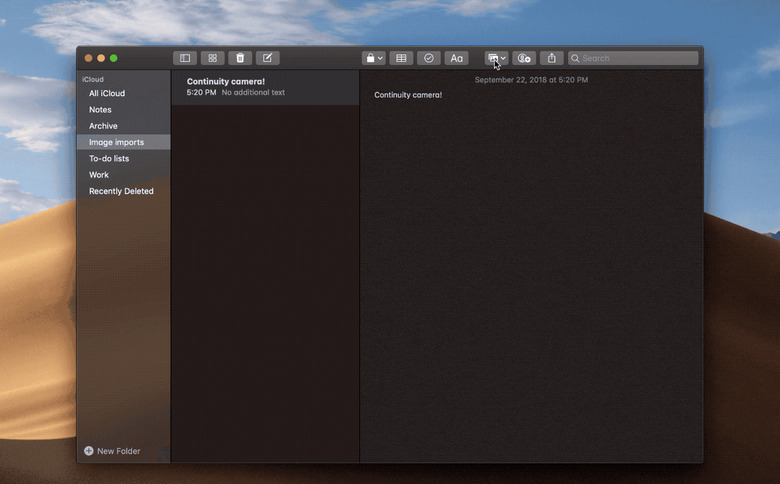
This is one of the more clever examples of iOS and macOS playing nicely together. In a handful of selected apps, including Pages, Numbers, Keynote, Finder, Notes, Messages and a few others, there's now a way for your Mac to talk to your iPhone or iPad's camera. Clicking an "import" button will show whatever iOS devices you have hooked up to iCloud; selecting one will open the camera on that device. Just shoot a picture, confirm you want to send it, and you're done. The transfer happens nearly instantaneously, even if your phone isn't on the same WiFi network as your Mac.
It was already pretty easy to shoot a picture on the iPhone and get it to a Mac, either with AirDrop, by attaching it to the Notes app or in many other ways. But if there's a particular app that you'd like to directly import images or scans of document into, Continuity Camera makes it simple. Here's hoping third-party apps adopt this feature soon. The only caveat is that imported images aren't full size or full quality, so if you want the best quality, you're better off shooting with the normal camera app. Images I shot and imported into the Finder were 1,920 x 1,440 JPG files, rather than the 4,032 x 3,024 HEIC files that my iPhone 8 Plus normally takes.
iOS apps on the Mac
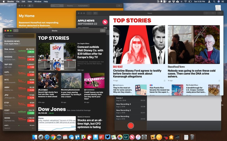
Apple
Apple made a big deal at WWDC about how it's bringing four iOS apps to the Mac. Those apps are Voice Memos, Stocks, News and Home. While that selection might not excite everyone, it represents a telling preview of what to expect once Apple makes it easier for third-party developers to port their iOS apps over to macOS. If you've tried any of these four apps on an iPad running iOS 12, well, they're basically identical.
That's a good thing, and somewhat surprising, as they were all built with Apple's touch-based OS in mind. A combination of buttons in the apps' top bar, keyboard shortcuts and traditional menu bar items are more than enough for getting around the apps. Having the Home app on the Mac to manage various smart home devices is particularly handy, and reading articles in the News app is just as enjoyable an experience here as it is on an iPad. It's nice to get notifications for stories here during the day instead of having to jump from my Mac to my phone. Of course, it depends on your habits; plenty of people won't ever touch these apps.
It's also worth noting that Apple has brought some iOS apps to the Mac before. Notes, Messages, Maps and many more started on the iPhone and were brought to the Mac. But they weren't ported over with the new, supposedly simpler technology that Apple revealed at its most recent developer conference. Still, this marks another move toward iOS and macOS coming together more closely than ever before. Developers will certainly appreciate being able to more easily repurpose iOS apps for Macs, and that expanded selection will ultimately benefit actual users.
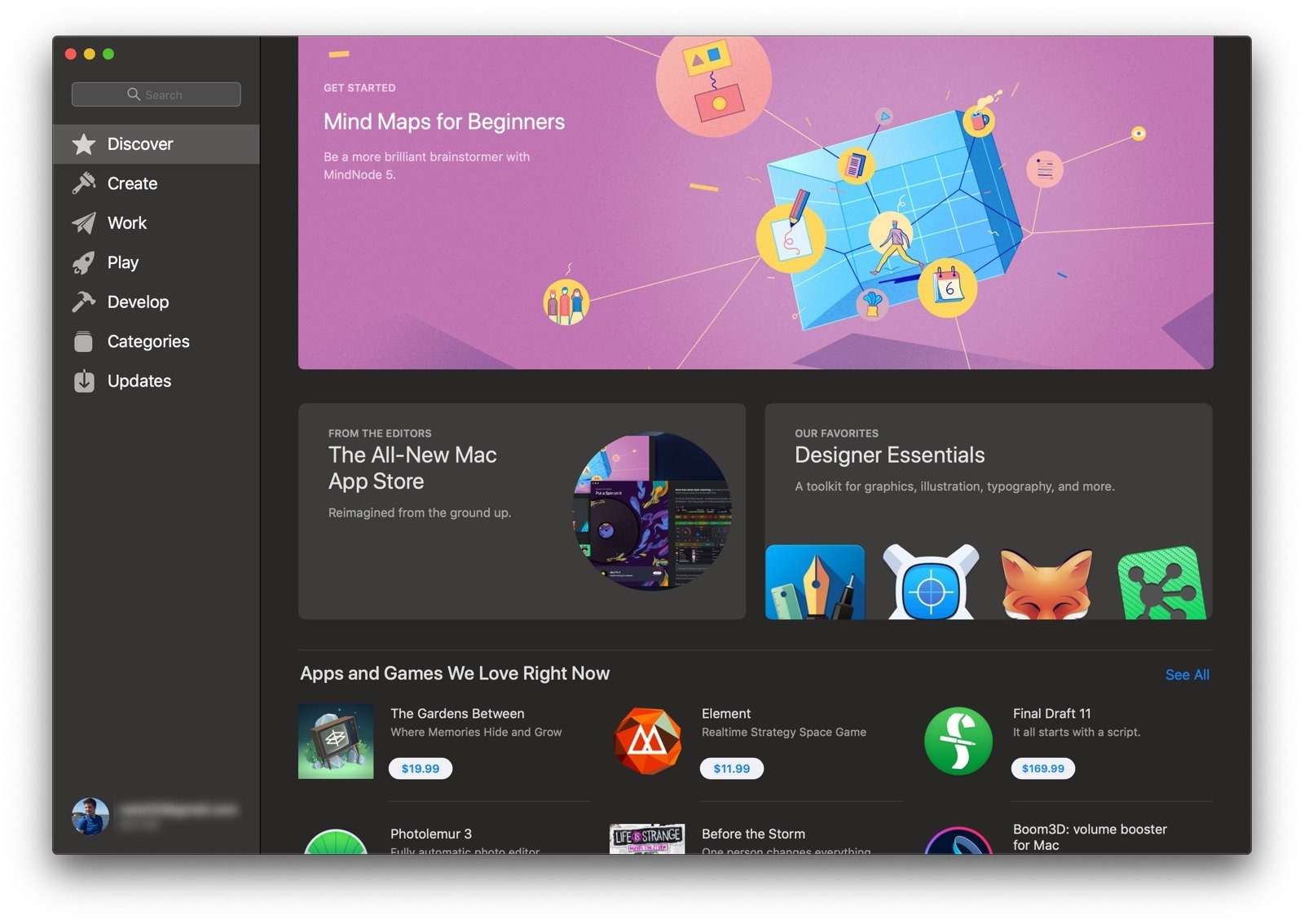
A new look for the Mac App Store
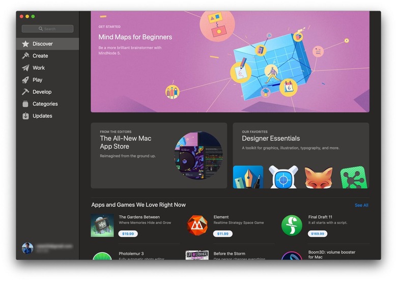
The Mac App Store hasn't become nearly as essential as its iOS counterpart, but it does remain the easiest way to find and install programs that don't come with the operating system. Its design had gotten pretty stale, though, so a fresh coat of paint and new UI are welcome here. Naturally, the new store takes a cue from last year's iOS App Store redesign, in terms of both visual design and content. The Discover page is analogous to the Today page on iOS, where featured apps are accompanied by stories explaining why they're worth trying. That editorial-style content is sprinkled throughout the rest of the store too, alongside large, bold images and drawings.
To dig in deeper, apps are organized under four broad categories: Create, Work, Play and Develop. Each section features more of the stories and how-to content found in the Discover area, alongside top charts and recommended collections of apps for tasks like managing projects or making music. Finally, the Categories section shows 21 more granular groupings if you'd rather see more specific lists.
Wrap-up
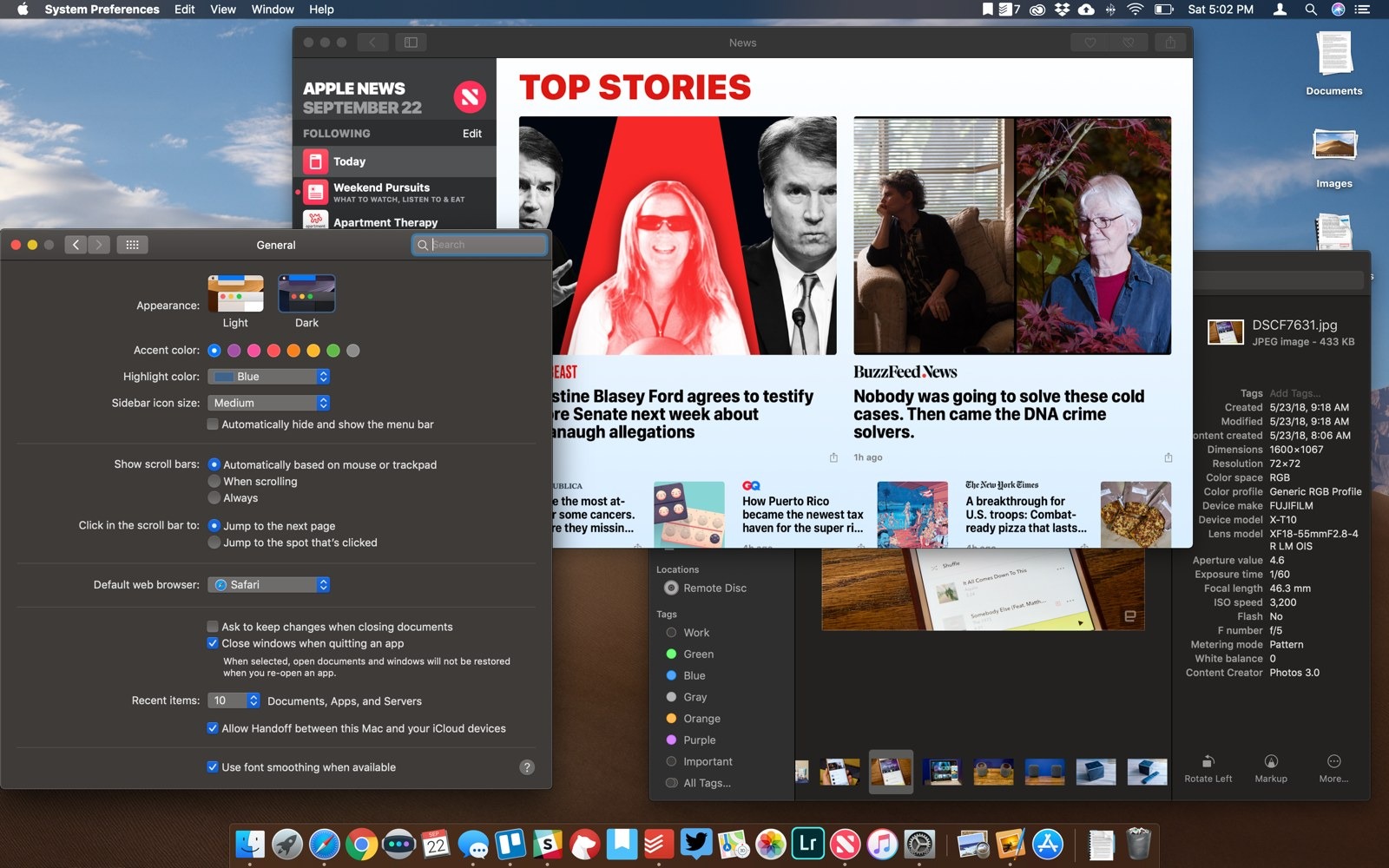
As with most recent macOS updates, there's no reason not to upgrade to Mojave. If you're using a relatively recent Mac, performance should be unaffected, and there are a host of useful organizational features here, not to mention the new Dark Mode. Apple also continues to put a big emphasis on security and privacy. For example, Safari includes improved protection against cross-site web tracking (so you don't get that ad for a pair of shoes on every site you visit). Safari also prevents "fingerprinting," which is when ad and tracking companies use data about the device you're visiting their site with to try and uniquely identify it. These are things many consumers don't think about, but it's nevertheless a relief to have these protections built right in.
All of this adds up to a strong update that's worth the download. The only caveat would be if you're running a machine right on the edge of being left out, like a 2012 MacBook Pro or Air. In that case, it's probably worth asking around online to see how well those machines handle Mojave. Otherwise, I'm fairly confident that this is an update most Mac users will enjoy and maybe even find useful. None of these features are game-changing on their own, but they add up to an improved, refined experience.