Second Life 2.0: A sneak peek at the new user-interface [updated]

This week we managed to get a look at an early build of what calls itself Second Life 2.0 – though the final version numbering is up for grabs and it could wind up being called 1.24 or 1.25 yet but Linden Lab has been amending their Second Life trademarks to allow "2" to be added. The only really major changes in 2.0 revolve around the user-interface that interactive design agency Big Spaceship has been working on for the last 6-8 months.
And quite a change it is. We're under no illusions that the new user-interface is entirely set in stone. A few parts are confusing, and it has a ton of rough edges and little quirks. It's fascinating to see the direction that it's going in, however.
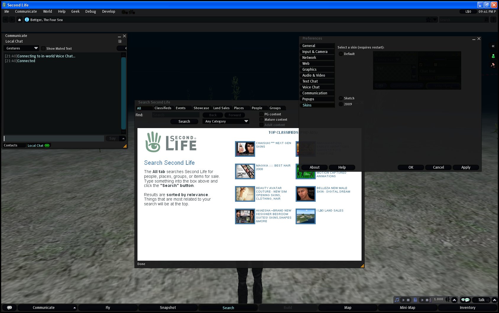
Firstly, the menus have been renamed. The new ones are (in order) Me, Communicate, World, Help, Geek, Debug and Develop. Click below for a larger view.

The Geek, Debug and Develop menus are mostly broken out of the current Advanced menu, with a couple extras moved into them, making the overall basic-user menus a whole lot cleaner.
You'll also note that the top bar is heavily reworked, featuring a button for teleporting home, and a teleport history (more about that feature in a minute).

If you look closely on the right, you'll see three new buttons for pop-out tabs.
The top button pops the currently selected tab out (or back in again). The next one is an unusual, but interesting friends-interface. The third accesses landmarks and a persistent teleport history, the latter definitely taking the prize for best new feature.

Popping out the friends tab, gives access to multiple additional friends-lists and associated buttons, each in its own compartment that can be folded and unfolded. If you want handy access to specific subsets of your friends-list (and if your friends-list is of any real size, you probably do) this looks like a really handy way of managing it.

The version we saw comes with three skins, none of which are the 'Silver' skin that's an option in the current viewers. The default is the traditional blue and grey skin that we're all familiar with.
The second skin is called 'Sketch', and is primarily monochrome whites and greys, with buttons that feel hand-drawn.

The third will probably please the gamer or goth in your life. It's called '2009' and looks for all the world like the 'Obsidian' skin in Valve's Steam client (and strongly reminiscent of most digital-delivery game downloaders, actually). Blacks and greys are the theme here. While you can only make out most of the icons as silhouettes in this skin, we assume that's just an early glitch.

What about those pie-shaped context menus? They're gone. They've been replaced with simple, yet functional ordinary sub-treed pop-up menus. Fast, clean and usable, definitely, but we've still got a soft spot for the old pie menu, if only someone had poured a little more polish on them.
All in all, the new interface is useful, even enhancing, though the top bar is a bit of a space-hog, and nothing at all has happened to the bottom bar... yet. That could come down in a future iteration.
It's useful, but it feels stale, a bit dry and utilitarian. It does the job, but it isn't anything special to look at, neither inviting nor repelling. While it seems unusual that a big agency would get brought in to produce something bland, there is also something to be said for a user-interface that doesn't distract the eye from the actual environment – which is, after all, technically the point.
There's also a separate project consisting of a brand-new, fluffy, easy-to-use, fire-and-forget downloader/installer that's been in development through the first half of the year, and we're expecting Linden Lab to announce both of these during the inevitable speeches and press-releases at Second Life's sixth anniversary later this month.
UPDATES:
Many of you have asked, how we got a hold of the new viewer. Well, if you dig deeply enough into the tangle that is the SL knowledge-base and the SL Wiki, you'll find a lot of information, including a publicly accessible web-server where every new internal viewer-build is uploaded, the moment it is complete. We've been watching that site (and about a dozen others) for almost two years.
It's a bit of a scary place to hang out, really. The new viewer builds can sometimes do terrible things to your system.
Surprisingly, the Lab's removed the 2.0 builds (and only the 2.0 builds) from that server. Which is odd. We've never known the Lab to remove brand new builds (or, technically, any builds) from there before, even when they were made public. So, what's so special about 2.0?
The Lab acknowledges that the new 2.0 viewer is the Viewer 2009 of which it spoke earlier. We probably should have mentioned that during the initial writeup, but the Lab seemed to have lost sight of the 2009 branding. There seems to be some branding confusion inside the Lab, as various groups there don't seem to be sure whether the new viewer is called Second Life 2.0, Viewer 2.0, or Viewer 2009. Dig deep enough and you'll find examples of all of these.
Linden Lab seems to have made the choice to jump from 1.24 or 1.25 to 2.0 for this viewer, and to amend its trademark registrations to allow them to cover Second Life 2. If the folks at the Lab are not going with Second Life 2 or Second Life 2009, then they seem to be wasting a whole lot of effort.
 | Are you a part of the most widely-known collaborative virtual environment or keeping a close eye on it? Massively's Second Life coverage keeps you in the loop. |
