Moto 360 review (2015): More than just good looks this time around
The Moto 360 made a huge splash when it was introduced alongside Android Wear some 18 months ago. It was by far the most attractive smartwatch the world had seen, and it held its spot near the top of the heap for many months after — mostly because it looked like an actual watch. Unfortunately, the promise of the device didn't quite live up to the reality, at least at launch. Battery life was terrible; performance was occasionally sluggish; and the device itself was far too large for those with svelte wrists.
Fortunately, Motorola improved what it could throughout the year: Android Wear as a platform continued to gain useful new features; software updates helped fix the poor battery life; and Motorola started offering Moto X-style personal customization. But now, an all-new Moto 360 is in the wild, with two case sizes, totally new guts and a host of ways to make it fit your own style. But there are also far more Android Wear watches to choose from now than last year. Is the now-iconic circular Moto 360 still the smartwatch to covet? And, more importantly, does it improve in the areas where last year's model failed?
Design
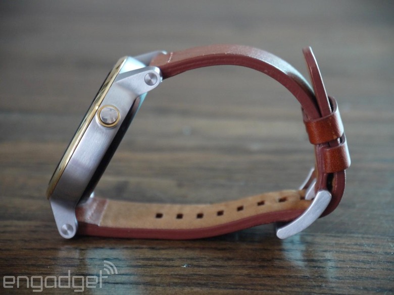
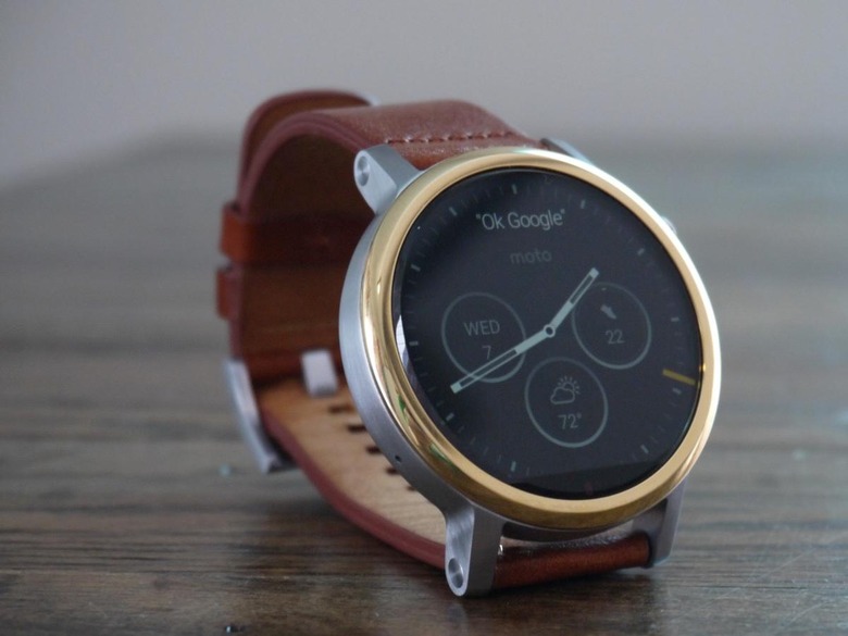
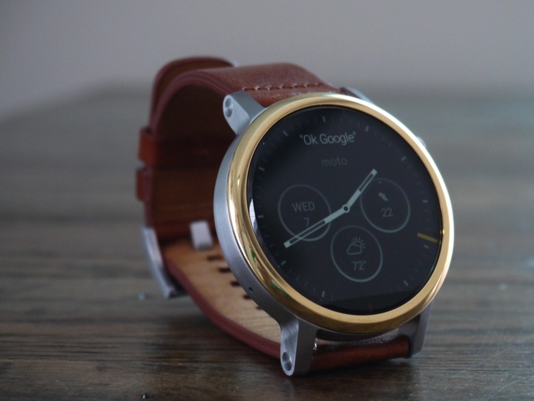
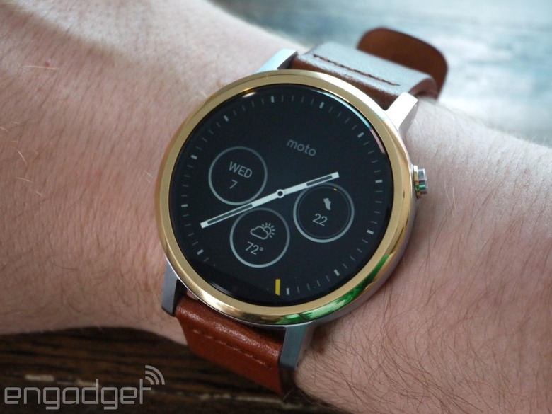
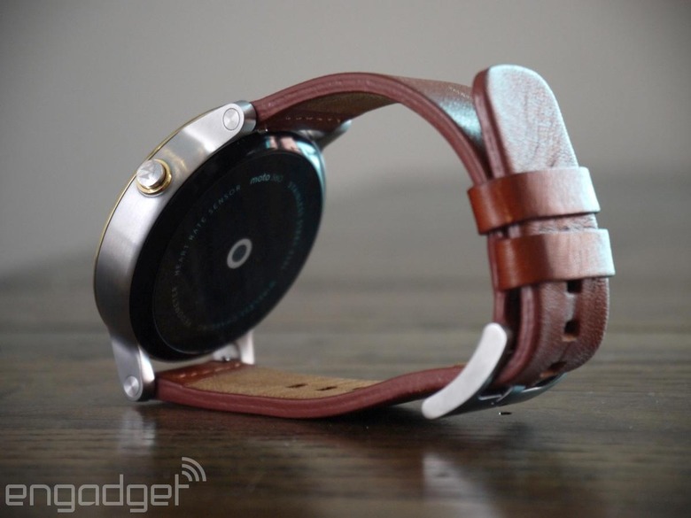
The 2015 Moto 360 looks nearly identical to its predecessor. The device is still dominated by its circular display that still has a tiny slice removed from the bottom where sensors are housed — a move that keeps its bezel nice and slim. There's still a side button, but Motorola moved it up from the center of the case. Considering where my finger naturally rests when I touch the side of the watch, this feels like a smart change. The other major (and arguably more important) tweak is that the watchband lugs are on the outside of the case, something that makes the watch look even more like a traditional timepiece. This is also a major functional improvement, as it's now quite easy to change the watch strap yourself.
Perhaps the smartest design change Motorola made was to offer the new Moto 360 in two different sizes: There's a smaller 42mm option as well as the same 46mm case that last year's model was based on. The 360 uses 20mm and 22mm watch bands, respectively; they're both common sizes, which means you should be able to find plenty of third-party options. In addition to those two variants, there's also a second 42mm option, built specifically with women in mind. Other than the fact that it's offered with different color and material choices, the biggest difference there is that the strap lugs are pushed closer together to accommodate thinner 16mm bands.
Even if you don't want to find a third-party band, there are plenty of ways to customize the Moto 360 (although not as many as the Apple Watch). For the men's line that I tested, you can choose from black-, silver- or gold-colored aluminum bezels that have either a smooth metal finish or a textured "micro knurl" pattern for an additional $20. The watch cases come in the same colors, although gold will run you an extra $30. As for bands, you can choose among black and brown leather or silver, black and gold metal (the metal option commands a $50 premium). The women's case has the same choices (albeit with a different "micro cut" textured pattern option for the bezel), but Motorola swapped out the black color option for rose gold. The leather straps come in more traditionally feminine colors, and there's also a double-wrap leather band that calls to mind the Apple Watch Hermes "double tour" band.
So that's a lot of customization. In fact, it's one of the best things about the new Moto 360 — chances are much better this year that you'll find one to suit your style. But these options come at a cost. The base price of the Moto 360 actually saw a significant increase: Last year's 46mm watch started at $250, but this year's 42mm sells for $300 and up. If you want a 46mm model, you're looking at spending $350, a full $100 more than before.
The model I tested had a 46mm silver case, gold bezel and brown leather strap. The strap itself was comfortable and handsome to look at, but it didn't go well with the rest of the watch. With the brown, silver and gold (not to mention the black screen), there were just a few too many clashing colors for my tastes. I think I would have preferred an all-silver body as well as the 42mm size, though these options would have been readily available if I had the opportunity to customize my own the way regular shoppers will. Lastly, the 360 is still rather thick, although its light weight makes wearing it easy enough. That said, it's still one of the better-looking smartwatches on the market, by a longshot. It has a simple, classy design that isn't overwrought like many of the other Android Wear watches on the market. Of course, as with any device, your opinion may differ vastly from mine.
Hardware and display
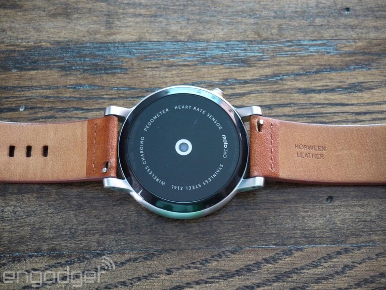
While the Moto 360 looks largely the same as its predecessor, Motorola gave the internals a significant upgrade. Gone is the aging TI OMAP 3 processor found in the original, replaced by a Snapdragon 400 chip — the same as you'll find in LG's Watch Urbane. There's still the same 4GB of storage for music and 512MB of RAM, and both of those specs still seem to be sufficient. Performance is generally snappy, although dismissing notification cards sometimes took a surprisingly long time, and I noticed occasional lags when tapping certain user interface elements or swiping away notifications.
The display has also been refreshed: The 42mm case has a 1.37-inch screen running at 360 X 325, while the 46mm steps up to 1.56 inches at a 360 x 330 resolution. Both models feature a higher resolution than last year's Moto 360, and in usage things are noticeably sharper. Despite that, I still wouldn't rate the display as anything particularly special — it's a bit easier to read outdoors, and the higher resolution is certainly appreciated, but colors aren't terribly vibrant. Since you're only glancing at the watch for a few seconds at a time, it's passable, although there are other watches with more impressive screens.
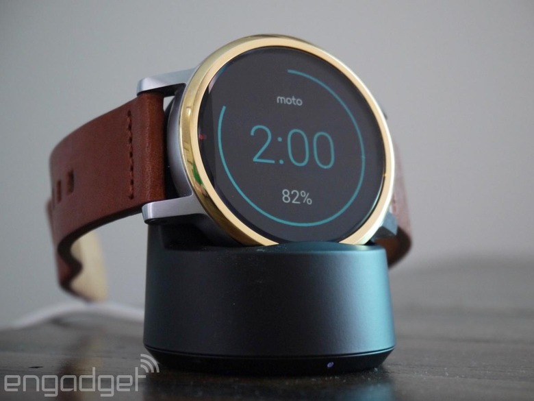
The last hardware change here is by far the most important: The 46mm Moto 360 now features a 400mAh battery, up from the 300-320mAh on the last model. (The 42mm watch is rated at 300mAh.) In the real world, this meant I could comfortably use the Moto 360 all day, with plenty of power left when I finally went to bed. That's with the ambient display feature turned on all the time (that's the setting which displays your watch face in black and white, with low brightness). Motorola says the 360 is only rated for a day's usage in this scenario, but I could easily get more than that. I still charged the Moto 360 nightly, but the good news is that I basically never had to worry about the battery running low, which is the best you can expect from a smartwatch.
On your wrist
Since it's running Android Wear, using the Moto 360 is like using any other Android-based watch. Plenty of new and useful features have come to the platform since its debut, but its core purpose is still showing you smartphone notifications and Google Now suggestions, as well as carrying out voice searches and commands.
The Moto 360's upgraded hardware typically handled all these features without a problem: Notifications were pushed to my watch quickly and dismissing them helpfully syncs that change back to your phone. Voice search worked well enough, although it failed to recognize the "OK Google" command often enough to be a bit frustrating. Fortunately, you can swipe a few screens over to get a full list of voice commands and just tap the one you want to make your watch listen to your request. Talking to your phones and watches has come a long way in the last few years, but it's hardly bulletproof at this point — not a knock against Motorola, exactly, but Android Wear is so reliant on your voice that the whole platform feels a bit less useful when the device doesn't hear me shouting "OK Google" at it.
Motorola also built in some new watch faces that include customizable "complications" (watch parlance for small slices of information). It's part of a recent update to Android Wear that supports interactive watch faces, and it definitely adds to the experience — being able to glance at my wrist and see the temperature, date and how many steps I've taken is pretty great. In fact, it's something that should have been in the operating system from the beginning, but either way it's a very useful addition.
Beyond these features, Android Wear now supports full applications; you can access your app list by holding down on the Moto 360's side button. Most of these apps were focused around quick interactions for things you'll want to do frequently (as they should be), but sometimes the feature sets felt just a little too limited. For example, Wunderlist only shows items that are in your "Inbox"; any other list you might have will be inaccessible. The Apple Watch Wunderlist app lets you also see everything due on the current day or everything assigned to you — two views that feel especially useful to me.
Naturally, most Google applications are fairly full-featured and comprehensive. Hangouts lets you scroll back through your conversations and reply with your voice, an emoji or a variety of pre-selected responses, while Google Maps lets you zoom in and out of a full map, tap for local recommendations and navigate anywhere that you drop a pin. Notifications for Google apps are also particularly useful — being able to look down at my wrist and quickly delete emails helped keep my inbox a lot cleaner.
As always, what you get out of Android Wear will depend on how much data you put into Google. If you use the company's services religiously, you'll get more useful info out of Google Now pushed to your watch. Unfortunately, I've started to personally feel like the reality of Google Now doesn't quite match its original ambitions, something that hampers the usefulness of Android Wear. Too often, info that I've already looked up on Google and digested continues to pop up there; I'll frequently look up directions to a location, actually go there, and then find Google Now giving me traffic alerts to that place after my trip is already over, for example.
Fitness tracking
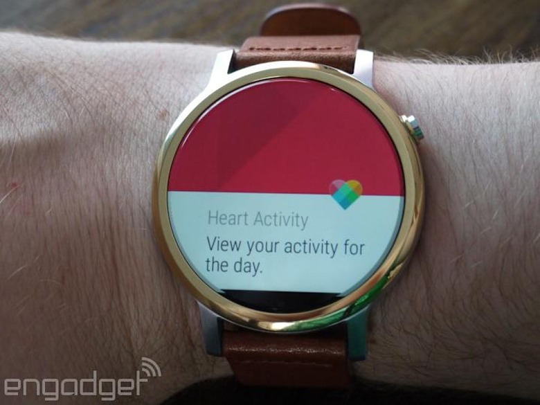
The new Moto 360 has a heart rate tracker on board, just like last year's model, making it a decent option for measuring your workouts. Unfortunately, based on my testing, the 360 lags far behind the Apple Watch for tracking your fitness. At a basic level, the Moto 360 and Moto Body app track your steps and distance, active calorie burn and "heart activity" minutes, which is essentially how many minutes you spend exercising. Similar to the Apple Watch, the Moto Body app wants you to meet all three of those goals each day — but there's no way to actually track activity specifically for when you're doing more intense workouts.
That's not a complete deal breaker, as there are plenty of third-party options like Runkeeper for tracking your more vigorous physical activity. But one of the best things about the Apple Watch is how it combines formal workouts with day-to-day activity to help you always keep an eye on your fitness levels; in my opinion, it's the most compelling feature of the device. Motorola's approach is simple but not nearly as comprehensive: The 360 will work fine as a basic activity tracker, but if you want a bit more detail about your workouts, you'll need to look elsewhere. Fortunately, the 360 appears to do a reasonably accurate job tracking your heart rate and steps. If that's all you need, it'll do the trick.
One last note: It's foolish of Motorola to sell a watch and tout its activity-tracking features without offering a band suited for use during exercise. I sweated all over the 360's nice leather strap while working out, which is kind of a shame. It definitely absorbs sweat rather than repelling it, and it's also far less comfortable than a more sport-appropriate band would be. Motorola is working on a special Moto 360 designed for athletes, but that doesn't change the fact that the company positions fitness tracking as a main feature of this watch. Providing a band to make that feasible is a must.
Using the Moto 360 and Android Wear with an iPhone
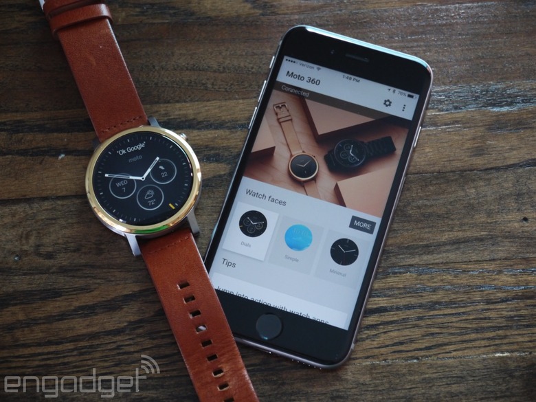
The Moto 360 is also notable for being one of the first Android Wear watches to go on sale that works with iOS, a feature announced back in August. As such, it's worth noting what the Moto 360 can and cannot do when paired with an iPhone. Setup is simple and essentially identical to the process on an Android phone — you download the iOS Android Wear app to your iPhone, pair over Bluetooth and then you're off and running.
From there, you'll still get the notifications from your phone mirrored on your Moto 360, and you'll also receive Google Now info, provided you log in with your Google account. You can do the same OK Google queries to search Google or ask your watch to do things like set a reminder, start a timer or set an alarm — or show you data like your steps or heart rate.
Unfortunately, basically all other deep app integration is gone. The Gmail app supports rich notifications, which means you can archive or reply to emails right from your watch, but that's it. As far as I can tell, no other notifications are actionable; tapping on a Google Now alert about my commute home showed me the route I should take, but I can't start any navigation or really do anything with that info. You can't reply to Hangouts or texts or initiate any conversations with your voice. With an iPhone, you basically get your notifications on your wrist and quick access to Google Now and Google voice search. A year ago, that would have sounded pretty appealing, but at this point there's basically no reason for an iPhone user to seriously consider the Moto 360, particularly when an Apple Watch isn't much more expensive.
The competition
The new Moto 360 is entering a much more crowded field than the original did last year. There are too many Android Wear watches to cover here, not to mention the new Pebble Time Round. From a looks and cost perspective, the most direct competitors to the Moto 360 are probably the $349 LG Watch Urbane and the $399 Huawei Watch. They're both on the higher end of Android Wear devices and feature round faces with premium materials and design. As I've noted multiple times before, though, a watch's style is so important and so subjective that it's hard to identify exactly which devices the Moto 360 is competing against. It's probably fair to say it's up against the entire Android Wear field, which is a lot more competitive now than it was a year ago.
Wrap-up
Thanks to the changes Motorola has made to the Moto 360, as well as the enhancements that have come to the Android Wear platform as a whole, the new 360 is easier to recommend than its predecessor. The design has improved; there are more sizing options; battery life is longer; and Android Wear keeps getting more useful. Much of your mileage will depend on how invested you are in Google services, but if you have your heart set on an Android Wear device, the Moto 360 is one of the better options out there. That said, a $100 price hike means buying a Moto 360 is a bigger investment than it was a year ago, so you'll want to make sure that Android Wear does exactly what you need it to before taking the plunge.