Google Play Music tweak adds a sidebar full of shortcuts
The web app's UI is a lot closer to matching the mobile apps.

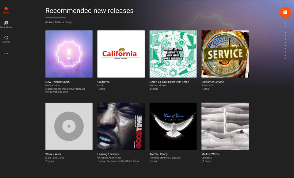

As a music streaming service, Google Play Music works well enough but its user interface leaves an awful lot to be desired. Following the mobile app's update that added persistent navigation buttons, as 9to5 Google spotted, Mountain View has added those to the web version as well. The dedicated icons for your music library, recent listening history and home tab reside on the left rail now, and hovering over the ellipses below those reveals top charts, new releases, radio stations and podcasts.
It's a welcome addition to be sure, but still doesn't address some of the app's bigger design problems. Perhaps Google will kill off the Myspace Top Eight approach to displaying playlists, artists you might be interested in and new releases next. Or maybe that's asking too much.
