Netflix's latest original: A typeface
The company developed a custom typeface called 'Netflix Sans'.


If you're averse to change, then you might not like Netflix's most recent announcement. According to It's Nice That, the streaming service is changing its typeface from the old reliable Gotham to Netflix Sans. It was developed with typeface designers Dalton Maag.
The reasoning behind the switch is simple. First, typefaces are critical to the way people interact with an online service such as Netflix. This move gives the team more ownership over the entire experience. Second, licensing the Gotham typeface has gotten expensive, according to Netflix brand design lead Noah Nathan. "Developing this typeface not only created an ownable and unique element for the brand's aesthetic . . . but saves the company millions of dollars a year as foundries move towards impression-based licensing for their typefaces in many digital advertising spaces," Nathan said to It's Nice That.
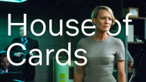
It's not clear when we'll see this typeface roll out across Netflix's services, but eagle-eyed viewers will probably notice the change when it occurs. We've got some images of what the new typeface will look like below.


