layout
Latest

Google vows to make Search 'better' after redesign backlash
Last week, Google upset desktop users when it changed the appearance of Search. The changes were relatively minor, showing companies' favicons next to link previews, but critics argue that the changes cluttered an otherwise clean interface and made it difficult to distinguish ads from search results. Now, Google is backtracking a bit. In a tweet, the company said it is going to "experiment with new placements for favicons."

Chipotle is redesigning its restaurants to better serve mobile orders
No one wants to wait in line for their Chipotle order, and honestly, most people don't want to talk to anyone either. For those reasons, Chipotle's "digital business" -- orders placed through the app, online or via third-parties like DoorDash -- has grown to $1 billion. Now, Chipotle says it's going to make the digital ordering process even better with new restaurant designs optimized for pickups.
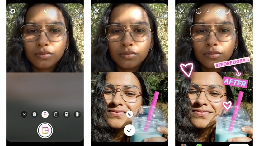
Instagram's Layout feature adds collages to your Stories
Today, Instagram is rolling out new Layout feature that will let you include multiple photos in a single story. When you open the Stories camera and select the Layout option, you'll be able to choose between two and six photos to combine in a grid-based collage.
Google tweaks Hangout Chat app to keep conversations organized
Google has made a couple of changes to the design of the Hangout Chat app to make it easier to keep track of your conversations and stay organized. The previously singular list of People, Rooms and Bots has been split into two tabs: People and Rooms, with Bots included in the People tab. Google has also removed the filter at the top of these tabs to make navigation simpler. Search using the magnifying glass at the top of the screen, or start a chat by tapping + in the bottom right corner. These changes are rolling out on iOS and Android now.

Google Search redesign adds website names and logos to results page
Google is bringing a new Search layout to mobile, and it's rolling out the changes beginning today. Now, when you search on your mobile device, you'll see a website name and logo at the top of each results card. If Google has a "useful ad" to show you, it will appear with a bolded ad label and the web address. The new design will also allow Google to add new actions, like the ability to buy movie tickets or play podcasts, to the results page.

Microsoft's Layout and Remote Assist apps are just what HoloLens needs
It's one thing to talk about how much HoloLens could help businesses, and it's another to show it. That's just what Microsoft did yesterday, when it led me into two elaborate demos for its latest Mixed Reality apps: Layout and Remote Assist. The former lets you design physical spaces virtually, rather than just relying on blueprints. Remote Assist, on the other hand, lets you collaborate with people while letting them see through your eyes using HoloLens. While they're not the sort of apps that would make HoloLens a must-have for everyone, based on my demos, they could make life easier for certain professionals. And that's exactly what Microsoft wants.

YouTube is testing a cleaner Material design
YouTube's basic design hasn't changed a lot over the years, but it could get a major cosmetic upgrade soon. Commenters on Reddit's YouTube forum discovered a new Material look that would bring it in line with the latest version of Chrome OS and Android Marshmallow. It's hidden in YouTube's code, but it's possible to unlock it from the Chrome browser's developer tools, as shown at the top of the Reddit discussion. As noted, you'll need to either sign out of your account or try it from Chrome's incognito mode.
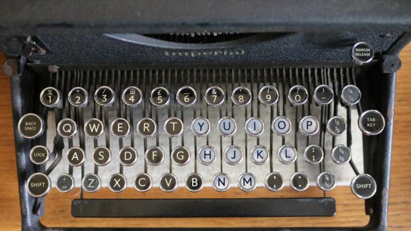
QWERTY keyboards change how you feel about words
The keyboard is mightier than the pen for written communications nowadays, and that apparently has a large impact on how we feel about words. A good example is the QWERTY effect, where words from the right side of the keyboard supposedly have more positive associations. For instance "hunky pinup" typed with the right hand supposedly makes you feel better than the left-side only phrase "sweet dress." Swiss and German researchers have concluded that the effect works all over the web, and applies to product names, film and book titles, and video clips.

France wants to fix the terrible AZERTY keyboard
When I first encountered a French AZERTY keyboard as an ex-pat, I thought "this isn't so bad." The letter layout is similar to QWERTY, so I reckoned that typing in français would be a snap. I soon came to hate it, however. As the English-language Parisian site The Local points out, the keyboards lack both logic and consistency -- they actually differ from manufacturer to manufacturer. Even locals can't stand AZERTY, due to the difficulty in finding accented characters and commonly used symbols like "@." As a result, the government has launched a new plan to standardize the keyboard in an effort to protect people's sanity and the French language itself.

Instagram's Layout collage app comes to Android
You no longer have to use an iPhone to get creative with Layout, Instagram's collage app -- it's now available for Android. As before, the software lets you cram up to nine photos into a single image, with options to shuffle and flip pictures if you're aiming for a particular effect. It'll automatically detect faces to help you find your friends, and you don't need an Instagram account to sign up or share pictures. You will get an extra perk if you do use Facebook's square photo app, though. Android-based Instagram users (iOS is coming soon) are getting Structure, an editing tool that emphasizes details and textures in your shots. However artistic you are, you'll definitely want to swing by Google Play.

Adobe's new iPad app helps with presentations, newsletters and more
Squarespace offers folks who are less web savvy the ability to create a decent-looking website in minutes. Adobe is looking to do something similar for reports, newsletters and other web content with Slate. The new iPad app offers preset layouts with a library of fonts, colors and animations that allow students, teachers and business folks the tools needed to easily develop a polished presentation. As you might expect, you're able to pull in images to complete the project, overlaying titles and captions as needed. The pre-built themes are designed to look good on the desktop and mobile devices, with buttons that'll let eager readers do things like donate or register. Published work ends up as a sharable web link, text message, email or embedded on a blog or website.

Use an iPad to start print, web and mobile layouts with Adobe Comp CC
Mobile devices may not be able to handle all of the tasks needed project ready for print, but they are certainly handy for getting work started. Back in the fall, Adobe launched Brush CC, Shape CC, and Color CC that allow you to quickly nab useful bits of smartphone photos for use in full-on desktop applications like Photoshop and Illustrator. Today, the software company announced Comp CC: a new iPad app that pulls items from a user's Creative Cloud Library to get started on print, web and mobile app layouts while on the go.

Instagram reveals Layout, its own photo collage app
If you've ever seen a collage in your Instagram feed, it was likely created by one of several third-party apps -- Diptic and Framatic are a couple that spring to mind -- that let you arrange multiple photos in a variety of grids. Now Instagram will let you do that with its very own layout app appropriately called, well, Layout. Much like Hyperlapse, Layout exists as a standalone app separate from the core Instagram offering. It's iOS-only for now, though an Android version should be available in a few months.

Heroes of the Storm launches interactive battleground page
Looking forward to exploring the maps in Heroes of the Storm? The good news is that you can do so right now, even if you aren't currently in the test pool. The game's interactive battleground maps are now available, showing off the fields of battle and allowing you to zoom in or out, highlight important points, and scroll around to see all of the neat stuff that's there to be seen. Each of the maps has numerous different mechanics as well as additional routes for players to take, including aboveground and underground routes or enemies that spawn during the night. The page outlines how all five maps will work and should help players start plotting strategies even without getting your hands on the game. If you feel like a bit of surveying, go check out the maps now.

The Daily Grind: What frustrates you about official game sites?
Working at Massively has given me several years to gain an appreciation for official game sites done properly. You wouldn't think that putting together a website for a game that's already online would be the difficult part, but apparently it is. EverQuest II and Lord of the Rings Online both hide their screenshot galleries in unrelated headers. Final Fantasy XIV doesn't link to the official forum from the main page. And this isn't even discussing sites with auto-playing videos or Flash elements preventing you from interacting with the site normally. Pretty much every MMO requires you to go through the official site on a semi-regular basis, which means that any minor problems start to become continual irritations given enough time. So what frustrates you about official game sites? Wonky graphic placement? Poor font choices? Too many separate logins? For that matter, what official game sites do you think have pretty much gotten the formula correct? Every morning, the Massively bloggers probe the minds of their readers with deep, thought-provoking questions about that most serious of topics: massively online gaming. We crave your opinions, so grab your caffeinated beverage of choice and chime in on today's Daily Grind!

New iBooks Author supports LaTeX and MathML
LaTeX is document markup system (similar to the popular Markdown) that's popular among high-level academia and mathematics authors. iBooks Author 2, which was released during Apple's big event, now supports the LaTeX protocol. It works through the MathML markup language, which a lot of educational textbooks often use for marking up and displaying complex mathematical equations and formulas. In other words, iBooks Author has gained significant functionality for working together with a markup language already used by education professionals, mathematics authors and students. That fits right in line with Apple intentions for iBooks Author, namely the creation of academic documents for college curriculums and classes. That's good news for anyone who commonly uses this language, as they can now load up iBooks Author and continue their work there. This is a small, very technical change, that accomplishes Apple's mission of making this software work for the systems already being used to create higher education texts. [via Michael Tsai]

The Mog Log: The zone design of Final Fantasy XIV
I love Final Fantasy XIV, something that comes as no surprise to regular readers of this column. But the game's zone design is not its highlight. This is one of those design aspects that really bothered everyone in the world when the game launched, and it was for good cause, but I think there's more to it than simply condemning the whole thing out of hand. There are several places where the zone design isn't actually bad and in fact is downright brilliant. You could say that it's a variation on Final Fantasy XIV's theme right there: brilliance mixed in with average and awfulness. Obviously, zone design will be changing in a big way when version 2.0 launches, something that gets closer with each passing day. Still, it's worth examining where we are now if for no other reason than to hopefully identify what a good revision would look like. This is not a horrible mess; this is a few great elements mixed in with several elements that just aren't well thought out.

This is just like word wrap, except that it works with photos (video)
If you regularly snap pages of hardcopy text on your smartphone for perusing later, then an Android app being developed by Fujifilm may just tick your literary boxes. Called GT-Layout, it automatically carves up a photo containing text so that each character becomes a separate image. These sub-images can then be reformatted with line breaks to fit your screen area and preferred level of zoom -- so you don't have to pinch and pan so much and there's no need for OCR. Want to try it? Then you'll have to wait. GT-Layout is reportedly coming in an update to Fujifilm's Dropbox client, GT-Document Lite, but there's no sign of it appearing there just yet.

Layout app adds framing style to images on the iPad
JuicyBits Software is well known for some innovative iOS apps, including Halftone and 3D Camera. Now the company has released a new app that's perfect for arranging, annotating, framing, and sharing any image you can view on your iPad. Layout (US$2.99) is an iPad app that makes it child's play to create an attractive, framed arrangement of your favorite images and then share it with friends. I had the pleasure of testing Layout over the last week, and I found it to be both easy to use and just plain fun. The app currently supports the iPad (2nd generation or later), but will be available soon in an iPhone-compatible Universal version (free upgrade). Upon launching Layout, you're welcomed with a blank gray screen. That's your palette for creating a photo arrangement. You can add framed windows by simply swiping a finger horizontally or vertically, then drag the edges between windows with a finger. You can save your own window arrangements, or use one of the pre-defined arrangements. %Gallery-159695% When you tap on a window, a radial menu control appears. This control is completely unique to Layout, and is used to perform all functions from adding images, touching up photos or applying effects, adding captions, and sharing. Adding images is easy. The images initially come from just your camera roll, but if you wish you can have the app go out to Instagram, Flickr, or Facebook and bring in your photos. Coming from those sites, the captions are automatically grabbed as well. Captions can also be added to any image, and if there's EXIF information included, it will let you automatically add the date with the touch of a button. The photo effects engine is powered by Aviary, and is very full-featured. If you want to enhance a photo, add effects, put stickers (like mustaches or hats) on people, change the orientation of an image, crop a photo, change the brightness, contrast, saturation or sharpness, or do human touchups (redeye correction, whiten teeth, or remove blemishes), it's possible. The sharing button lets you email your layout, save it to the camera roll, or share with Facebook, Twitter, or Flickr. I was unable to get the Twitter sharing to work properly, but Facebook sharing worked very well, creating a Layout Photos album. As with Halftone, Layout has found a permanent place on my iPad. It looks like the perfect tool for putting together "postcards" to email to friends and relatives when I'm on a trip. Take a look at the video below for a better idea of how the app works.

Apple trying new Genius Bar layout
IFO Apple Store has spotted a new trend in a few Apple Stores around the country: Apple is trying a new layout for the in-store Genius bar, turning it perpendicular to the store wall instead of running parallel along it. The new layout is designed to make things more accessible, and provide more room for users to come in and get their various Apple items inspected and fixed. I think it might make things more chaotic, with both sides of the bench available to Geniuses and customers. But especially for long, narrow stores with little room to spread out lengthwise, the bar metaphor isn't always best. Hopefully this new layout, if adapted chainwide, will help get more Apple users more help faster.


