Uber hopes a new font will symbolize its turnaround
New look, new company... right?

Uber has been through a lot since it booted Travis Kalanick: a new CEO, a new management team and an emphasis on doing things by the book (even if it proves costly). But how is it supposed to convey that it turned a corner besides ads? Through a new font, apparently. The ridesharing firm has unveiled a new look that revolves around a new typeface, Uber Move. It's unique, inspired by transportation fonts (think road signs and subways) and works in every country where Uber has a presence.
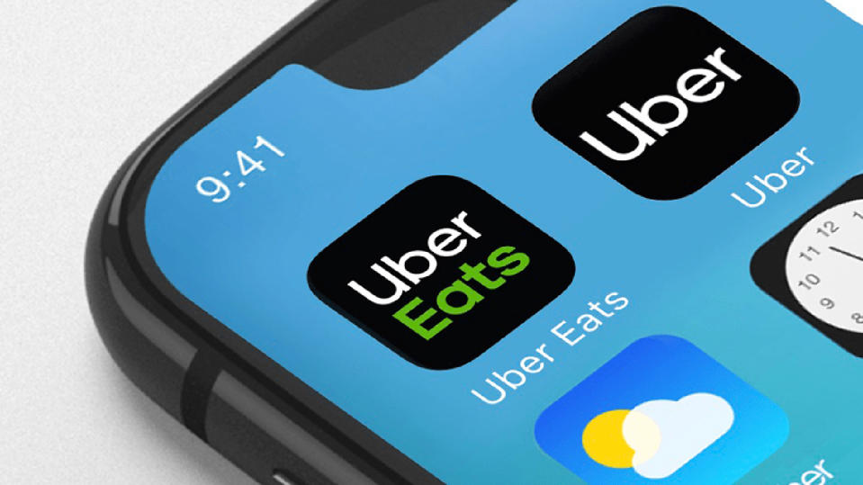
And gone is that abstract square-in-a-circle logo from 2016 -- instead, you'll simply see the word "Uber" in the new style. Many people didn't associate the symbol with Uber, the company's Peter Markatos told AdWeek. This removes any doubt as to what you're using.
You'll see the font and associated branding roll out on a basic level this week (the website and Uber Eats app have already updated as I write this), although deeper changes will take longer.
To some extent, there's a good reason for the new typeface. This isn't the same company that used to knowingly defy the law in the name of profit, and it's moving away from its automotive focus toward mixed transportation options like bikes and scooters. Even so, a font can only do so much. People still have bad memories of the old Uber, and there are incidents that have tarnished the modern Uber's image, such as its fatal self-driving car crash and complaints of low driver pay. As far as the company has come, it may need more than stylized text to prove that it has mended its ways.
